Visualizing long-read transcriptomes
In this blog post I explore some of the features of Swan, a new Python package for analysis and visualization of transcriptome data, especially from long-read transcriptomic technologies such as Pac Bio and Oxford Nanopore. Note that this is not really a formal tutorial of the software, which the developers of Swan provide, this is more of my experience learning how to use the software. In opposition to the genome-browser style plots that become quite messy when looking at the isoform-level, Swan uses directed graphs where a given path represents a specific isoform, allowing for simultaneous visualization of several isoforms on the same gene. To me, this seems like a natural improvement upon existing transcript visualizations, especially since more and more research is using long-read sequencing technologies. Swan seems like an ideal platform for alternative splicing analysis, with its robust visualization suite and integrated analysis tools for detection of differential isoforms and alternative splicing events. Below is a sample visualization from Swan, which I will show you how to make later in this blog post.
install Swan and download data
For this analysis, I will be using two Pac Bio samples from K562 cells. Before doing anything, we first need to install the Swan library, which is done simply as a pip command followed by running a script that adds some functionality to networkx.
1
2
 pip3 install swan_vis
swan_patch_networkx
Let’s fire up Python3 to quickly check that Swan was properly installed.
import swan_vis as swanNow that Swan is installed, we need to download the processed dataset. Note that this data is supplied in .gtf format, but Swan accepts other formats as input. This data was pre-processed using TALON v5 according to the ENCODE long-read RNA-seq pipeline, yielding a .gtf for each sample as well as an isoform abundance .tsv. Importantly, the specific annotation that was used to annotate the data is required for this analysis, so we are also going to download that (in this case, gencode v29).
mkdir data/
wget https://hpc.oit.uci.edu/~freese/Swan_files/all_talon_abundance_filtered_with_k562.tsv ./data/
wget https://hpc.oit.uci.edu/~freese/Swan_files/k562_1_talon.gtf ./data/
wget https://hpc.oit.uci.edu/~freese/Swan_files/k562_2_talon.gtf ./data/
wget ftp://ftp.ebi.ac.uk/pub/databases/gencode/Gencode_human/release_29/gencode.v29.annotation.gtf.gz ./data/
gunzip ./data/gencode.v29.annotation.gtf.gz
We now have everything that we need to start working with Swan. The following block of python code will load the Swan library as well as the data that we just downloaded.
import swan_vis as swan

# reference gtf
annot_gtf = 'data/gencode.v29.annotation.gtf'

# processed k562 gtfs
gtf_files = {
  'k562_1': 'data/k562_1_talon.gtf',
  'k562_2': 'data/k562_2_talon.gtf'
}

# abundance file
ab_file = 'data/all_talon_abundance_filtered_with_k562.tsv'
Now we will initialize a SwanGraph, the core data structure of the Swan library.
# initialize empty Swan graph
sg = swan.SwanGraph()

# add reference data
sg.add_annotation(annot_gtf)

# add k562 samples:
for sample_id, file_path in gtf_files.items():
  sg.add_dataset(
    sample_id, file_path,
    counts_file = ab_file,
    count_cols = sample_id
  )
gene and transcript visualization
We are now ready to visualize any gene of interest. I don’t normally work with k562 cells, so I did a quick search to figure out what genes are up-regulated in this system. The following code will generate Swan “Gene summary” plots for three selected genes: CDC45, ZNF280A, and FBXO42.
for gene in ['CDC45', 'ZNF280A', 'FBXO42'] :
  sg.plot_graph(gene)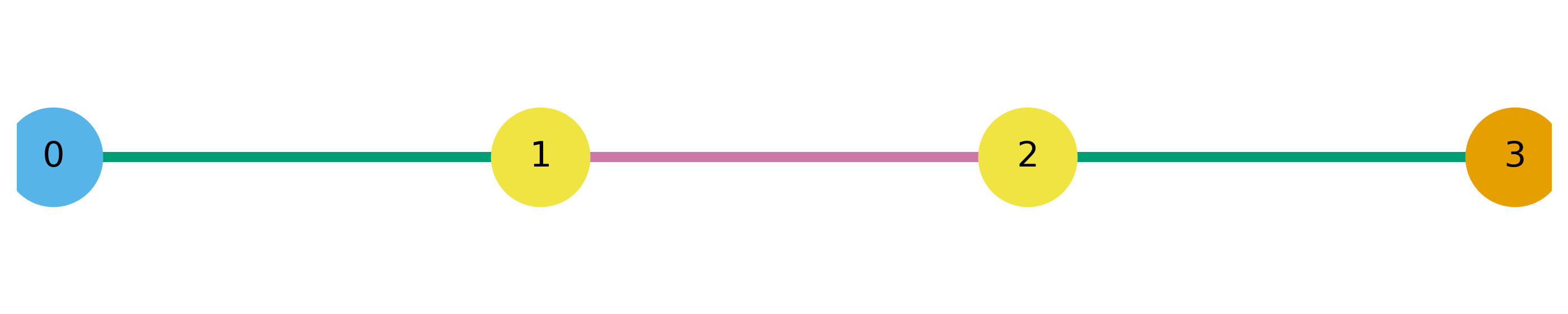
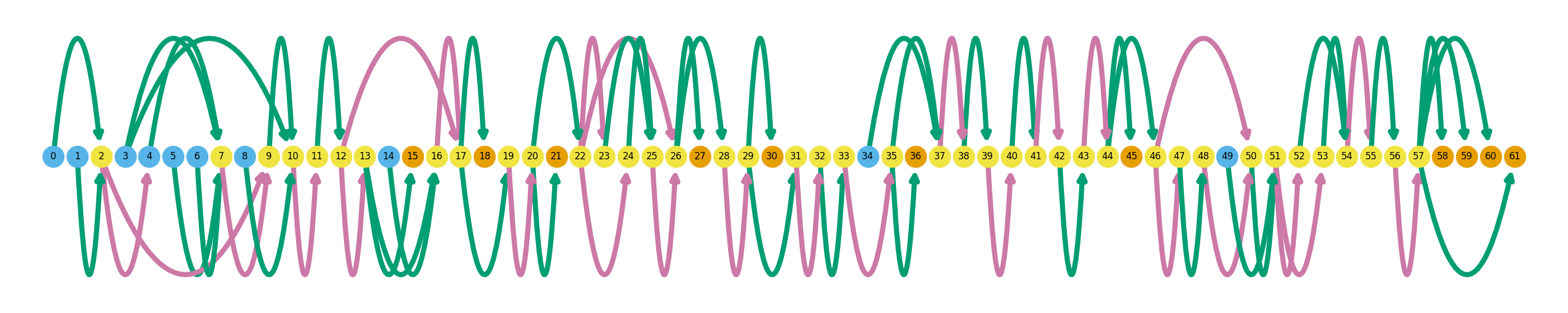
I will briefly explain how to interpret these gene summary plots. An entire graph represents a single gene, while each node represents a single unique splice site. Naturally, edges between these nodes represent exons (green) and introns (pink). Blue nodes represent transcription start sites (TSS), and orange nodes represent transcription end sites (TES). Novel splicing events are denoted as black outlines around a node. Swan’s documentation has a more thorough explanation of how to interpret these graphs. The graphs above show all of the isoforms detected in the dataset in these three genes, and later I will go over how highlight individual isoforms.
Despite somewhat randomly picking these three genes out of a list of up-regulated genes, they exemplify the highly variable complexity across the transcriptome. ZNF280A is a simple example, with only two exons and one intron, while CDC45 is much more complex with a total of 61 splice sites.
Next, we will look at a gene that has novel isoforms unobserved in the supplied reference .gtf. Novelty is determined while processing the data using TALON, and you can read the TALON manuscript if you are interested in exactly how they determine isoform novelty. Unfortunately, none of the genes that I had already plotted had any novel isoforms. In the following code, I will subset the transcript dataframe by ‘NNC’ (Novel Not in Catalog) to find a novel isoform.
sg.t_df.loc[(sg.t_df.annotation == False) & (sg.t_df.novelty == 'NNC')][['gname', 'novelty']].head()It appears that GAPDH has a NNC isoform, so I will take the transcript id of that isoform from the transcript dataframe and visualize using the following code:
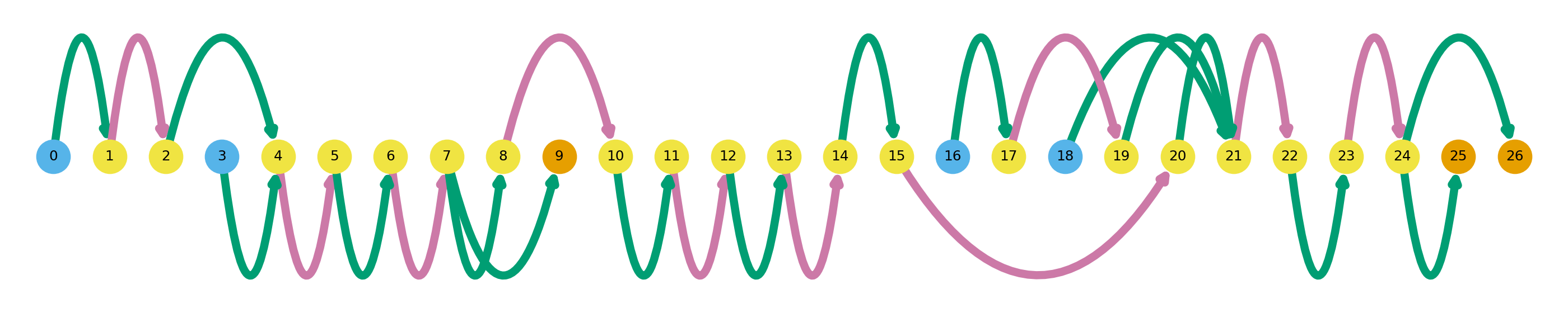
gene = 'GAPDH'
cur_transcript = sg.t_df.loc[(sg.t_df.annotation == False) & (sg.t_df.novelty == 'NNC') & (sg.t_df.gname == gene)].index.tolist()[1]
sg.plot_transcript_path(cur_transcript, indicate_novel=True)In this plot, novel splicing events are indicated as dashed lines. The path plotted in dark colors represent the isoform of interest, while the dulled nodes and edges are used in other isoforms in the dataset. Here we can see that this particular GAPDH isoform has a novel exon between nodes 20 and 22, and a novel intron between nodes 22 and 24. Additionally, in this isoform we can see that there is alternate TSS and TES usage. How does this visualization compare to old-school genome-brower style gene models? Swan also has a way to visualize those.
sg.plot_transcript_path(cur_transcript, browser=True)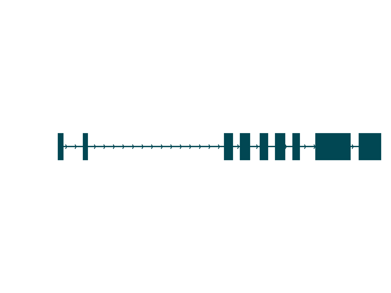
Aside from the fact that so much more information is contained in a Swan graph, one key difference between these plots is that the browser-style plot is scaled to the genomic axis. The distance between nodes in a Swan graph are uniform, and thus do not contain any information about genomic coordinates. Thus, a more complete understanding of the isoform is achieved using both of these plots.
Swan reports
So far I have demonstrated some of Swan’s usefulness in terms of visualization of your favorite genes, but you probably don’t know which isoform is interesting for further study. Swan has a function to generate a report for all of the transcripts in a gene, which I demonstrate in the following block of code. This, which was actually taken directly from the swan documentation, summarizes the isoforms for ADRM1.
sg.gen_report('ADRM1',
              prefix='figures/adrm1_paper',
              heatmap=True,
              include_qvals=True,
              novelty=True,
              indicate_novel=True)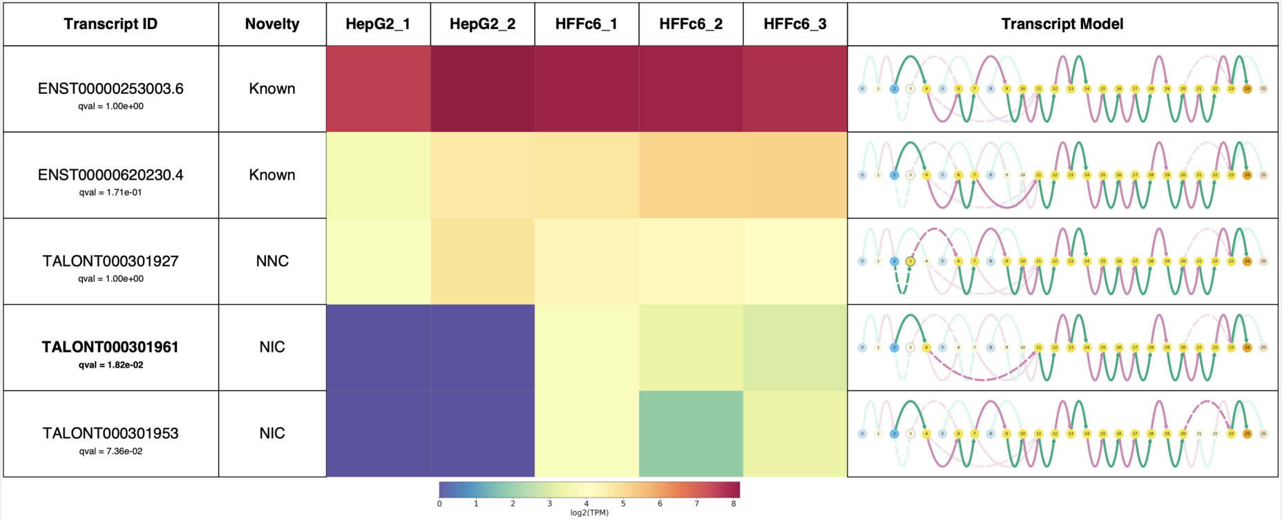
This report succinctly contains the novelty of each transcript, isoform expression data in each sample, and the Swan graph for each transcript.
exon skipping an intron retention
The graph-based framework allows Swan to quickly identify exon skipping and intron retention events, as demonstrated in the following block of code.
es_genes, es_transcripts = sg.find_es_genes()
ir_genes, ir_transcripts = sg.find_ir_genes()
Swan reported 361 novel exon skipping events, and 22 novel intron retention events, highlighting the utility of this tool for discovering alternative splicing events in a biological system of interest. We can then subset the transcript dataframe by es_genes or ir_genes to visualize some of these events.
es_df = sg.t_df[[g in es_genes for g in sg.t_df.gid.tolist()]]
es_df.head()
As an example of exon skipping, I will plot IFITM1 , which I chose just because it was of the first results from the subsetted exon skipping dataframe.
Here we can see an exon skipping event between nodes 7 and 8, which is replaced by a novel intron. Next, let’s look for an example of intron retention.
ir_df = sg.t_df[[g in ir_genes for g in sg.t_df.gid.tolist()]]
ir_df.head()Here we visualize a transcript from RPS2, and we can see an intron retention event between nodes 8 and 11. We can see a novel exon spanning between nodes 2 and 15, thus encompassing the sequence between nodes 8 and 11 that are normally intronic and thus spliced out of the final gene product.
differential isoform expression
Swan has a built-in wrapper for diffxpy, a python tool for performing differential expression analysis. However, since my toy dataset only has two samples, it doesn’t really make sense to perform differential expression analysis. You can check out the documentation for a differential expression example using Swan. Additionally, Swan can detect isoform switching events if differential isoform expression analysis has been performed.
Conclusion
Overall I found Swan easy to learn, due to the great documentation. It should go without saying that these plots are quite eye-catching, and should spice up any publication or talk in which gene models are shown. However, it would be nice if the authors implemented a few new features such as customized color schemes, and mapping data attributes to certain plot attributes (for example, opacity of an edge corresponding to the proportion of its usage in a certain dataset). I do appreciate that the authors were careful in their selection of the default color scheme in terms of color blind accessibility.