RNA velocity analysis with scVelo
Introduction
In this tutorial, I will cover how to use the Python package scVelo to perform RNA velocity analysis in single-cell RNA-seq data (scRNA-seq). scVelo was published in 2020 in Nature Biotechnology, making several improvements from the original RNA velocity study and its accomanpying software velocyto.
Briefly, RNA velocity analysis allows us to infer transcriptional dynamics that are not directly observed in a scRNA-seq experiment using a mathematical model of transcriptional kinetics. We can use RNA velocity to determine if a gene of interest is being induced or repressed in a give cell population of interest. Moreover, we can extrapolate this information to predict cell fate decision via pseudotime trajectories.
The majority of this tutorial is taken from the scVelo documentation.
Step -1: Convert data from Seurat to Python / anndata
For this tutorial, I am starting with a mouse brain dataset that contains cells from disease and control samples. I have already performed the primary data processing (filtering, normalization, clustering, batch alignment, dimensionality reduction) using Seurat in R. First I will go over the code that I used to convert my Seurat object into a format that is usable in scVelo (anndata format). It is possible to use the SeuratDisk R package to convert between Seurat and anndata formats, but this software is in early development stages and I have had mixed results when using it.
# assuming that you have some Seurat object called seurat_obj:

# save metadata table:
seurat_obj$barcode <- colnames(seurat_obj)
seurat_obj$UMAP_1 <- seurat_obj@reductions$umap@cell.embeddings[,1]
seurat_obj$UMAP_2 <- seurat_obj@reductions$umap@cell.embeddings[,2]
write.csv(seurat_obj@meta.data, file='metadata.csv', quote=F, row.names=F)

# write expression counts matrix
library(Matrix)
counts_matrix <- GetAssayData(seurat_obj, assay='RNA', slot='counts')
writeMM(counts_matrix, file=paste0(out_data_dir, 'counts.mtx'))

# write dimesnionality reduction matrix, in this example case pca matrix
write.csv(seurat_obj@reductions$pca@cell.embeddings, file='pca.csv'), quote=F, row.names=F)

# write gene names
write.table(
  data.frame('gene'=rownames(counts_matrix)),file='gene_names.csv',
  quote=F,row.names=F,col.names=F
)
import scanpy as sc
import anndata
from scipy import io
from scipy.sparse import coo_matrix, csr_matrix
import numpy as np
import os
import pandas as pd

# load sparse matrix:
X = io.mmread("counts.mtx")

# create anndata object
adata = anndata.AnnData(
    X=X.transpose().tocsr()
)

# load cell metadata:
cell_meta = pd.read_csv("metadata.csv")

# load gene names:
with open("gene_names.csv", 'r') as f:
    gene_names = f.read().splitlines()

# set anndata observations and index obs by barcodes, var by gene names
adata.obs = cell_meta
adata.obs.index = adata.obs['barcode']
adata.var.index = gene_names

# load dimensional reduction:
pca = pd.read_csv("pca.csv")
pca.index = adata.obs.index

# set pca and umap
adata.obsm['X_pca'] = pca.to_numpy()
adata.obsm['X_umap'] = np.vstack((adata.obs['UMAP_1'].to_numpy(), adata.obs['UMAP_2'].to_numpy())).T

# plot a UMAP colored by sampleID to test:
sc.pl.umap(adata, color=['SampleID'], frameon=False, save=True)

# save dataset as anndata format
adata.write('my_data.h5ad')

# reload dataset
adata = sc.read_h5ad('my_data.h5ad')
Step 0: Constructing spliced and unspliced counts matrices
Rather than using the same UMI-based genes-by-counts matrix that we used in Seurat, we need to have a matrix for spliced and unspliced transcripts. We can construct this matrix using the velocyto command line tool, or using Kallisto-Bustools. Here I am using the velocyto command line tool, simply because I had a working script from before Kallisto supported RNA velocity, so I have personally never bothered to try Kallisto.
The velocyto command line tool has a function that works directly from the cellranger output directory, but it also can be used on any single-cell platform as long as you provide a .bam file. We also have to supply a reference .gtf annotation for your species (mm10 used here), and optionally you can provide a .gtf to mask repeat regions (recommended by velocyto).
repeats="/path/to/repeats/mm10_rmsk.gtf"
transcriptome="/path/to/annoation/file/gencode.vM25.annotation.gtf"
cellranger_output="/path/to/cellranger/output/"

velocyto run10x -m $repeats \
                $cellranger_output \
                $transcriptome
Step 1: Load data
Now that we have our input data properly formatted, we can load it into python. Velocyto created a separate spliced and unspliced matrix for each sample, so we first have to merge the different samples into one object. Additionally, I am reformatting the cell barcodes to match my anndata object with the full genes-by-cells data.
import scvelo as scv
import scanpy as sc
import cellrank as cr
import numpy as np
import pandas as pd
import anndata as ad

scv.settings.verbosity = 3
scv.settings.set_figure_params('scvelo', facecolor='white', dpi=100, frameon=False)
cr.settings.verbosity = 2
adata = sc.read_h5ad('my_data.h5ad')
# load loom files for spliced/unspliced matrices for each sample:
ldata1 = scv.read('Sample1.loom', cache=True)
ldata2 = scv.read('Sample2.loom', cache=True)
ldata3 = scv.read('Sample3.loom', cache=True)
Variable names are not unique. To make them unique, call `.var_names_make_unique`.
Variable names are not unique. To make them unique, call `.var_names_make_unique`.
Variable names are not unique. To make them unique, call `.var_names_make_unique`.
# rename barcodes in order to merge:
barcodes = [bc.split(':')[1] for bc in ldata1.obs.index.tolist()]
barcodes = [bc[0:len(bc)-1] + '_10' for bc in barcodes]
ldata1.obs.index = barcodes

barcodes = [bc.split(':')[1] for bc in ldata2.obs.index.tolist()]
barcodes = [bc[0:len(bc)-1] + '_11' for bc in barcodes]
ldata2.obs.index = barcodes

barcodes = [bc.split(':')[1] for bc in ldata3.obs.index.tolist()]
barcodes = [bc[0:len(bc)-1] + '_9' for bc in barcodes]
ldata3.obs.index = barcodes
# make variable names unique
ldata1.var_names_make_unique()
ldata2.var_names_make_unique()
ldata3.var_names_make_unique()
# concatenate the three loom
ldata = ldata1.concatenate([ldata2, ldata3])
# merge matrices into the original adata object
adata = scv.utils.merge(adata, ldata)
# plot umap to check
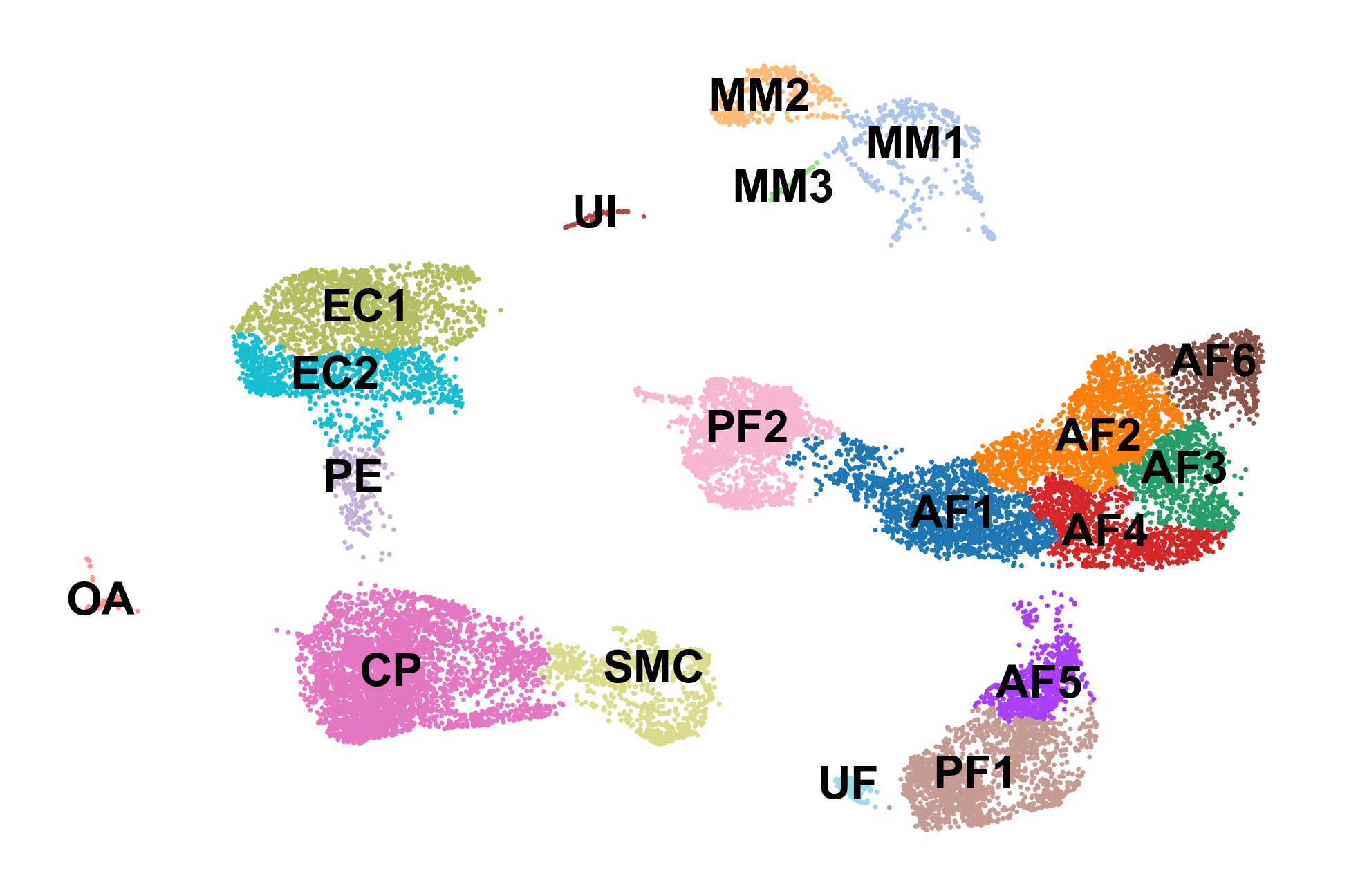
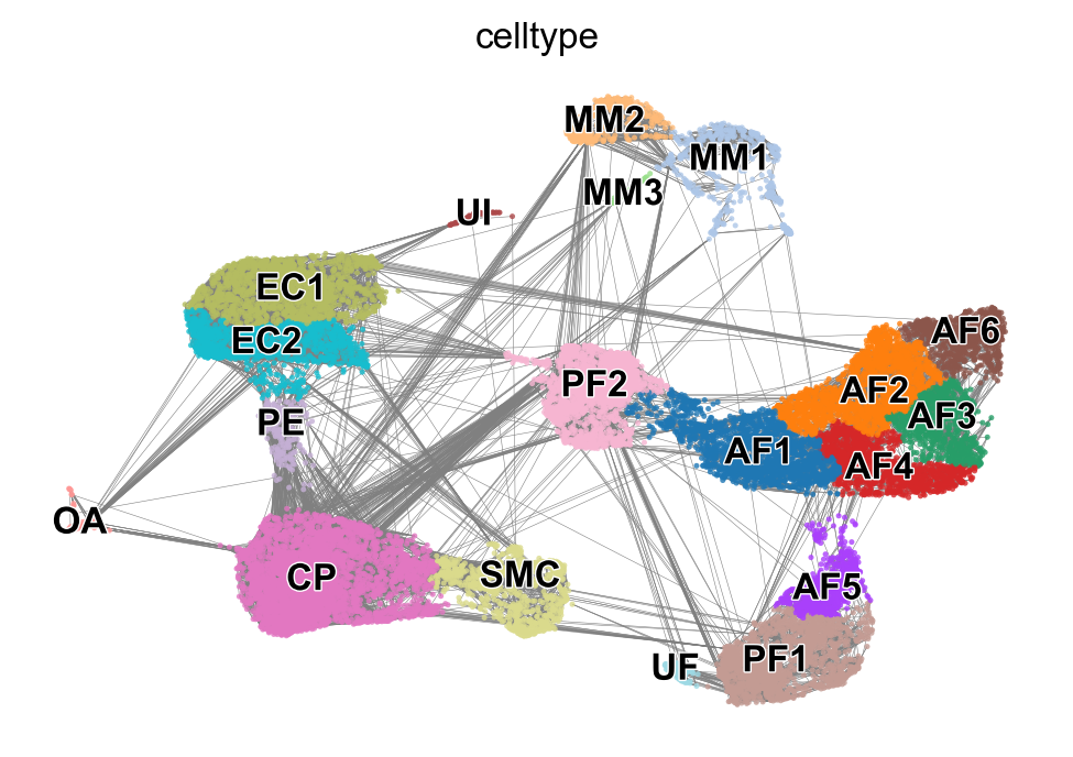
sc.pl.umap(adata, color='celltype', frameon=False, legend_loc='on data', title='', save='_celltypes.pdf')
Part 2: Computing RNA velocity using scVelo
Finally we can actually use scVelo to compute RNA velocity. scVelo allows the user to use the steady-state model from the original 2018 publication as well as their updated dynamical model from the 2020 publication.
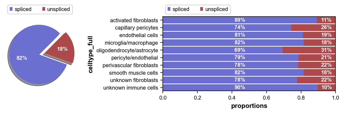
First we inspect the in each of our cell clusters. Next we perform some pre-processing, and then we compute RNA velocity using the steady-state model (stochastic option).
scv.pl.proportions(adata, groupby='celltype_full')
# pre-process
scv.pp.filter_and_normalize(adata)
scv.pp.moments(adata)
WARNING: Did not normalize X as it looks processed already. To enforce normalization, set `enforce=True`.
Normalized count data: spliced, unspliced.
WARNING: Did not modify X as it looks preprocessed already.
computing neighbors
    finished (0:00:14) --> added
    'distances' and 'connectivities', weighted adjacency matrices (adata.obsp)
computing moments based on connectivities
    finished (0:00:17) --> added
    'Ms' and 'Mu', moments of un/spliced abundances (adata.layers)
# compute velocity
scv.tl.velocity(adata, mode='stochastic')
scv.tl.velocity_graph(adata)
computing velocities
    finished (0:01:15) --> added
    'velocity', velocity vectors for each individual cell (adata.layers)
computing velocity graph
    finished (0:15:00) --> added
    'velocity_graph', sparse matrix with cosine correlations (adata.uns)
Part 2.1: Visualize velocity fields
We can get a broad visualiztion of RNA velocity across all genes and all cells by visualizing a vector field on top of the 2D dimensional reduction.
scv.pl.velocity_embedding(adata, basis='umap', frameon=False, save='embedding.pdf')
computing velocity embedding
    finished (0:00:06) --> added
    'velocity_umap', embedded velocity vectors (adata.obsm)
saving figure to file ./figures/scvelo_embedding.pdf
scv.pl.velocity_embedding_grid(adata, basis='umap', color='celltype', save='embedding_grid.pdf', title='', scale=0.25)
saving figure to file ./figures/scvelo_embedding_grid.pdf
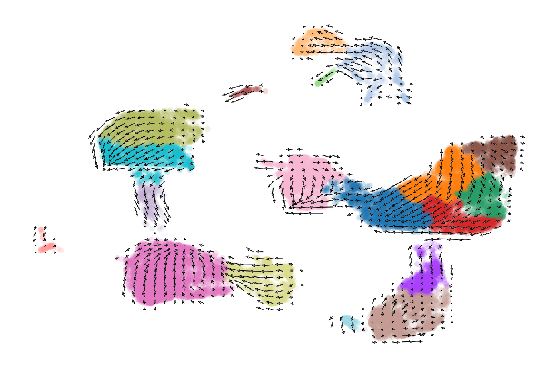
scv.pl.velocity_embedding_stream(adata, basis='umap', color=['celltype', 'condition'], save='embedding_stream.pdf', title='')
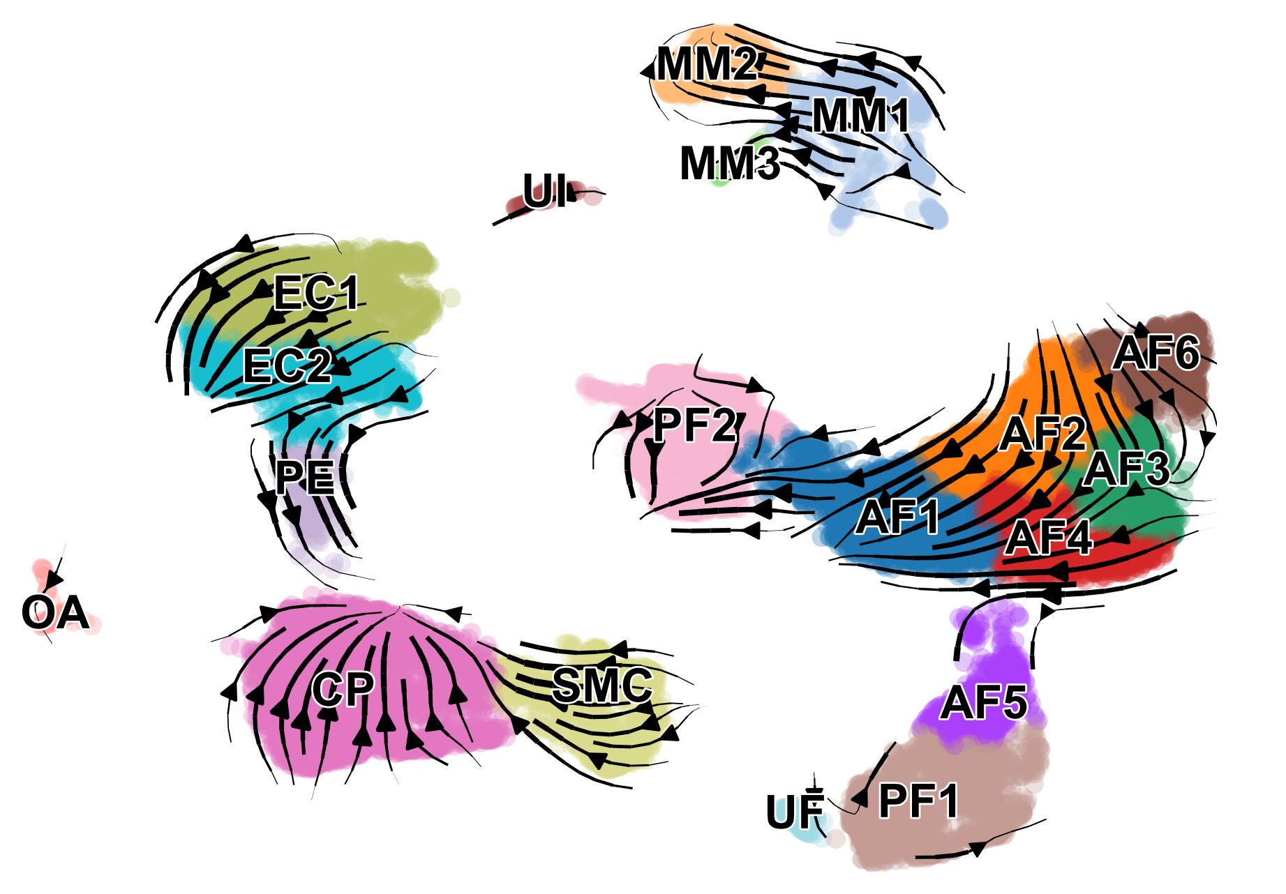
We can also visualize the dynamics of our favorite genes. Here we show the ratio of unspliced to spliced transcripts for Ptgds, as well as the velocity and expression values as feature plots.
# plot velocity of a selected gene
scv.pl.velocity(adata, var_names=['Ptgds'], color='celltype')
Part 3: Downstream analysis
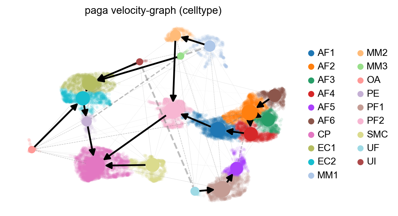
Here we show how to identify highly dynamic genes, compute a measure of coherence among neighboring cells in terms of velocity, and perform pseudotime inference. Using the pseudotime trajectory, we can identify predicted ancestors of individual cells, and we can orient the directionality of partition-based graph abstractions (PAGA).
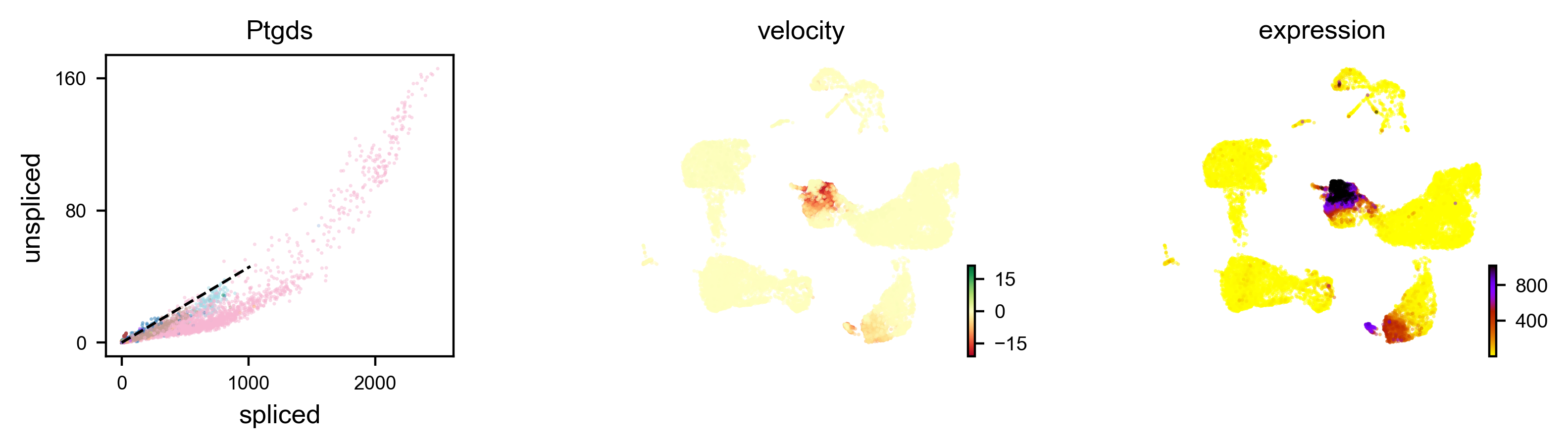
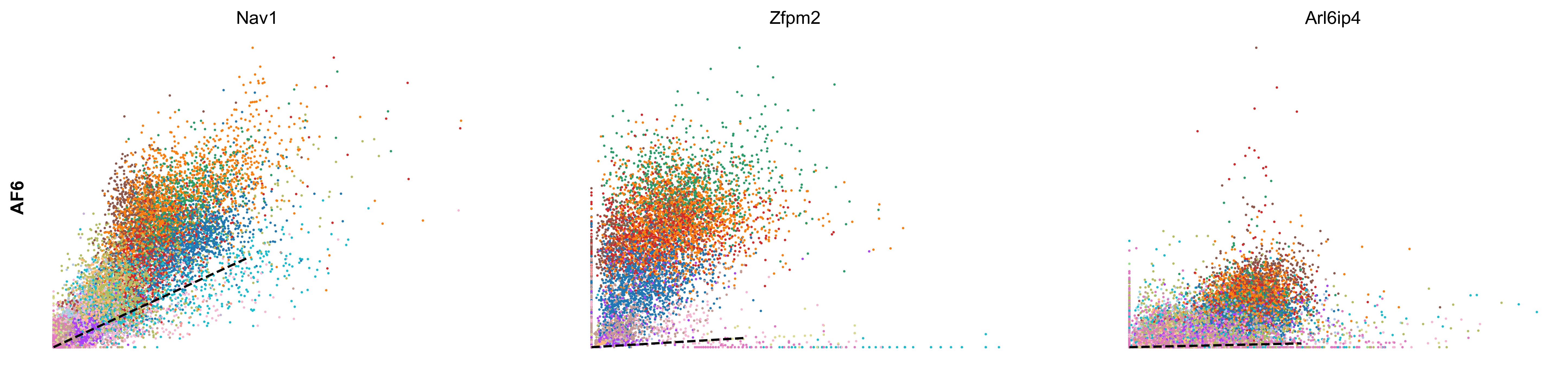
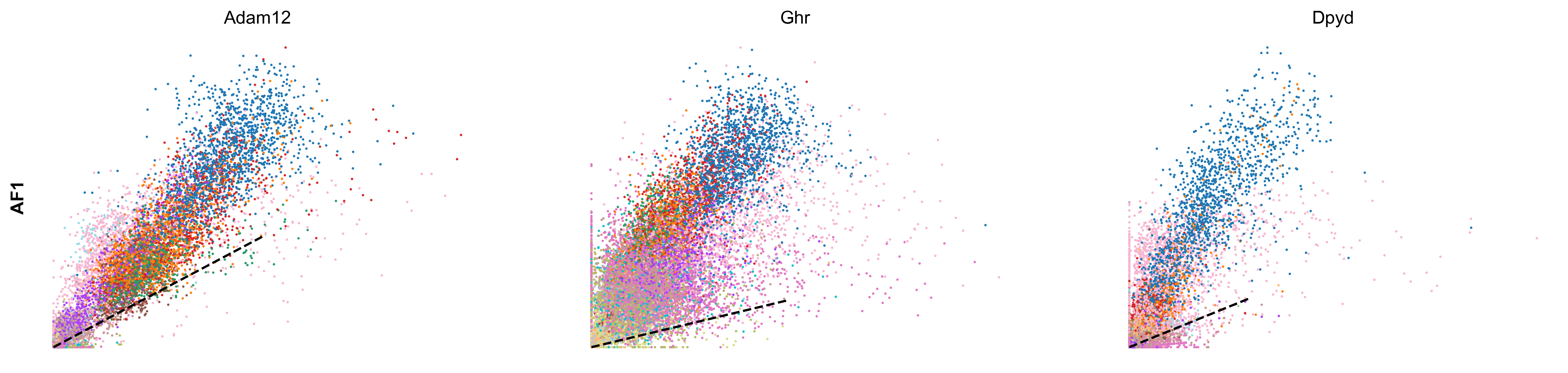
scv.tl.rank_velocity_genes(adata, groupby='celltype', min_corr=.3)

df = scv.DataFrame(adata.uns['rank_velocity_genes']['names'])
df.head()
ranking velocity genes
    finished (0:00:23) --> added
    'rank_velocity_genes', sorted scores by group ids (adata.uns)
    'spearmans_score', spearmans correlation scores (adata.var)
| AF1 | AF2 | AF3 | AF4 | AF5 | AF6 | CP | EC1 | EC2 | MM1 | MM2 | MM3 | OA | PE | PF1 | PF2 | SMC | UF | UI | |
|---|---|---|---|---|---|---|---|---|---|---|---|---|---|---|---|---|---|---|---|
| 0 | Adam12 | Zfpm2 | Zfpm2 | Ptprd | Pcdh7 | Nav1 | Sgip1 | Tmtc2 | St6galnac3 | Elmo1 | Rnf150 | Tmcc3 | Eya4 | Cobll1 | Nr3c2 | Slc1a3 | Dmd | Cadm2 | Adam10 |
| 1 | Ghr | Efemp2 | Mmp14 | Mtch1 | Rtl4 | Zfpm2 | Dlc1 | Ptprg | Plcb1 | Mir142hg | Ophn1 | Gm5086 | Soga3 | Atp13a5 | Fbxl7 | Frmpd4 | Ctnna3 | Dync1i1 | Trim37 |
| 2 | Dpyd | Tmem208 | Efna5 | Cped1 | Adamtsl1 | Arl6ip4 | Grm7 | Mecom | Cyyr1 | Rbm47 | Frmd4b | Srgap2 | Lrrc4c | Lnx2 | Slc47a2 | 4930594M22Rik | Cacnb2 | Nrp2 | Esam |
| 3 | Tcf4 | Rpl29 | Lrrc7 | Ccbe1 | Slc24a3 | Rpl29 | Rgs6 | Dnm3 | Ptprm | Gramd1b | Plekhg5 | Slc7a8 | Frmd4a | Apbb2 | Tbx15 | Acss3 | Slc38a11 | Ust | Sgms1 |
| 4 | Rbms3 | Mtch1 | Dclk1 | Cers6 | Slit3 | Efna5 | Trpc3 | Tjp1 | Lrch1 | Lyn | Runx1 | Qk | Ptprt | Egflam | Mmp16 | Kcnk2 | Sox6 | Sorbs1 | Emcn |
kwargs = dict(frameon=False, size=10, linewidth=1.5,
              add_outline='AF6, AF1')

scv.pl.scatter(adata, df['AF6'][:3], ylabel='AF6', frameon=False, color='celltype', size=10, linewidth=1.5)
scv.pl.scatter(adata, df['AF1'][:3], ylabel='AF1', frameon=False, color='celltype', size=10, linewidth=1.5)
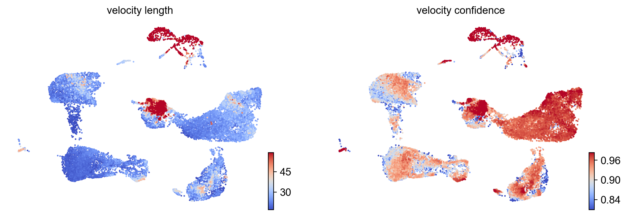
- Speed: length of the velocity vector
- Coherence: how well a velocity vector correlates to its neighbors
scv.tl.velocity_confidence(adata)
keys = 'velocity_length', 'velocity_confidence'
scv.pl.scatter(adata, c=keys, cmap='coolwarm', perc=[5, 95])
--> added 'velocity_length' (adata.obs)
--> added 'velocity_confidence' (adata.obs)
scv.pl.velocity_graph(adata, threshold=.1, color='celltype')
x, y = scv.utils.get_cell_transitions(adata, basis='umap', starting_cell=70)
ax = scv.pl.velocity_graph(adata, c='lightgrey', edge_width=.05, show=False)
ax = scv.pl.scatter(adata, x=x, y=y, s=120, c='ascending', cmap='gnuplot', ax=ax)
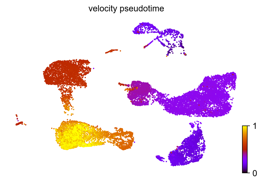
scv.tl.velocity_pseudotime(adata)
scv.pl.scatter(adata, color='velocity_pseudotime', cmap='gnuplot')
# this is needed due to a current bug - bugfix is coming soon.
adata.uns['neighbors']['distances'] = adata.obsp['distances']
adata.uns['neighbors']['connectivities'] = adata.obsp['connectivities']
scv.tl.paga(adata, groups='celltype')
df = scv.get_df(adata, 'paga/transitions_confidence', precision=2).T
#df.style.background_gradient(cmap='Blues').format('{:.2g}')
running PAGA using priors: ['velocity_pseudotime']
    finished (0:00:04) --> added
    'paga/connectivities', connectivities adjacency (adata.uns)
    'paga/connectivities_tree', connectivities subtree (adata.uns)
    'paga/transitions_confidence', velocity transitions (adata.uns)
scv.pl.paga(adata, basis='umap', size=50, alpha=.1,
            min_edge_width=2, node_size_scale=1.5)
Part 4: Analyzing a specific cell population
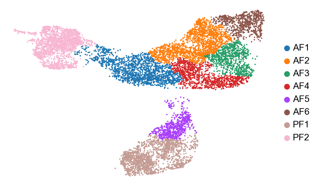
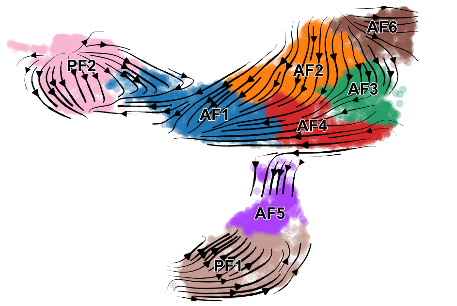
In a scRNA-seq dataset comprised of multiple cell lineages, it may be more relevant to perfom RNA velocity analysis separately for each major cell population Here we are going to perform RNA velocity analysis using only our fibroblast clusters. Additionally, we are going to use the dynamical model (from 2020 paper) whereas earlier we used the steady-state model (2018 paper).
cur_celltypes = ['AF1', 'AF2', 'AF3', 'AF4', 'AF5', 'AF6', 'PF1', 'PF2']
adata_subset = adata[adata.obs['celltype'].isin(cur_celltypes)]
sc.pl.umap(adata_subset, color=['celltype', 'condition'], frameon=False, title=['', ''])
sc.pp.neighbors(adata_subset, n_neighbors=15, use_rep='X_pca')

# pre-process
scv.pp.filter_and_normalize(adata_subset)
scv.pp.moments(adata_subset)
WARNING: Did not normalize X as it looks processed already. To enforce normalization, set `enforce=True`.
WARNING: Did not normalize spliced as it looks processed already. To enforce normalization, set `enforce=True`.
WARNING: Did not normalize unspliced as it looks processed already. To enforce normalization, set `enforce=True`.
WARNING: Did not modify X as it looks preprocessed already.
computing neighbors
    finished (0:00:03) --> added
    'distances' and 'connectivities', weighted adjacency matrices (adata.obsp)
computing moments based on connectivities
    finished (0:00:11) --> added
    'Ms' and 'Mu', moments of un/spliced abundances (adata.layers)
computing velocities
    finished (0:00:31) --> added
    'velocity', velocity vectors for each individual cell (adata.layers)
computing velocity graph
    finished (0:04:00) --> added
    'velocity_graph', sparse matrix with cosine correlations (adata.uns)
In this step, transcriptional dynamics are computed. This can take a lot longer than other steps, and may require the use of a high performance compute cluster such as HPC3 at UCI. This step took about 90 minutes to run on my laptop for ~15k cells.
scv.tl.recover_dynamics(adata_subset)
recovering dynamics
    finished (0:55:01) --> added
    'fit_pars', fitted parameters for splicing dynamics (adata.var)
scv.tl.velocity(adata_subset, mode='dynamical')
scv.tl.velocity_graph(adata_subset)
computing velocities
    finished (0:01:54) --> added
    'velocity', velocity vectors for each individual cell (adata.layers)
computing velocity graph
    finished (0:01:37) --> added
    'velocity_graph', sparse matrix with cosine correlations (adata.uns)
scv.pl.velocity_embedding_stream(adata_subset, basis='umap', color=['celltype', 'condition'], save='embedding_stream.pdf', title='')
computing velocity embedding
    finished (0:00:08) --> added
    'velocity_umap', embedded velocity vectors (adata.obsm)
figure cannot be saved as pdf, using png instead.
saving figure to file ./figures/scvelo_embedding_stream.pdf.png
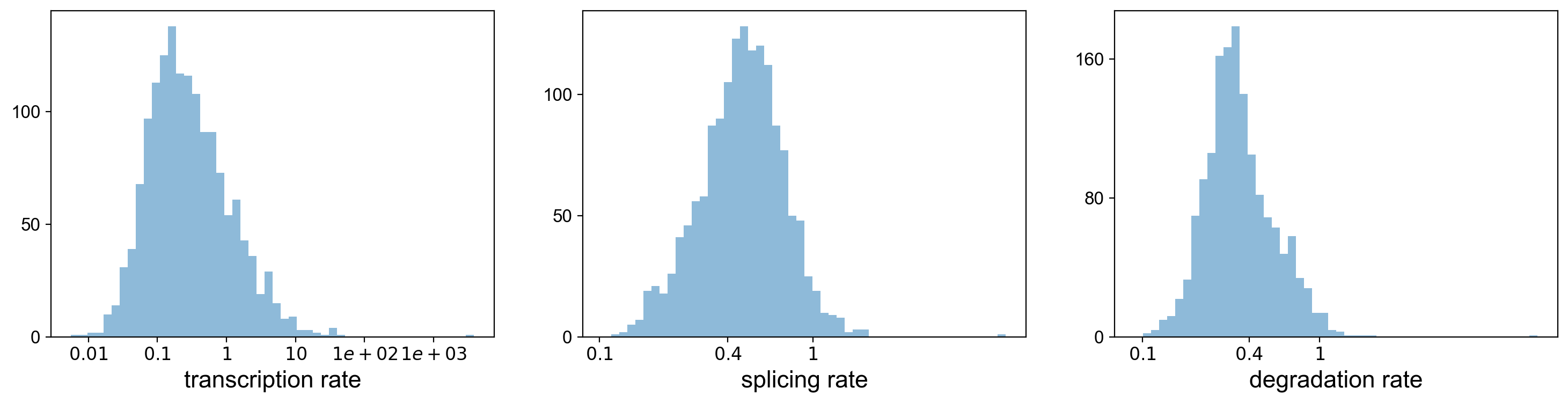
Using the dynamical model, we can actually look at the transcritpion rate, splicing rate, and degradation rate.
df = adata_subset.var
df = df[(df['fit_likelihood'] > .1) & df['velocity_genes'] == True]

kwargs = dict(xscale='log', fontsize=16)
with scv.GridSpec(ncols=3) as pl:
    pl.hist(df['fit_alpha'], xlabel='transcription rate', **kwargs)
    pl.hist(df['fit_beta'] * df['fit_scaling'], xlabel='splicing rate', xticks=[.1, .4, 1], **kwargs)
    pl.hist(df['fit_gamma'], xlabel='degradation rate', xticks=[.1, .4, 1], **kwargs)

scv.get_df(adata_subset, 'fit*', dropna=True).head()
| fit_alpha | fit_beta | fit_gamma | fit_t_ | fit_scaling | fit_std_u | fit_std_s | fit_likelihood | fit_u0 | fit_s0 | fit_pval_steady | fit_steady_u | fit_steady_s | fit_variance | fit_alignment_scaling | fit_r2 | |
|---|---|---|---|---|---|---|---|---|---|---|---|---|---|---|---|---|
| Sox17 | 0.898695 | 6.110614 | 0.484805 | 10.475681 | 0.105126 | 0.037980 | 0.421499 | 0.000018 | 0.0 | 0.0 | 0.492005 | 0.104282 | 1.640273 | 1.071412 | 1.816156 | 0.661397 |
| Pcmtd1 | 0.211919 | 0.720424 | 0.264111 | 12.202008 | 0.248776 | 0.086398 | 0.164096 | 0.232746 | 0.0 | 0.0 | 0.336931 | 0.270257 | 0.446798 | 0.749243 | 2.372727 | 0.108137 |
| Sgk3 | 0.031516 | 0.226350 | 0.197472 | 10.975034 | 1.652986 | 0.050927 | 0.038999 | 0.177014 | 0.0 | 0.0 | 0.159321 | 0.164692 | 0.126664 | 1.650863 | 3.383189 | 0.087770 |
| Prex2 | 0.209454 | 0.229509 | 0.231223 | 17.965210 | 1.644350 | 0.334659 | 0.288491 | 0.303137 | 0.0 | 0.0 | 0.430445 | 0.757209 | 0.657950 | 0.545063 | 3.398314 | 0.796931 |
| Sulf1 | 0.184210 | 0.221469 | 0.183979 | 14.692180 | 1.693538 | 0.300075 | 0.217056 | 0.243579 | 0.0 | 0.0 | 0.311456 | 0.848147 | 0.743920 | 0.904572 | 3.110569 | 0.164060 |
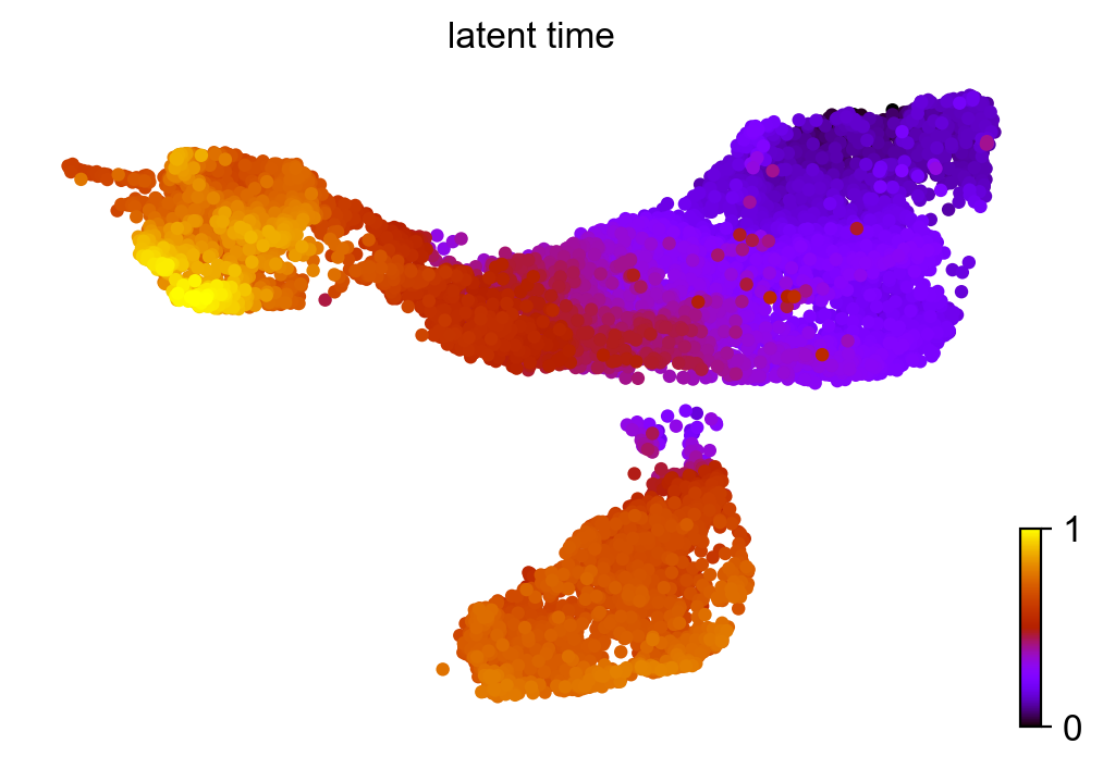
Similar to pseudotime, ‘latent time’ is computed from the dynamical model.
scv.tl.latent_time(adata_subset)
scv.pl.scatter(adata_subset, color='latent_time', color_map='gnuplot', size=80)
computing latent time using root_cells as prior
    finished (0:00:48) --> added
    'latent_time', shared time (adata.obs)
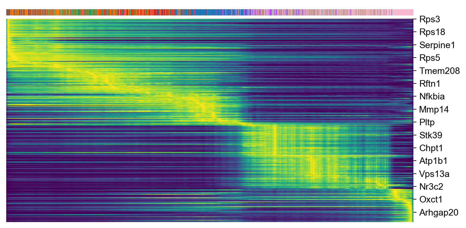
top_genes = adata_subset.var['fit_likelihood'].sort_values(ascending=False).index[:300]
scv.pl.heatmap(adata_subset, var_names=top_genes, sortby='latent_time', col_color='celltype', n_convolve=100)
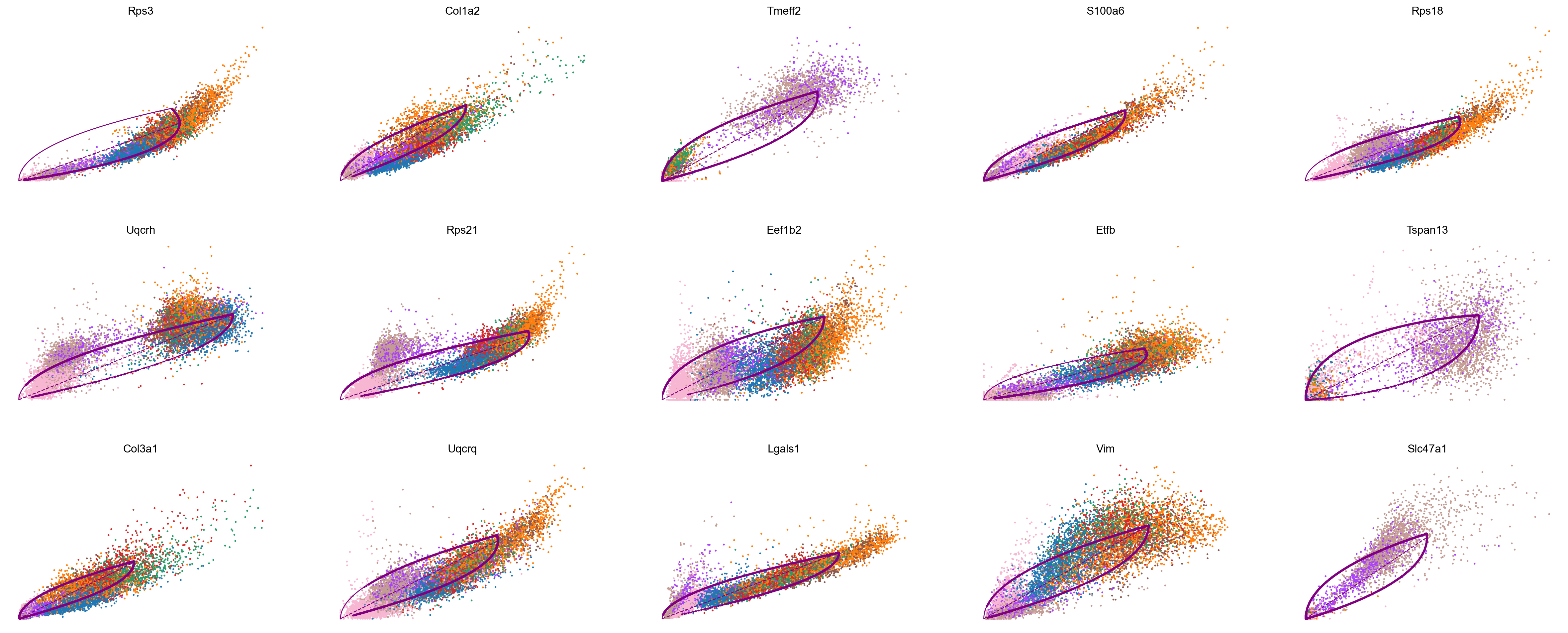
top_genes = adata_subset.var['fit_likelihood'].sort_values(ascending=False).index
scv.pl.scatter(adata_subset, color='celltype', basis=top_genes[:15], ncols=5, frameon=False)
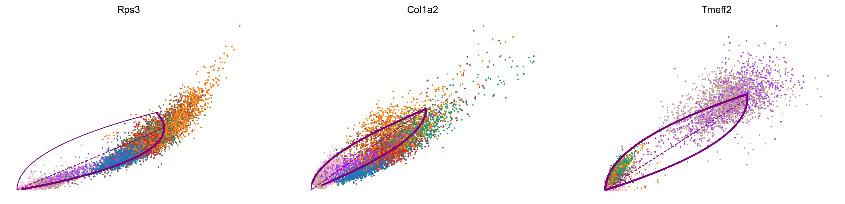
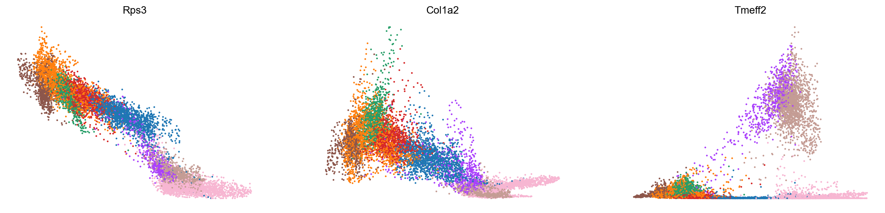
var_names = ['Rps3', 'Col1a2', 'Tmeff2']
scv.pl.scatter(adata_subset, var_names, color='celltype', frameon=False)
scv.pl.scatter(adata_subset, x='latent_time', y=var_names, color='celltype', frameon=False)
Conclusion and future directions:
In this tutorial we have learned how to perform RNA velocity analysis in scRNA-seq data using scVelo, as well as some downstream applications of RNA velocity such as identifying potential cell-state transitions and identifying genes that are being induced / repressed. RNA velocity is the starting point for a cell fate analysis program called CellRank, which can provide further insights for the analysis of cell lineages.