Single-cell RNA-seq essentials (legacy)
Note: this is a LEGACY tutorial, meaning that it was written several years ago and is using potentially outdated software.
Introduction
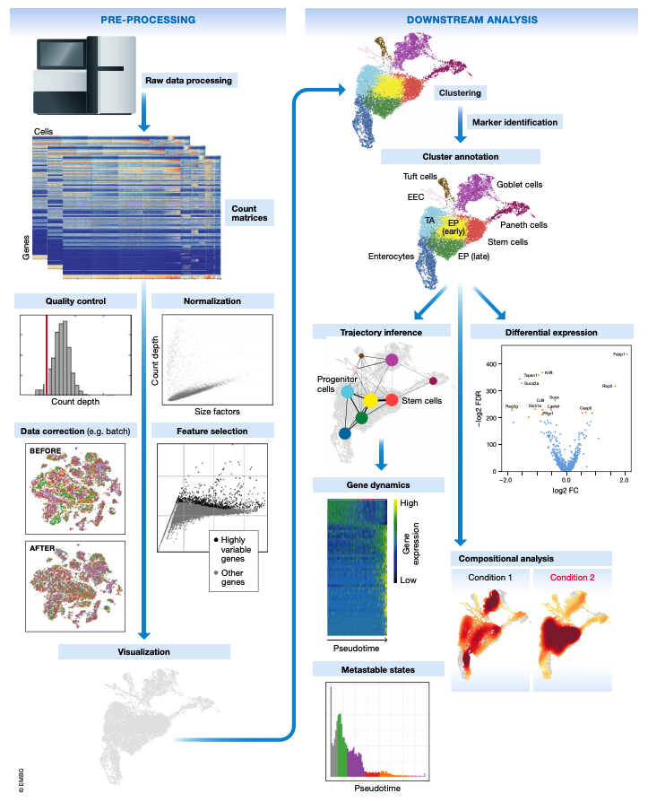
This document is the first in a series of tutorials covering the essentials of single-cell transcriptomics analysis. The following figure from Luecken & Theis illustrates many of the analysis techniques that are commonly employed in my lab and by many others for single-cell transcriptomics analysis.
The following topics are covered in this tutorial:
- Load UMI counts matrix into R/Seurat.
- Quality Control
- Normalization
- Feature selection
- Dimensionality Reduction
- Clustering
- Visualization
Seurat
The following section covers the absolute basics of single-cell analysis using the R package Seurat. Most of this tutorial is inspired by Seurat’s clustering tutorial, however we will be using a dataset from the human brain since that is much more relevant to the lab’s research.
Loading data into Seurat
In many cases, we work with single-cell data generated from the 10X Genomics platform. Single-cell analysis packages such as Seurat and Scanpy make it easy to load UMI counts matrices from the output of cellranger. The following commands create a Seurat object from the output of cellranger:
toggle code
library(Seurat)

data <- Read10X(data.dir = 'cellranger_aggr_dir/outs/filtered_feature_bc_matrix/')

seurat_obj <- CreateSeuratObject(
  counts = data,
  project = 'tutorial',
  min.cells =3,
  min.features=200
)
For this tutorial I am using a published dataset from a study of TREM2 in AD using single-cell transcriptomics in human and mouse samples (link to study). In this case a UMI counts matrix is stored separately for each sample in .mtx format, so we have to load each of these files before merging into one big Seurat object. This is a more general use case than using the Read10X function.
toggle code
library(Seurat)
library(tidyverse)
library(Matrix)
library(cowplot)
theme_set(theme_cowplot())

data_dir <- 'trem2_nmed/'
files <- dir(data_dir)
files <- files[grepl('matrix', files)]
file_stems <- str_replace_all(files, '_matrix.mtx', '')

# construct a list of seurat objects for each sample by iteratively loading each file
seurat_list <- lapply(file_stems, function(file){
  print(file)
  X <- readMM(paste0(data_dir,file,'_matrix.mtx'))

  genes <- read.csv(file=paste0(data_dir,file,'_features.tsv'), sep='\t', header=FALSE)
  barcodes <- read.csv(file=paste0(data_dir,file,'_barcodes.tsv'), sep='\t', header=FALSE)

  colnames(X) <- barcodes$V1
  rownames(X) <- genes$V2

  cur_seurat <- CreateSeuratObject(
    counts = X,
    project = "tutorial"
  )
  cur_seurat@meta.data$SampleID <- file
  cur_seurat
})

# merge into one big seurat object
seurat_obj <- merge(x=seurat_list[[1]], y=seurat_list[2:length(seurat_list)])

# add metadata
meta <- read.csv(paste0(data_dir, 'meta.csv'))
rownames(meta) <- meta$Sample.ID.in.snRNA.seq

meta.data <- meta[seurat_obj$SampleID,]
for(m in names(meta.data)){
  seurat_obj@meta.data[[m]] <- meta.data[[m]]
}

# remove individual seurat objects to save memory
rm(seurat_list); gc();
Let’s get a sense for the size of our dataset by plotting the number of cells in each sample.
toggle code
# use table function to get the number of cells in each Sample as a dataframe
df <- as.data.frame(rev(table(seurat_obj$SampleID)))
colnames(df) <- c('SampleID', 'n_cells')

# bar plot of the number of cells in each sample
p <- ggplot(df, aes(y=n_cells, x=reorder(SampleID, -n_cells), fill=SampleID)) +
  geom_bar(stat='identity') +
  scale_y_continuous(expand = c(0,0)) +
  NoLegend() + RotatedAxis() +
  ylab(expression(italic(N)[cells])) + xlab('Sample ID') +
  ggtitle(paste('Total cells:', sum(df$n_cells))) +
  theme(
    panel.grid.minor=element_blank(),
    panel.grid.major.y=element_line(colour="lightgray", size=0.5),
  )

png('figures/basic_cells_per_sample.png', width=9, height=4, res=200, units='in')
print(p)
dev.off()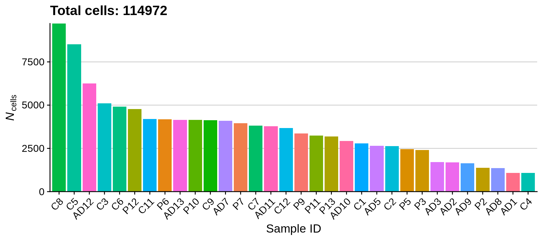
We can see that the number of cells varies quite a bit between samples, the largest number of cells one sample being 9718 and the smallest being 1075. Based on how the experiment was set up, we reasonably expect 10,000 cells as the maximum for a single sample, and a minimum of a few thousand, so overall this is not out of the ordinary. Next we will remove some outliers that do not pass our quality control criteria.
Quality Control
In this section we will remove low quality cells based on several quality control criteria, such as the percentage of reads in mitochondrial genes, the number of genes detected per cell, and the number of UMIs detected per cell. First we compute the percentage of mitochondrial reads for each cell, and then we plot the distribution of these metrics in each sample.
toggle code
# calculate the percentage of mitochondrial reads per cell
seurat_obj[["percent.mt"]] <- PercentageFeatureSet(seurat_obj, pattern = "^MT-")

# plot distributions of QC metrics, grouped by SampleID
png('figures/basic_qc.png', width=10, height=10, res=200, units='in')
VlnPlot(
  seurat_obj,
  features = c("nFeature_RNA", "nCount_RNA", "percent.mt"),
  group.by='SampleID',
  ncol = 1, pt.size=0)
dev.off()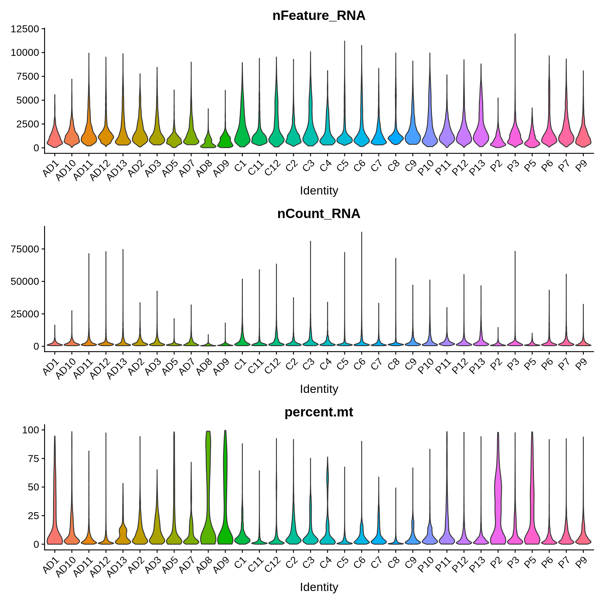
These distributions provide insight into the overall quality of these samples. For example, we observe that sample AD8 has much lower UMI and gene detection than other samples, as well as a much higher percent of mitochondrial reads. Considering the relative low quality of sample AD8, it might be indicative that something went wrong with the single-cell RNA-seq experiment itself, and that it should be removed from the analysis entirely. In this published dataset, the authors included all of the cells before quality control, so we have to apply the QC filters ourselves.
Here we apply QC filtering such that the downstream analysis only contains only very high quality cells. I want to emphasise how important this step is, as outliers can highly influence all of the downstream analysis and interpretation. Later on if something doesn’t look right, this is always a good step to revisit.
Additionally, this step serves as a great example of how often data analysis is both an art and a science. There isn’t a one-size fits all solution to properly filtering every single-cell dataset, meaning that some level of personal judgement is required.
Here I will apply the following filters:
- Remove cells with more than 15% mitochondrial reads.
- Remove cells with greater than
30,000UMIs and fewer than250UMIs.
toggle code
# apply filter
seurat_obj <- subset(seurat_obj, nCount_RNA >= 250 & nCount_RNA <= 30000 & percent.mt <= 15)

# plot the number of cells in each sample post filtering
df <- as.data.frame(rev(table(seurat_obj$SampleID)))
colnames(df) <- c('SampleID', 'n_cells')
p <- ggplot(df, aes(y=n_cells, x=reorder(SampleID, -n_cells), fill=SampleID)) +
  geom_bar(stat='identity') +
  scale_y_continuous(expand = c(0,0)) +
  NoLegend() + RotatedAxis() +
  ylab(expression(italic(N)[cells])) + xlab('Sample ID') +
  ggtitle(paste('Total cells post-filtering:', sum(df$n_cells))) +
  theme(
    panel.grid.minor=element_blank(),
    panel.grid.major.y=element_line(colour="lightgray", size=0.5),
  )
png('figures/basic_cells_per_sample_filtered.png', width=9, height=4, res=200, units='in')
print(p)
dev.off()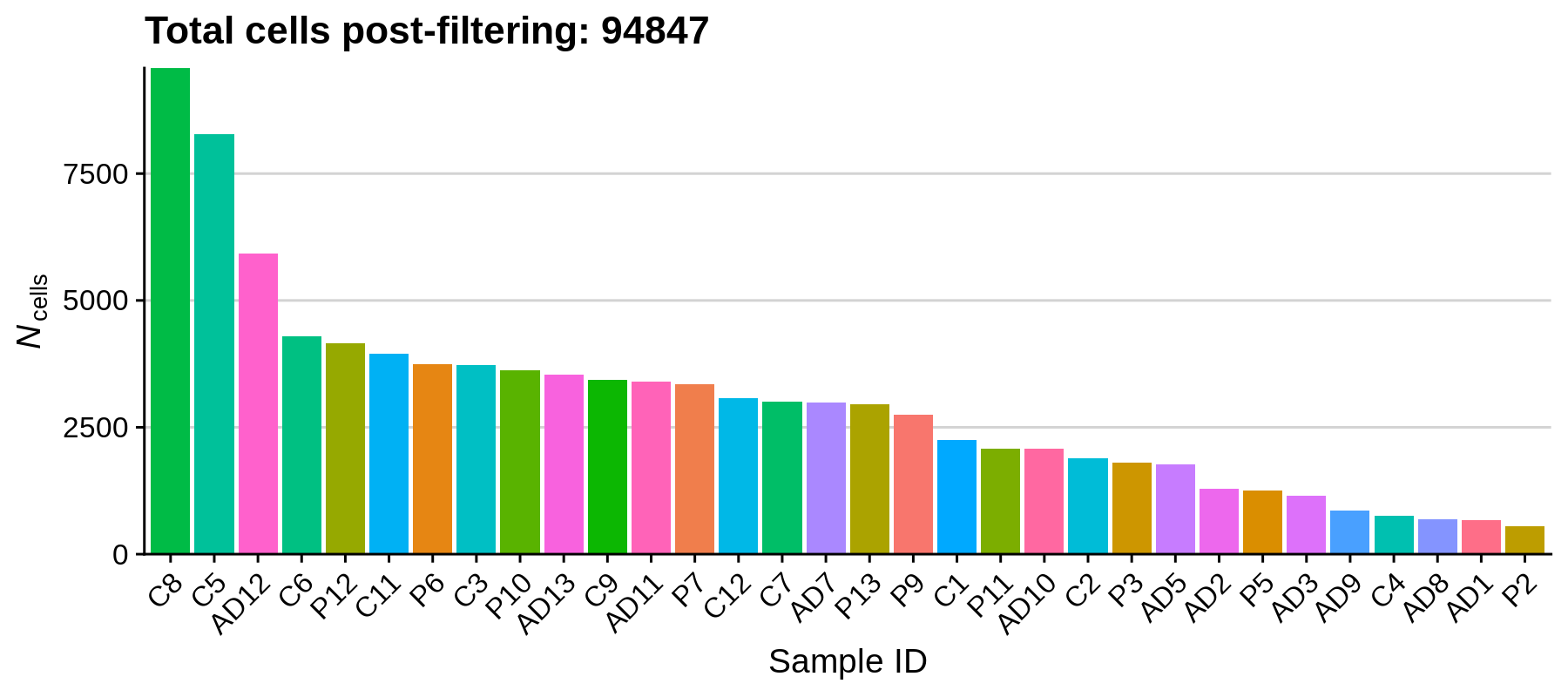
Using these filters we removed 20,125 low-quality cells, retaining a total of 94,847 cells for downstream analysis. It looks like the paper actually has a more stringent QC cutoff, retaining a total of 66,311 nuclei.
Normalization
In this section we apply a logarithmic transformation and apply a scaling factor to the UMI counts matrix. We then scale the data to have a mean expression of 0 for each feature, and a variance of 1 (this is standard for many machine learning pre-processing pipelines).
toggle code
# log normalize data
seurat_obj <- NormalizeData(
  seurat_obj,
  normalization.method = "LogNormalize",
  scale.factor = 10000
)

# scale data:
seurat_obj <- ScaleData(seurat_obj, features = rownames(seurat_obj))
Feature Selection
In this section we identify a set of genes that are highly variable across the dataset. These genes tend to be more cell type and cell population specific, so we expect that they have high expression levels in some cells and low in others. We will use these genes for downstream analysis such as dimensionality reduction and clustering. Much like the previous QC step, the number of features to select is highly subject to each dataset.
toggle code
seurat_obj <- FindVariableFeatures(
  seurat_obj,
  selection.method = "vst",
  nfeatures = 4000
)

p <- LabelPoints(
  VariableFeaturePlot(seurat_obj),
  points = head(VariableFeatures(seurat_obj),10),
  repel = TRUE
) + theme(legend.position="bottom")

png('figures/basic_variable_features.png', width=5, height=5, res=200, units='in')
print(p)
dev.off()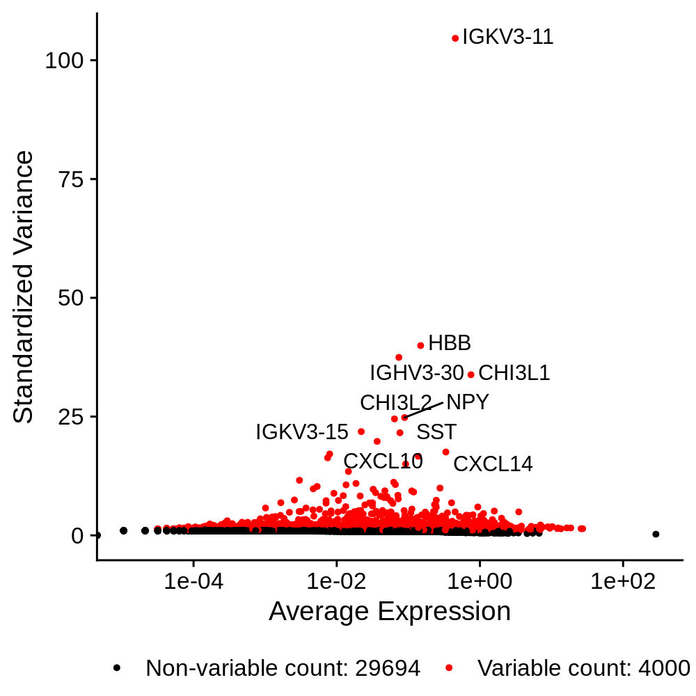
Linear Dimensionality Reduction
In this section we perform Principal Components Analysis (PCA) to construct a linear dimensionality reduction of the dataset. Specifically, we perform PCA on the scaled dataset using only the genes that we have identified as highly variable in the previous section.
toggle code
seurat_obj <- RunPCA(
  seurat_obj,
  features = VariableFeatures(object = seurat_obj),
  npcs=50
)
Now that we have constructed a PCA matrix, we can inspect the genes that contribute the most to the variance of the PCs.
toggle code
# plot the top genes contributing to the first 3 PCs
p <- VizDimLoadings(seurat_obj, dims = 1:3, reduction = "pca", ncol=3)

png('figures/basic_pca_loadings.png', width=10, height=5, res=200, units='in')
print(p)
dev.off()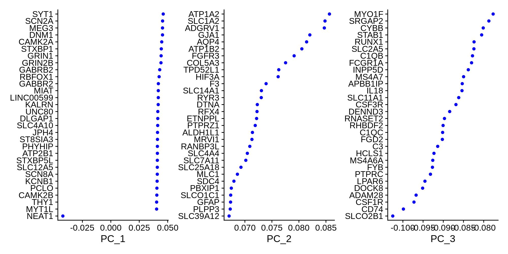
We can also visualize the data as a scatter plot showing each cell in PCA space.
toggle code
# PCA scatter plot colored by SampleID
p <- DimPlot(seurat_obj, reduction = "pca", group.by='SampleID')

png('figures/basic_pca_scatter.png', width=7, height=6, res=200, units='in')
print(p)
dev.off()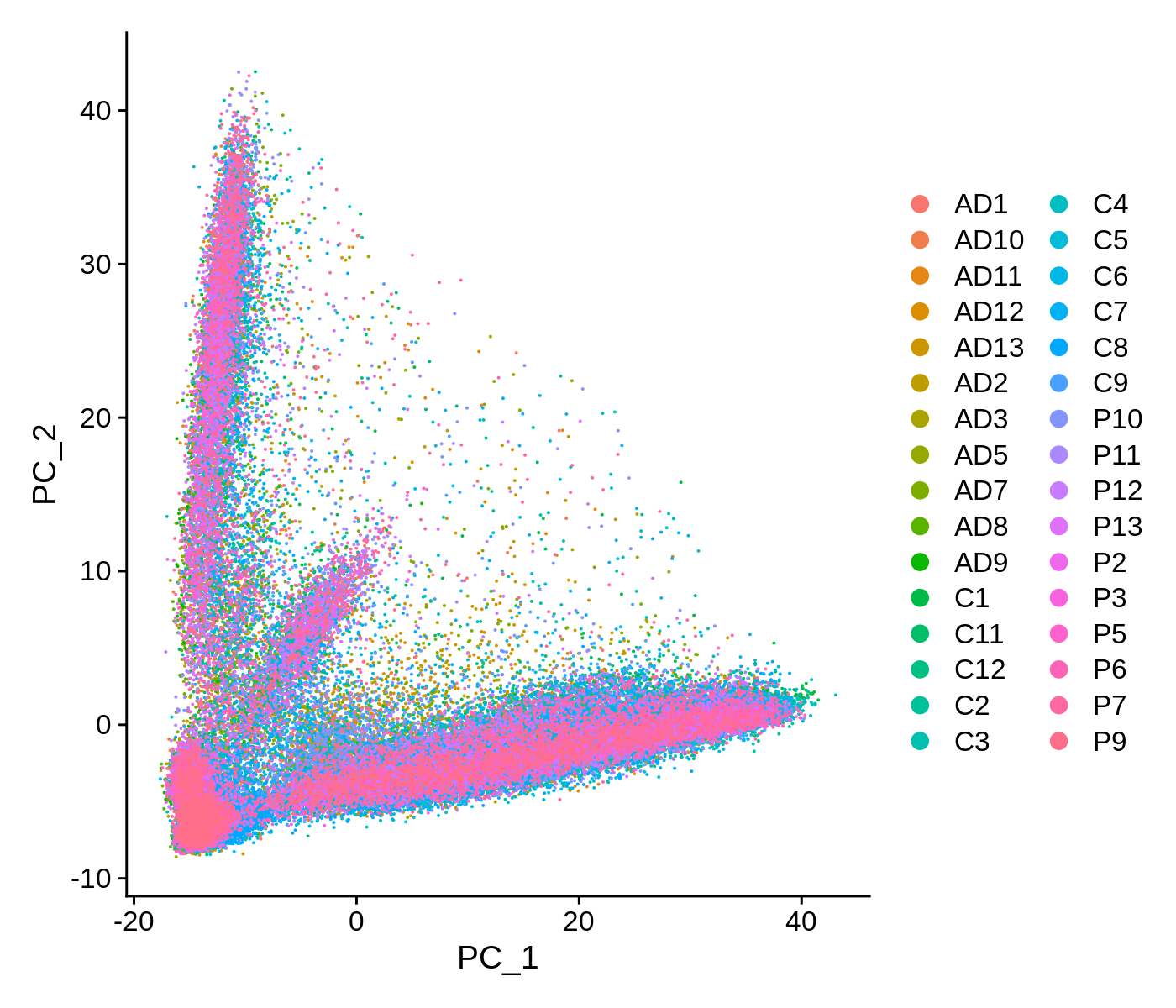
This scatter plot shows all ~90k cells in PCA space. While there are some patterns that we can observe here, the cells do not form easily distinguishable clusters. Applying a non-linear dimensionality reduction on top of this PCA transformation should yield better results for visualization and clustering purposes.
For downstream analysis, we do not necessarily need the entire PCA matrix. We can use a number of methods to identify the PCs that contain most of the complexity of the dataset, and discard the remaining PCs. First we can simply visualize heatmaps of the PCA matrix.
toggle code
# plot heatmaps for first 16 PCs
png('figures/basic_pca_heatmap.png', width=10, height=10, res=200, units='in')
DimHeatmap(seurat_obj, dims = 1:16, cells = 500, balanced = TRUE, ncol=4)
dev.off()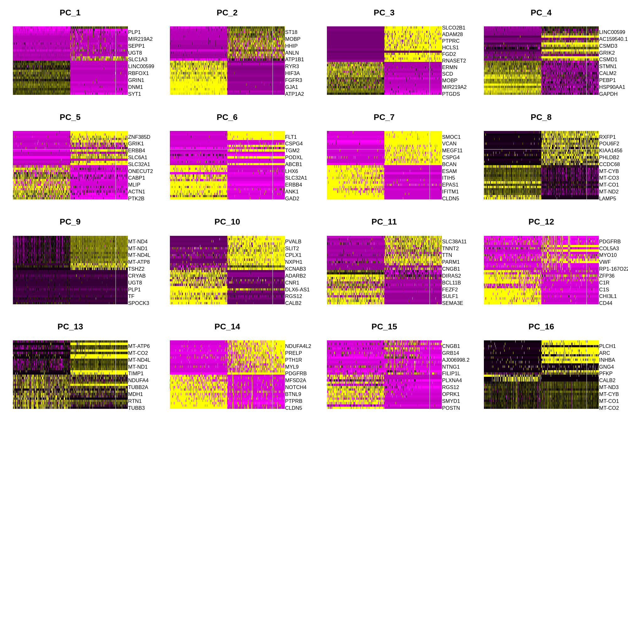
Now we inspect the standard deviation of each PC in a ‘elbow plot’.
toggle code
png('figures/basic_pca_elbow.png', width=6, height=3, res=200, units='in')
ElbowPlot(seurat_obj, ndims = 50)
dev.off()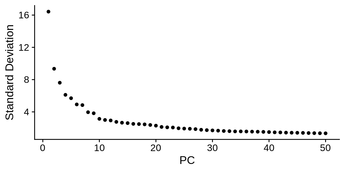
Based on these plots we can decide how many PCs to retain for downstream analysis. Once again, there is not a one size fits all solution to determining the number of PCs for a particular single-cell dataset, so you may have to try using different numbers of PCs in the downstream analysis to figure out what is appropriate. Based on the elbow plot, I am going to use a cutoff of 30 PCs for this dataset.
Clustering and non-linear dimensionality reduction
Here we cluster the cells using a graph-based approach within PCA space, and then apply non-linear dimensionality reductions for further visualization purposes. An important parameter for clustering is resolution, where a higher value of this parameter yields a larger number of clusters. For the purpose of this tutorial I am using resolution=0.5.
Following clustering we apply UMAP and t-SNE for non-linear dimensionality reductions. These algorithms are pretty complex, so you may be interested in reading up about them, however it is not necessary to know how they work in detail to use them effectively. The overall goal of these approaches are to construct low-dimensional manifolds of high-dimensional datasets such that data entries (single cells in this case) that are similar are closer together in manifold space. Of course, there are many more manifold learning approaches aside from UMAP and t-SNE, each with their own pros and cons. UMAP is a newer approach compared to t-SNE, and it generally does a better job at preserving the global structure of the data instead of just local structures. Both t-SNE and UMAP have a variety of hyperparameters that can be tweaked ad infinitum, but for this tutorial (and in most use cases) we can use the default parameters. I actually have a short blog post going over UMAP hyperparameters, and for the most part the default parameters are suitable.
toggle code
# KNN and clustering
seurat_obj <- FindNeighbors(seurat_obj, dims = 1:30)
seurat_obj <- FindClusters(seurat_obj, resolution = 0.5)

# non-linear reductions (UMAP & t-SNE)
seurat_obj <- RunUMAP(seurat_obj, dims = 1:30)
seurat_obj <- RunTSNE(seurat_obj, dims = 1:30)
Now let’s look at our clusters using our UMAP and t-SNE embeddings.
toggle code
umap_theme <- theme(
  axis.line=element_blank(),
  axis.text.x=element_blank(),
  axis.text.y=element_blank(),
  axis.ticks=element_blank(),
  axis.title.x=element_blank(),
  axis.title.y=element_blank(),
  panel.background=element_blank(),
  panel.border=element_blank(),
  panel.grid.major=element_blank(),
  panel.grid.minor=element_blank()
)

png('figures/basic_umap_clusters.png', width=7, height=7, res=200, units='in')
DimPlot(seurat_obj, reduction = "umap", group.by='seurat_clusters', label=TRUE) +
  umap_theme + NoLegend() + ggtitle('UMAP colored by seurat clusters')
dev.off()

png('figures/basic_tsne_clusters.png', width=7, height=7, res=200, units='in')
DimPlot(seurat_obj, reduction = "tsne", group.by='seurat_clusters', label=TRUE) +
 umap_theme + NoLegend() + ggtitle('t-SNE colored by seurat clusters')
dev.off()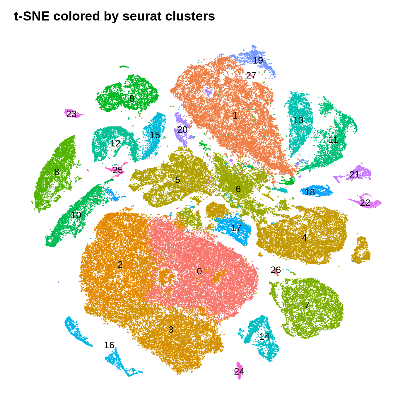
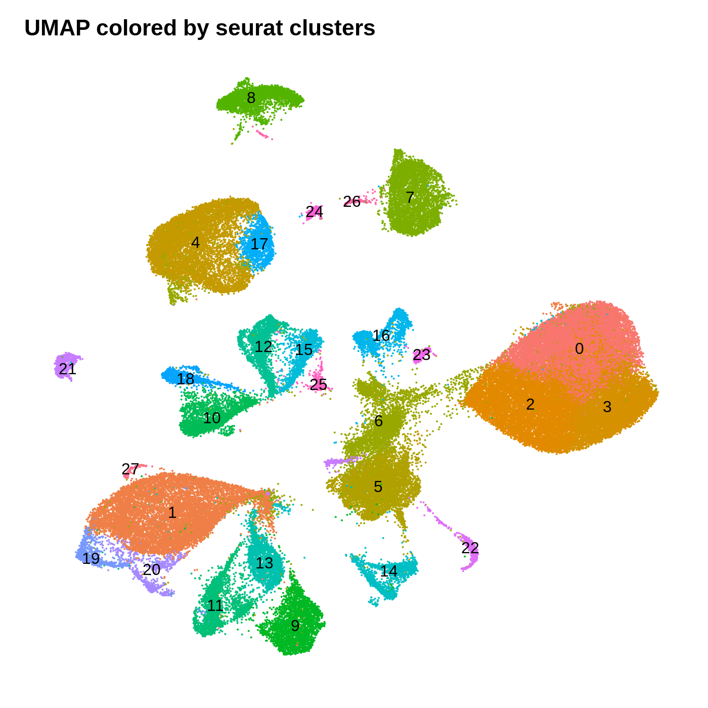
By coloring these plots by their cluster assignment, we can immediately see that both methods do a decent job at spatially separating cells by their clusters in this low-dimensional space. In general we don’t expect a perfect separation of the clusters in this space. Qualitatively, the UMAP plot separates the clusters further apart from one another, while the t-SNE plot looks more like a bunch of blobs stuck together. In this particular t-SNE I can tell that there is some funky things going on, for example part of cluster 2 is inside of cluster 0.
Cell-type annotation
Up to this point, we have only needed to use our data scientist hat to understand the different parts of the single-cell data analysis workflow. We have gone from a tangled mess of billions of nucleotide sequences to a much more organized and interpretable format consisting of a cells by genes expression matrix, a linear dimensionality reduction matrix, clusters, and a two-dimensional data manifold. So now it is our job to start interpreting the biology within this datase
We have to consider some of the known biology from published literature with regards to the samples that were sequenced for this analysis. Zhou et al. sequenced postmortem human brain samples from the dorsolateral prefrontal cortex (DLPFC). Based on what we know about the cellular composition of the DLPFC, we expect to primarily recover neurons and glia. Since we have transcriptomic data individual cells, we can actually provide much more precise annotations than neuronal/glia. You may wish to consult a neurobiology textbook to get a better idfea of what cell types you expect to find in the DLPFC and in other regions of the brain.
In this section we use a literature-curated list of known cell-type marker genes to provide a cell type annotation to each cluster. A critical assumption of this method is that all cells within the same cluster are of the same cell type. This assumption mostly holds true with a high enough resolution, but of course there are some exceptions that we have to live with. Here we visualize the gene expression of these marker genes directly on the UMAP embedding, as we visualize the distributions of these marker genes in each cluster.
toggle code
# set up list of canonical cell type markers
canonical_markers <- list(
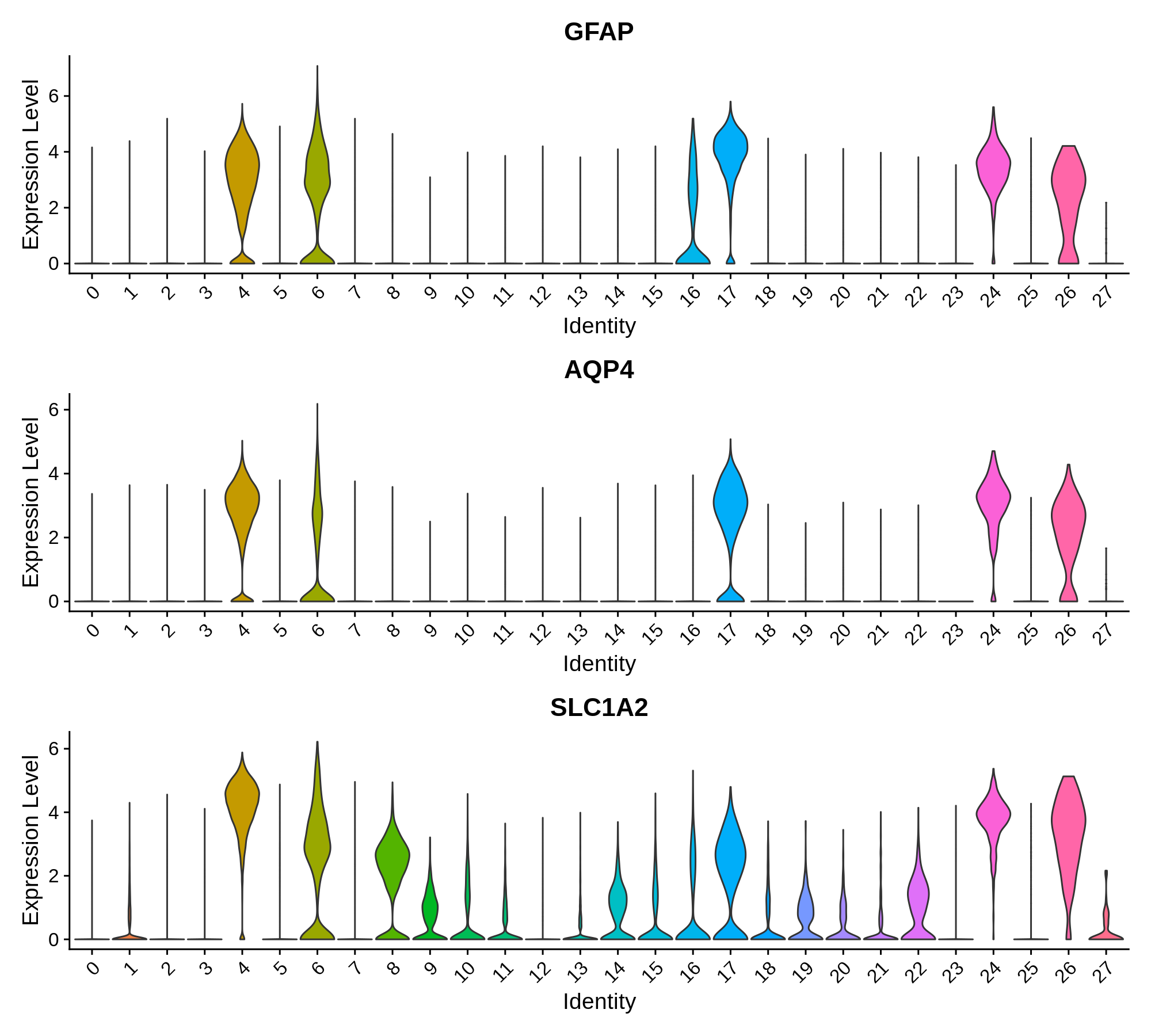
'Astrocyte' = c('GFAP', 'AQP4', 'SLC1A2'),
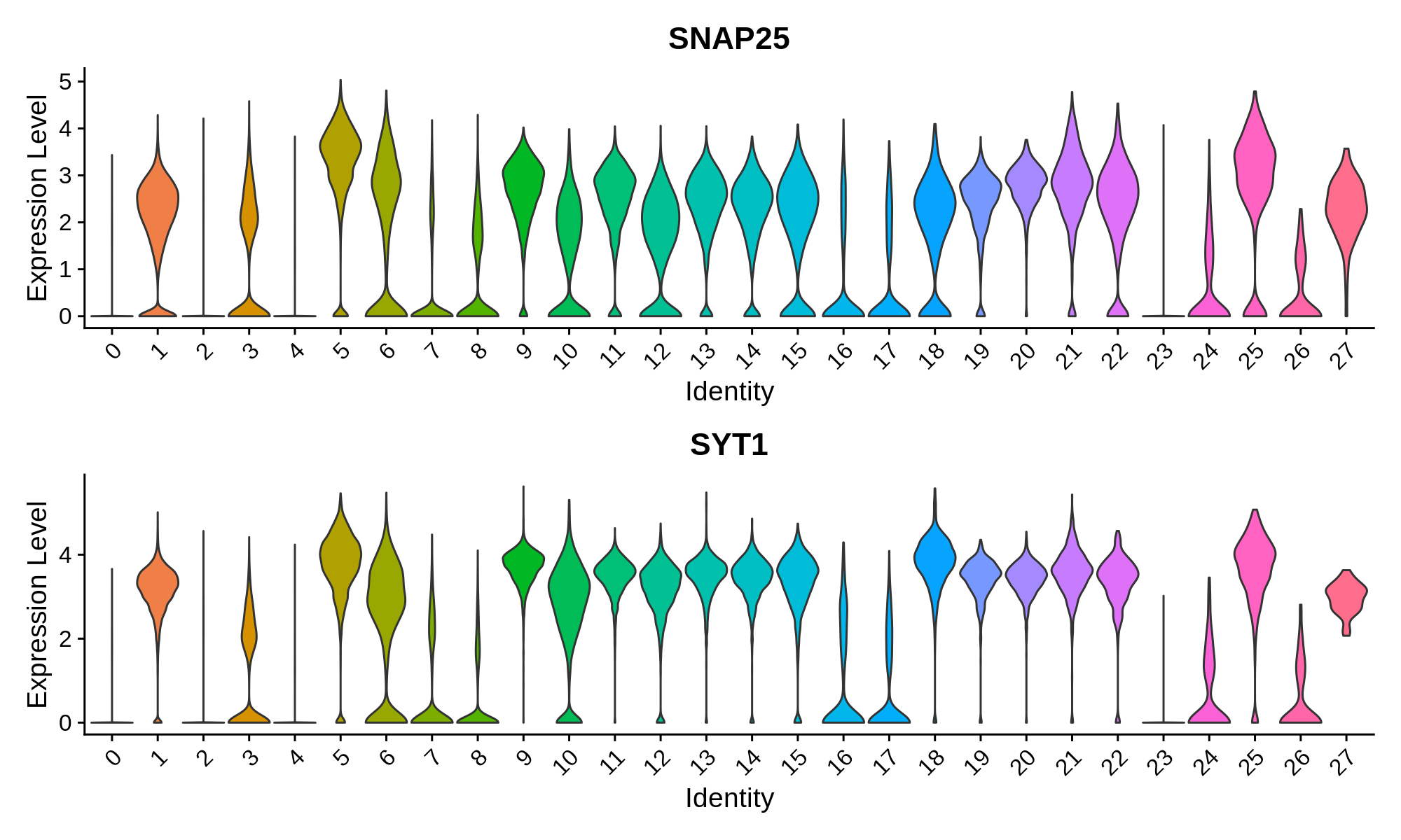
'Pan-neuronal' = c('SNAP25', 'SYT1'),
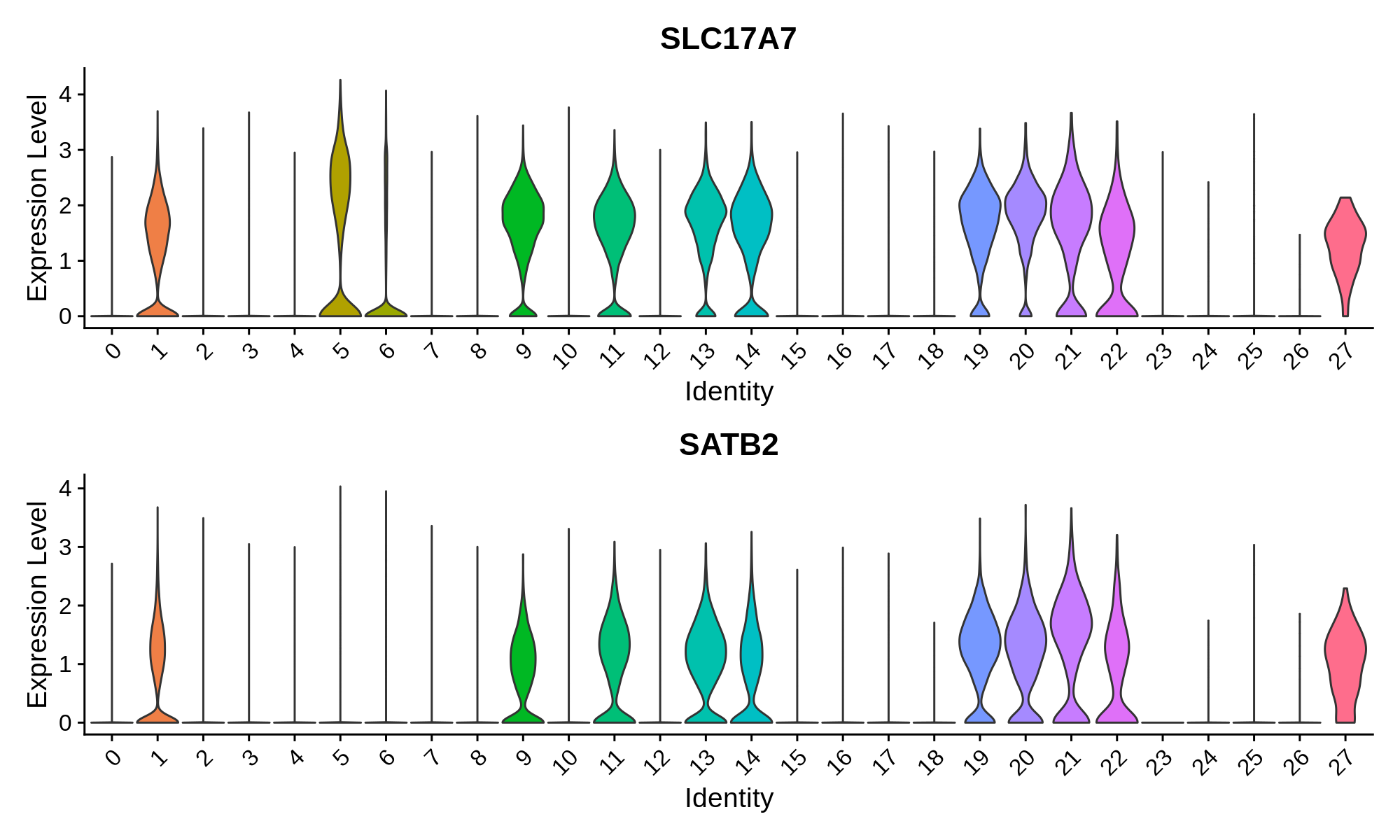
'Excitatory Neuron' = c('SLC17A7', 'SATB2'),
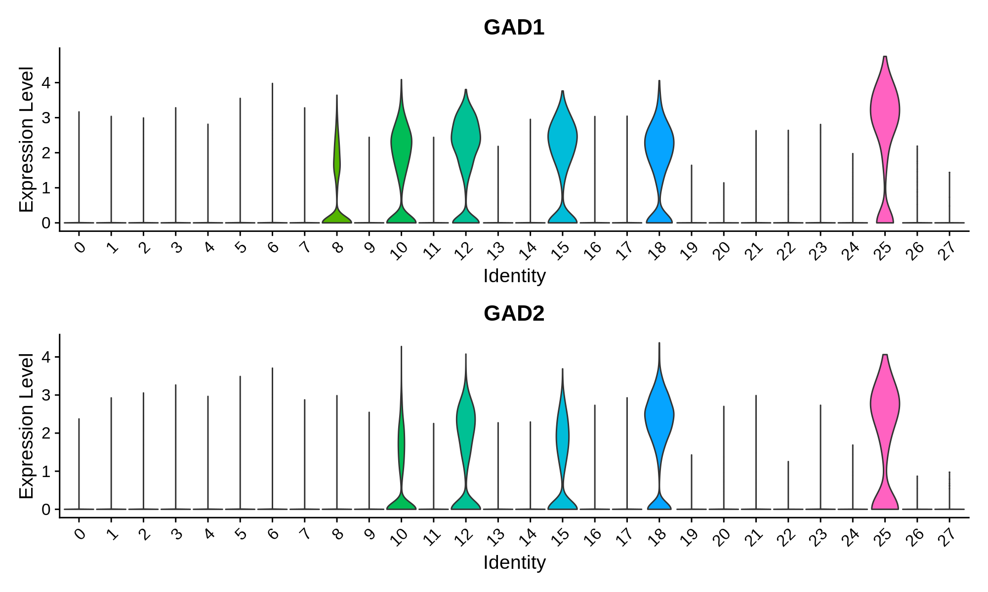
'Inhibitory Neuron' = c('GAD1', 'GAD2'),
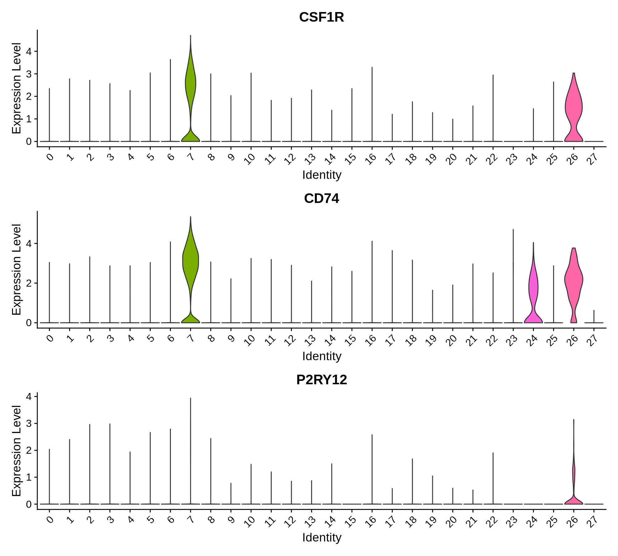
'Microglia' = c('CSF1R', 'CD74', 'P2RY12'),
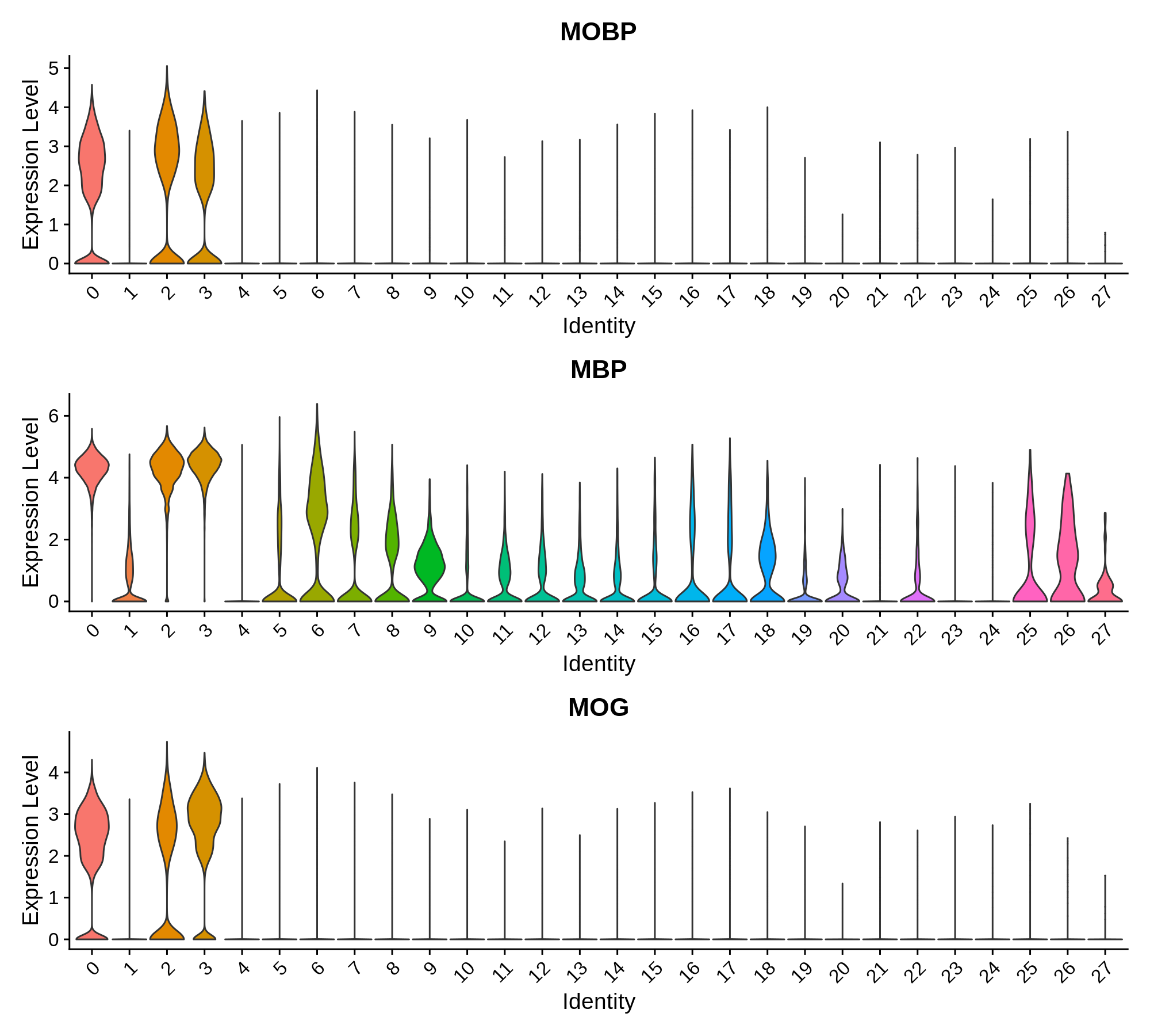
'Oligodendrocyte' = c('MOBP', 'MBP', 'MOG'),
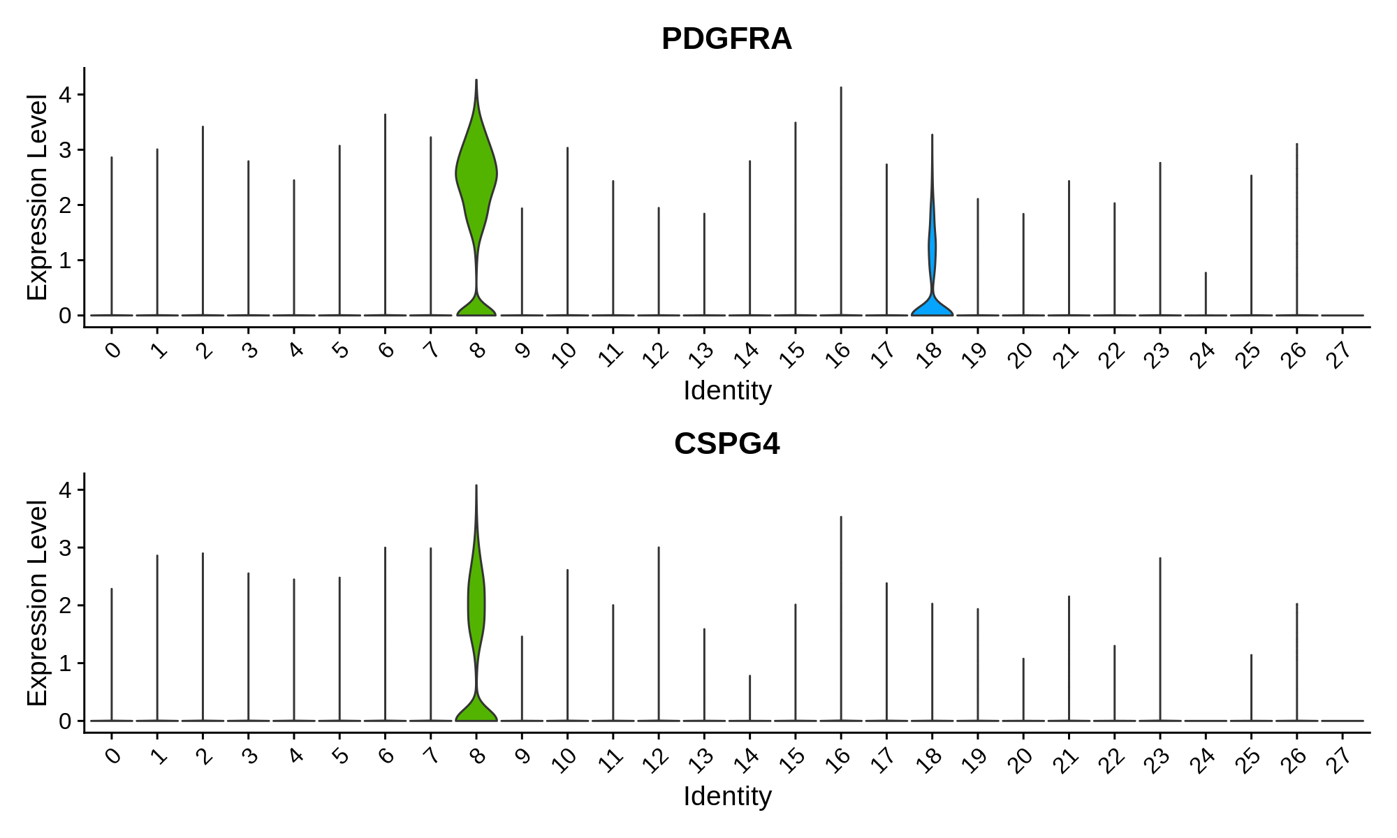
'Olig. Progenitor' = c('PDGFRA', 'CSPG4')
)
# plot heatmap:
library(viridis)
png('figures/basic_canonical_marker_heatmap.png', width=10, height=10, units='in', res=200)
DoHeatmap(seurat_obj, group.by ="seurat_clusters", features=as.character(unlist(canonical_markers)))
dev.off()
# create feature plots, cutoff expression values for the 98th and 99th percentile
plot_list <- FeaturePlot(
seurat_obj,
features=unlist(canonical_markers),
combine=FALSE, cols=viridis(256),
max.cutoff='q98'
)
# apply theme to each feature plot
for(i in 1:length(plot_list)){
plot_list[[i]] <- plot_list[[i]] + umap_theme + NoLegend()
}
png('figures/basic_canonical_marker_featurePlot.png', width=10, height=10, units='in', res=200)
CombinePlots(plot_list)
dev.off()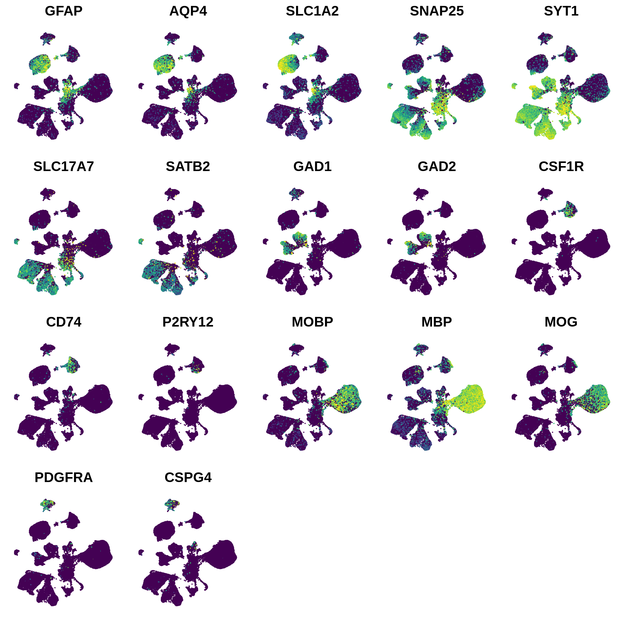
Next we can plot the distributions of these genes in each cluster.
toggle code
for(celltype in names(canonical_markers)){

  print(celltype)
  cur_features <- canonical_markers[[celltype]]

  # plot distributions for marker genes:
  p <- VlnPlot(
    seurat_obj,
    group.by='seurat_clusters',
    features=cur_features,
    pt.size = 0, ncol=1
  )
  png(paste0('figures/basic_canonical_marker_',celltype,'_vlnPlot.png'), width=10, height=3*length(cur_features), units='in', res=200)
  print(p)
  dev.off()

}
Astrocyte marker genes
Pan-neuronal marker genes
Excitatory Neuron Markers
Inhibitory Neuron Markers
Microglia Markers
Oligodendrocyte Markers
Oligodendrocyte Progenitor Markers
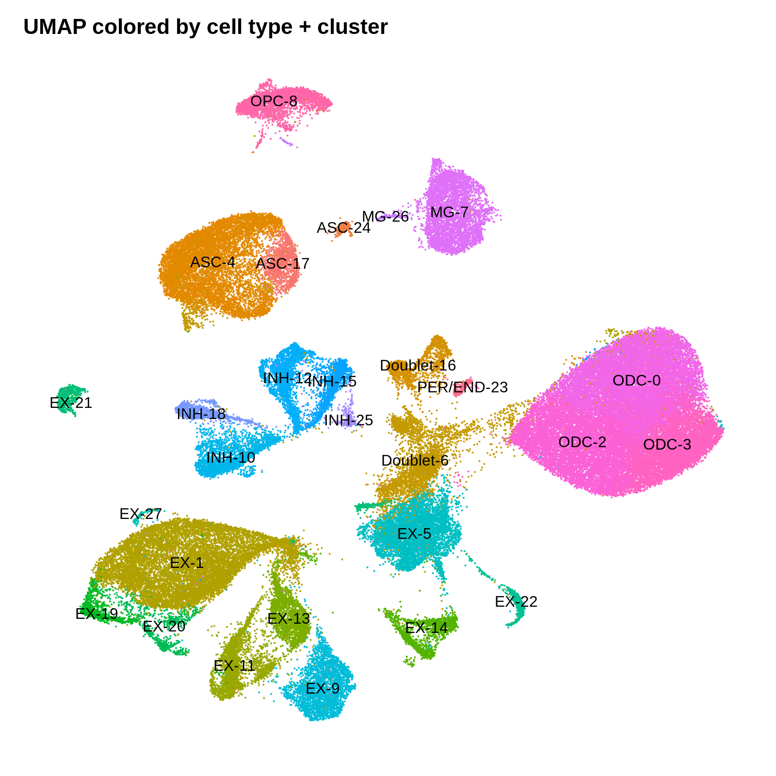
Finally, we can use all of this gene expression information to annotate each cluster with a cell type. Here we use a short hand to name each cluster. For clusters that have high expression of more than one cell type marker gene, we
toggle code
cluster_annotations <- list(
  '0' = 'ODC',
  '1' = 'EX',
  '2' = 'ODC',
  '3' = 'ODC',
  '4' = 'ASC',
  '5' = 'EX',
  '6' = 'Doublet', # ASC / Neuron / ODC markers all present,
  '7' = 'MG',
  '8' = 'OPC',
  '9' = 'EX',
  '10' = 'INH',
  '11' = 'EX',
  '12' = 'INH',
  '13' = 'EX',
  '14' = 'EX',
  '15' = 'INH',
  '16' = 'Doublet', # ASC / ODC markers present
  '17' = 'ASC',
  '18' = 'INH',
  '19' = 'EX',
  '20' = 'EX',
  '21' = 'EX',
  '22' = 'EX',
  '23' = 'PER/END',
  '24' = 'ASC',
  '25' = 'INH',
  '26' = 'MG',
  '27' = 'EX'
)

# add CellType to seurat metadata
seurat_obj$CellType <- unlist(cluster_annotations[seurat_obj$seurat_clusters])
seurat_obj$CellType_cluster <- paste0(seurat_obj$CellType, '-', seurat_obj$seurat_clusters)

png('figures/basic_umap_celltypes.png', width=8, height=7, res=200, units='in')
DimPlot(seurat_obj, reduction = "umap", group.by='CellType') +
  umap_theme + ggtitle('UMAP colored by cell type annotations')
dev.off()

png('figures/basic_umap_celltype_clusters.png', width=8, height=8, res=200, units='in')
DimPlot(seurat_obj, reduction = "umap", group.by='CellType_cluster', label=TRUE) +
  umap_theme + ggtitle('UMAP colored by cell type + cluster') + NoLegend()
dev.off()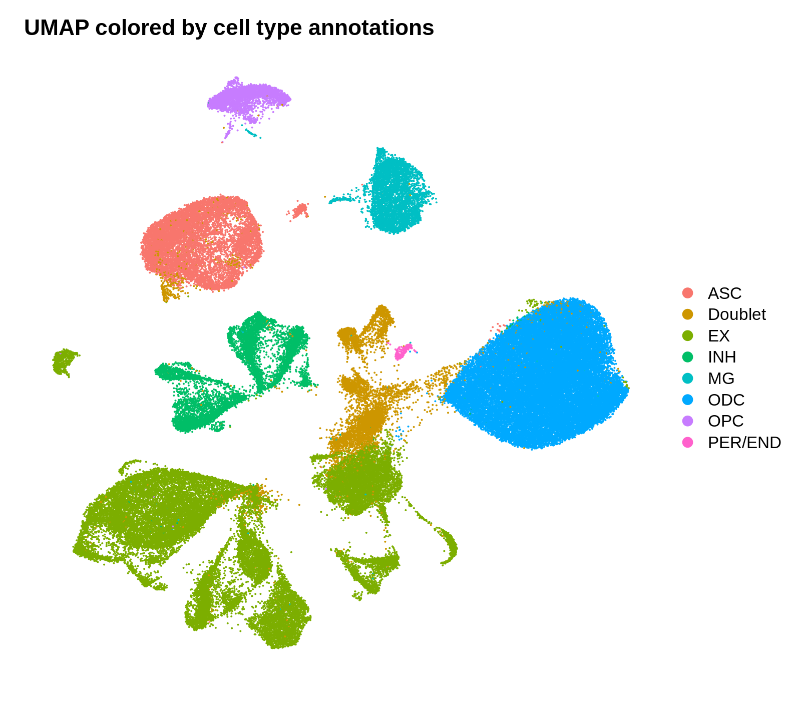
Identifying cluster biomarkers
In this section, we perform differential gene expression to find cluster marker genes. Marker genes are identified by iteratively comparing gene expression in each cluster to all other clusters. These comparisons can be done using a variety of statistical tests, such as logistic regression. Here we are using MAST, a hurdle model specifically tailored to the nuances of scRNA-seq data.
Seurat provides FindAllMarkers, a conventient function for iteratively performing these tests for each cluster. Alternatively, we could use the FindMarkers function to just compare two groups of cells. These functions have a lot of different options that effect the downstream results. Here I will use the default settings, which only look at genes that are up-regulated in the cluster of interest and show non-zero expression in at least 25% of cells in that clusters.
toggle code
cluster_markers <- FindAllMarkers(
seurat_obj,
only.pos = TRUE,
min.pct = 0.25,
logfc.threshold = 1.0,
method='MAST'
)
cluster_markers$CellType_cluster <- paste0(unlist(cluster_annotations[cluster_markers$cluster]), '-', cluster_markers$cluster)
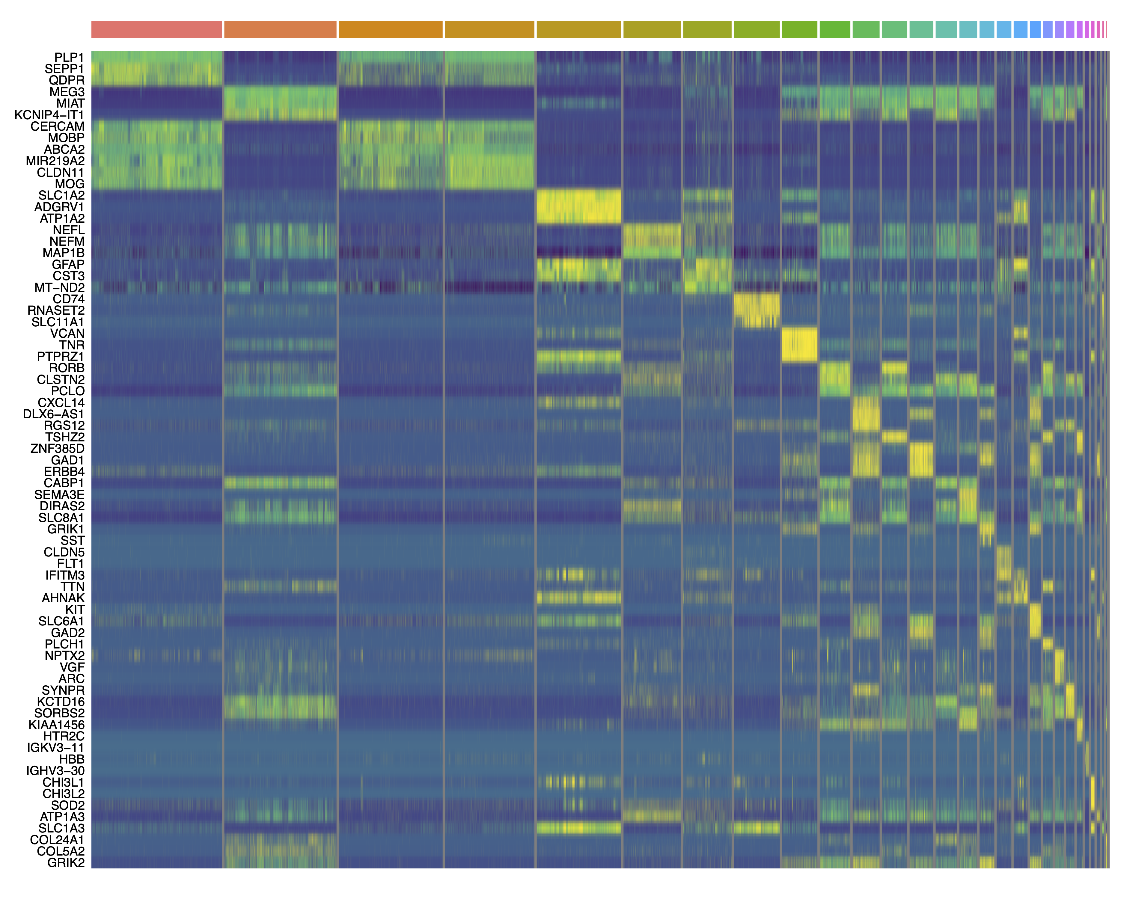
write.csv(cluster_markers, file='data/cluster_markers.csv', quote=FALSE, row.names=FALSE)Now that we have perfomed these tests, we can create some plots that summarize the results. Below we plot the number of DEGs per cluster as a bar plot, and a heatmap of the top 3 DEGs per cluster.
toggle code
# plot the number of DEGs per cluster:
df <- as.data.frame(rev(table(cluster_markers$CellType_cluster)))
colnames(df) <- c('cluster', 'n_DEGs')

# bar plot of the number of cells in each sample
p <- ggplot(df, aes(y=n_DEGs, x=reorder(cluster, -n_DEGs), fill=cluster)) +
  geom_bar(stat='identity') +
  scale_y_continuous(expand = c(0,0)) +
  NoLegend() + RotatedAxis() +
  ylab(expression(italic(N)[DEGs])) + xlab('') +
  theme(
    panel.grid.minor=element_blank(),
    panel.grid.major.y=element_line(colour="lightgray", size=0.5),
  )

png('figures/basic_DEGs_barplot.png', width=9, height=4, res=300, units='in')
print(p)
dev.off()

# plot the top 3 DEGs per cluster as a heatmap:
top_DEGs <- cluster_markers %>%
  group_by(CellType_cluster) %>%
  top_n(3, wt=avg_logFC) %>%
  .$gene

png('figures/basic_DEGs_heatmap.png', width=10, height=10, res=300, units='in')
pdf('figures/basic_DEGs_heatmap.pdf', width=15, height=12, useDingbats=FALSE)
DoHeatmap(seurat_obj, features=top_DEGs, group.by='seurat_clusters', label=FALSE) + scale_fill_gradientn(colors=viridis(256)) + NoLegend()
dev.off()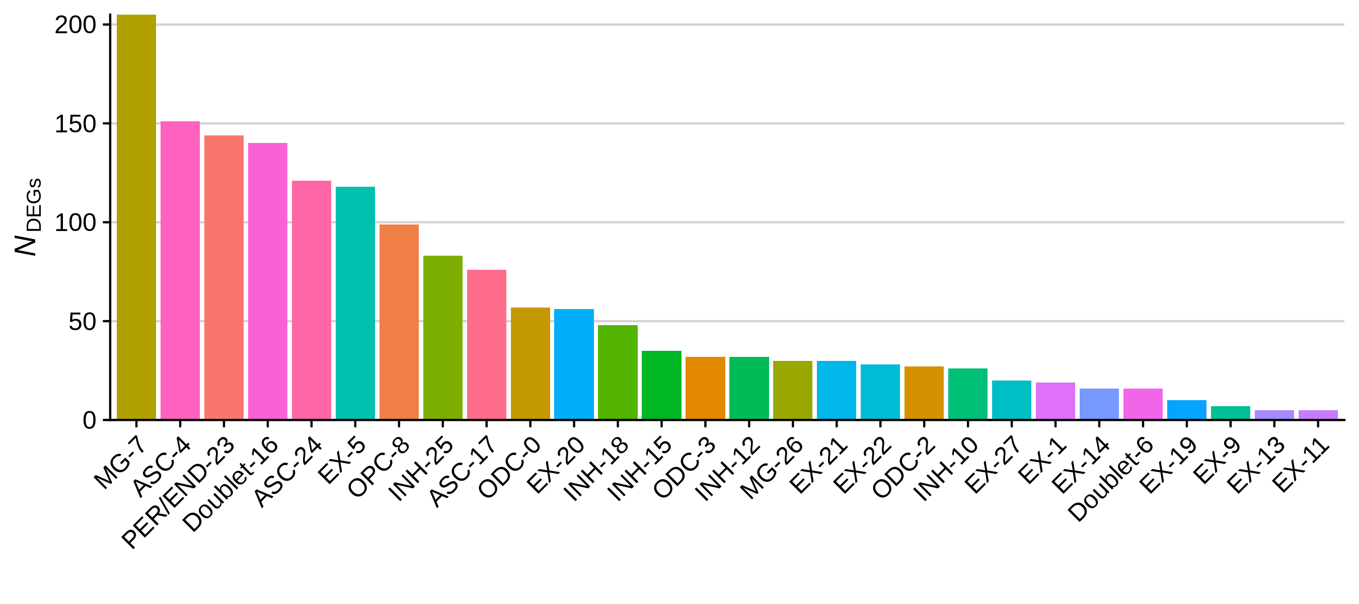
Saving and loading Seurat objects
This concludes the very basics of exploratory data analysis using Seurat. Finally, we will save the processed object so we can use it again later.
toggle code
# save seurat object
saveRDS(seurat_obj, file='data/processed_seurat_object.rds')

# load seurat object
seurat_obj <- readRDS(ile='data/processed_seurat_object.rds')