Compiled: 27-02-2024
Source: vignettes/network_visualizations.Rmd
Introduction
In this tutorial, we demonstrate several ways of visualizing the co-expression networks made with hdWGCNA. Before starting this tutorial, make sure that you have constructed the co-expression network as in the single-cell tutorial or the spatial transcriptomics. This tutorial covers three main network visualizations functions within hdWGCNA:
-
ModuleNetworkPlot, visualizes a separate network plot for each module, showing the top 25 genes by kME. -
HubGeneNetworkPlot, visualizes the network comprisng all modules with a given number of hub genes per module. -
ModuleUMAPPlot, visualizes all of the genes in the co-expression simultaneously using the UMAP dimensionality reduction algorithm.
Finally, we provide guidance for making custom network visualizations using the ggraph and tidygraph packages.
Before we visualize anything, we first need to load the data and the required libraries.
# single-cell analysis package
library(Seurat)

# plotting and data science packages
library(tidyverse)
library(cowplot)
library(patchwork)
library(magrittr)

# co-expression network analysis packages:
library(WGCNA)
library(hdWGCNA)

# network analysis & visualization package:
library(igraph)

# using the cowplot theme for ggplot
theme_set(theme_cowplot())

# set random seed for reproducibility
set.seed(12345)

# load the Zhou et al snRNA-seq dataset
seurat_obj <- readRDS('data/Zhou_control.rds')
Individual module network plots
Here we demonstrate using the ModuleNetworkPlot function to visualize the network underlying the top 25 hub genes for each module. By default, this function creates a new folder called “ModuleNetworks”, and generates a .pdf figure for each module. There are a few parameters that you can adjust for this function:
ModuleNetworkPlot(
  seurat_obj,
  outdir = 'ModuleNetworks'
)
Here we can see what one of these network plots looks like:
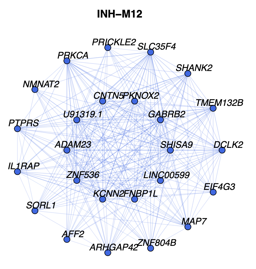
In this network, each node represents a gene, and each edge
represents the co-expression relationship between two genes in the
network. Each of these module network plots are colored based on the
color column in the hdWGCNA module assignment table
GetModules(seurat_obj). The top 10 hub genes by kME are
placed in the center of the plot, while the remaining 15 genes are
placed in the outer circle.
Optionally, certain visualization parameters can be changed in this plot:
-
edge.alpha: determines the opacity of the network edges -
vertex.size: determines the size of the nodes -
vertex.label.cex: determines the font size of the gene label
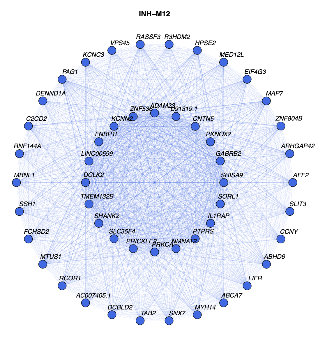
Here we run this function again with some of the options changed to show more genes:
ModuleNetworkPlot(
    seurat_obj,
    outdir='ModuleNetworks2', # new folder name
    n_inner = 20, # number of genes in inner ring
    n_outer = 30, # number of genes in outer ring
    n_conns = Inf, # show all of the connections
    plot_size=c(10,10), # larger plotting area
    vertex.label.cex=1 # font size
)
Combined hub gene network plots
Here we will make a network plot combining all of the modules
together using the HubGeneNetworkPlot function. This
function takes the top n hub genes as specified by the user,
and other randomly selected genes, and constructs a joint network using
the force-directed
graph drawing algorithm. For visual clarity, the number of edges in
the network can be downsampled using the edge_prop
parameter. In the following example, we visualize the top 3 hub genes
and 6 other genes per module.
# hubgene network
HubGeneNetworkPlot(
  seurat_obj,
  n_hubs = 3, n_other=5,
  edge_prop = 0.75,
  mods = 'all'
)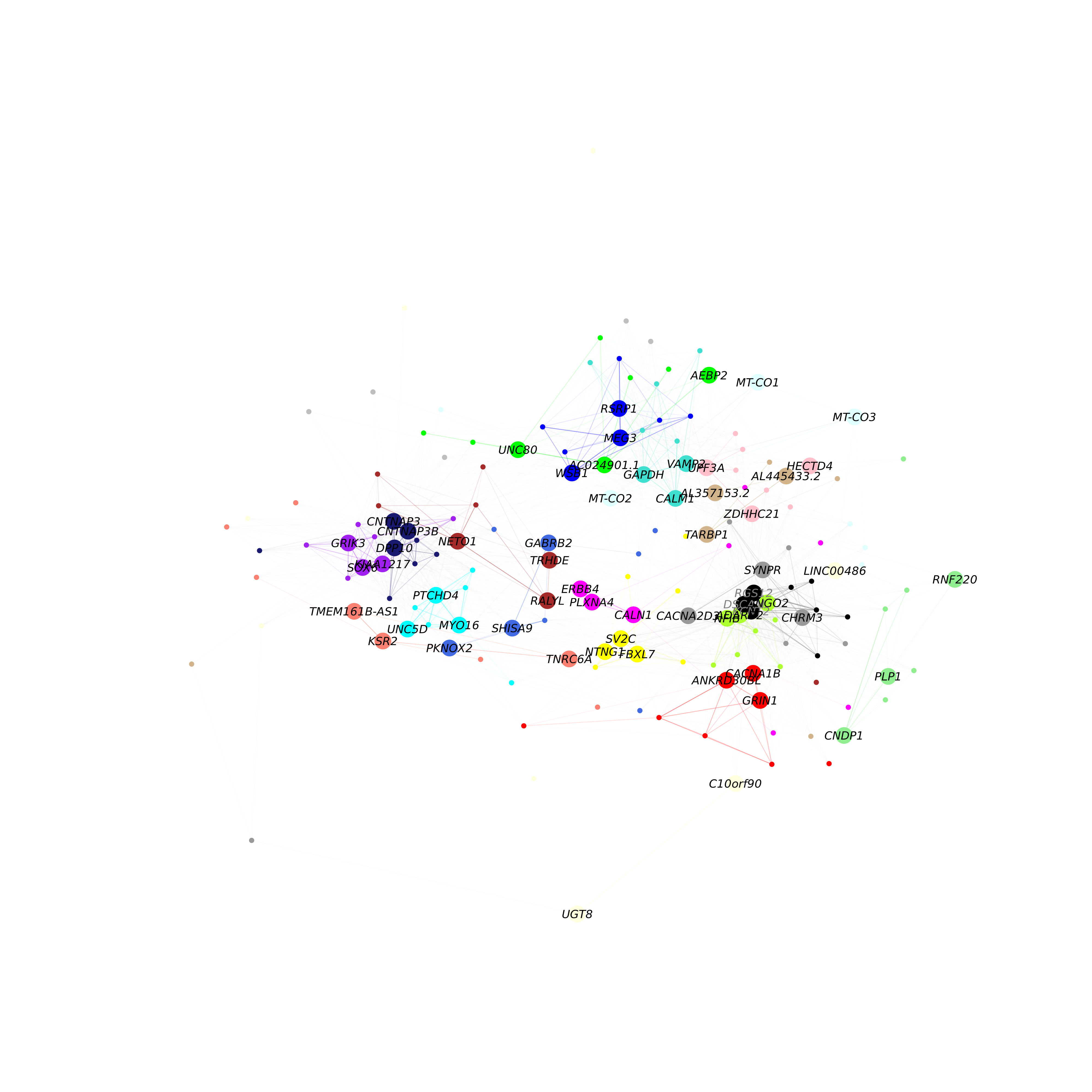
As in the previous network plot, each node represents a gene and each
edge represents a co-expression relationship. In this network, we color
intramodular edges with the module’s color, and intermodular edges gray.
The opacity of edges in this network is scaled by the strength of the
co-expression relationship. Additional network layout settings can be
passed to the layout_with_fr
function in igraph. The user can also specify
return_graph = TRUE to return the igraph object to plot
using their own custom code.
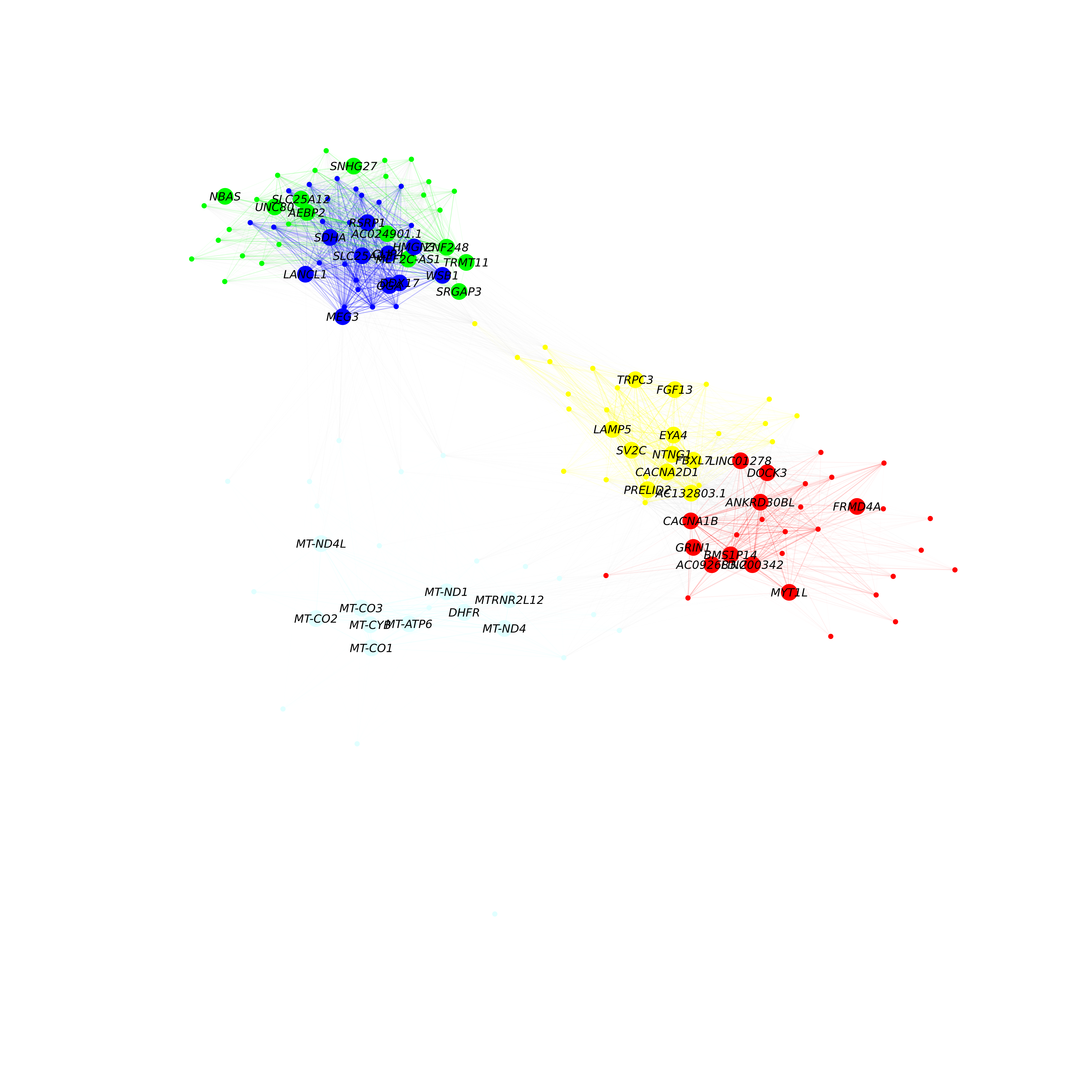
g <- HubGeneNetworkPlot(seurat_obj, return_graph=TRUE)Here we run HubGeneNetworkPlot again, this time only
selecting 5 specific modules:
# get the list of modules:
modules <- GetModules(seurat_obj)
mods <- levels(modules$module); mods <- mods[mods != 'grey']

# hubgene network
HubGeneNetworkPlot(
  seurat_obj,
  n_hubs = 10, n_other=20,
  edge_prop = 0.75,
  mods = mods[1:5] # only select 5 modules
)
Applying UMAP to co-expression networks
Previously we visualized a subset of the co-expression network with an emphasis on the hub genes. Here, we use an alternative approach to visualize all genes in the co-expression network simultaneously. UMAP is a suitable method for visualizing high-dimensional data in two dimensions, and here we apply UMAP to embed the hdWGCNA network in a low-dimensional manifold.
hdWGCNA includes the function RunModuleUMAP to run the
UMAP algorithm on the hdWGCNA topological overlap matrix
(TOM). For the UMAP analysis, we subset the columns in the TOM to
only contain the top n hub genes by kME for each module, as
specified by the user. Therefore, the organization of each gene in UMAP
space is dependent on that gene’s connectivity with the network’s hub
genes. This function leverages the UMAP implementation from the uwot R
package, so additional UMAP parameters for the uwot::umap
function such as min_dist or spread can be
included in RunModuleUMAP.
The following code demonstrates using the RunModuleUMAP
function with 10 hub genes per module:
seurat_obj <- RunModuleUMAP(
  seurat_obj,
  n_hubs = 10, # number of hub genes to include for the UMAP embedding
  n_neighbors=15, # neighbors parameter for UMAP
  min_dist=0.1 # min distance between points in UMAP space
)
Next we will make a simple visualization of the UMAP using ggplot2:
# get the hub gene UMAP table from the seurat object
umap_df <- GetModuleUMAP(seurat_obj)

# plot with ggplot
ggplot(umap_df, aes(x=UMAP1, y=UMAP2)) +
  geom_point(
   color=umap_df$color, # color each point by WGCNA module
   size=umap_df$kME*2 # size of each point based on intramodular connectivity
  ) +
  umap_theme()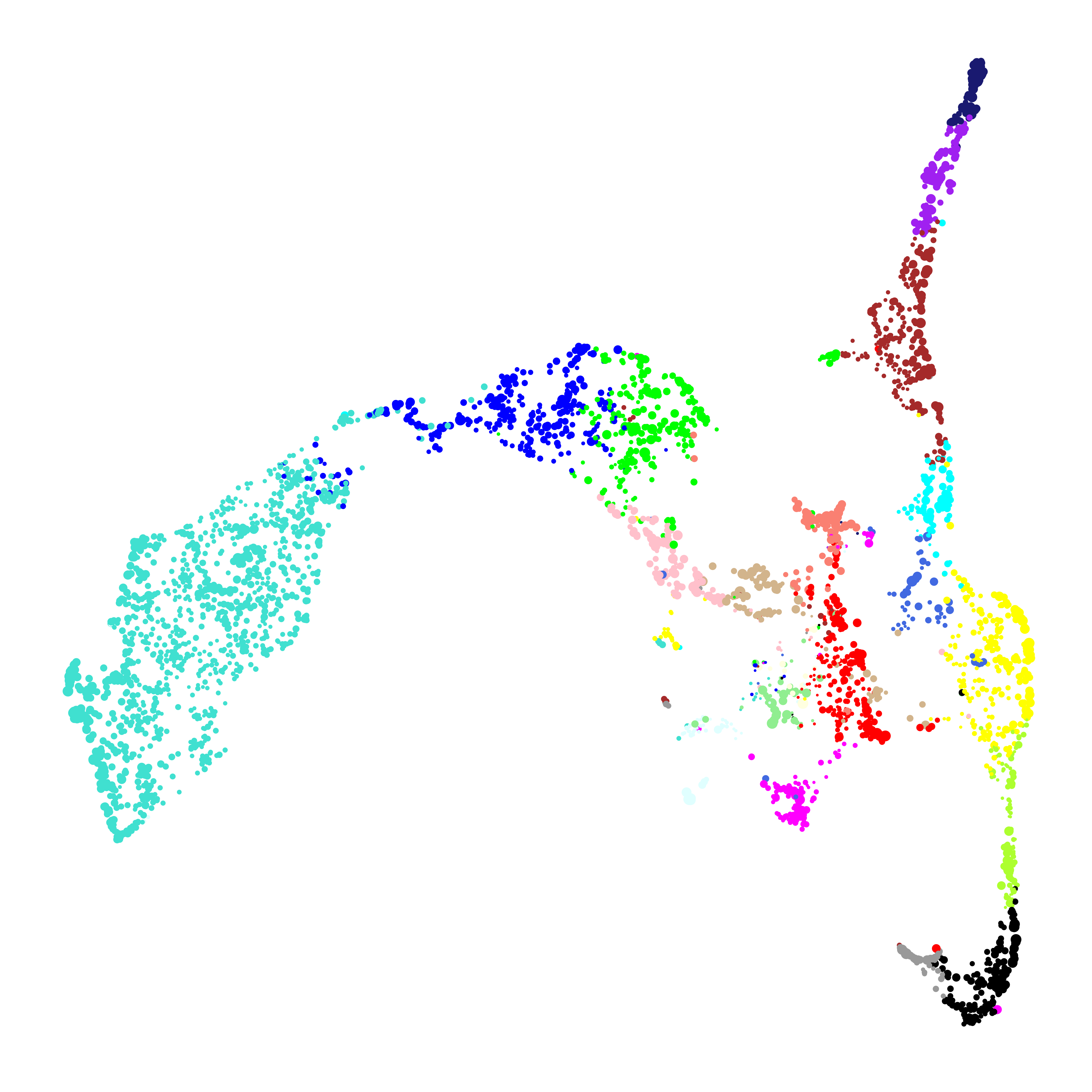
In this plot, each point represents a single gene. The size of each
dot is scaled by the gene’s kME for it’s assigned module. ggplot2 is
sufficient to visualize the genes in the module UMAP, but here we are
not visualizing the underlying network. We can use the function
ModuleUMAPPlot to plot the genes and their co-expression
relationships.
ModuleUMAPPlot(
  seurat_obj,
  edge.alpha=0.25,
  sample_edges=TRUE,
  edge_prop=0.1, # proportion of edges to sample (20% here)
  label_hubs=2 ,# how many hub genes to plot per module?
  keep_grey_edges=FALSE

)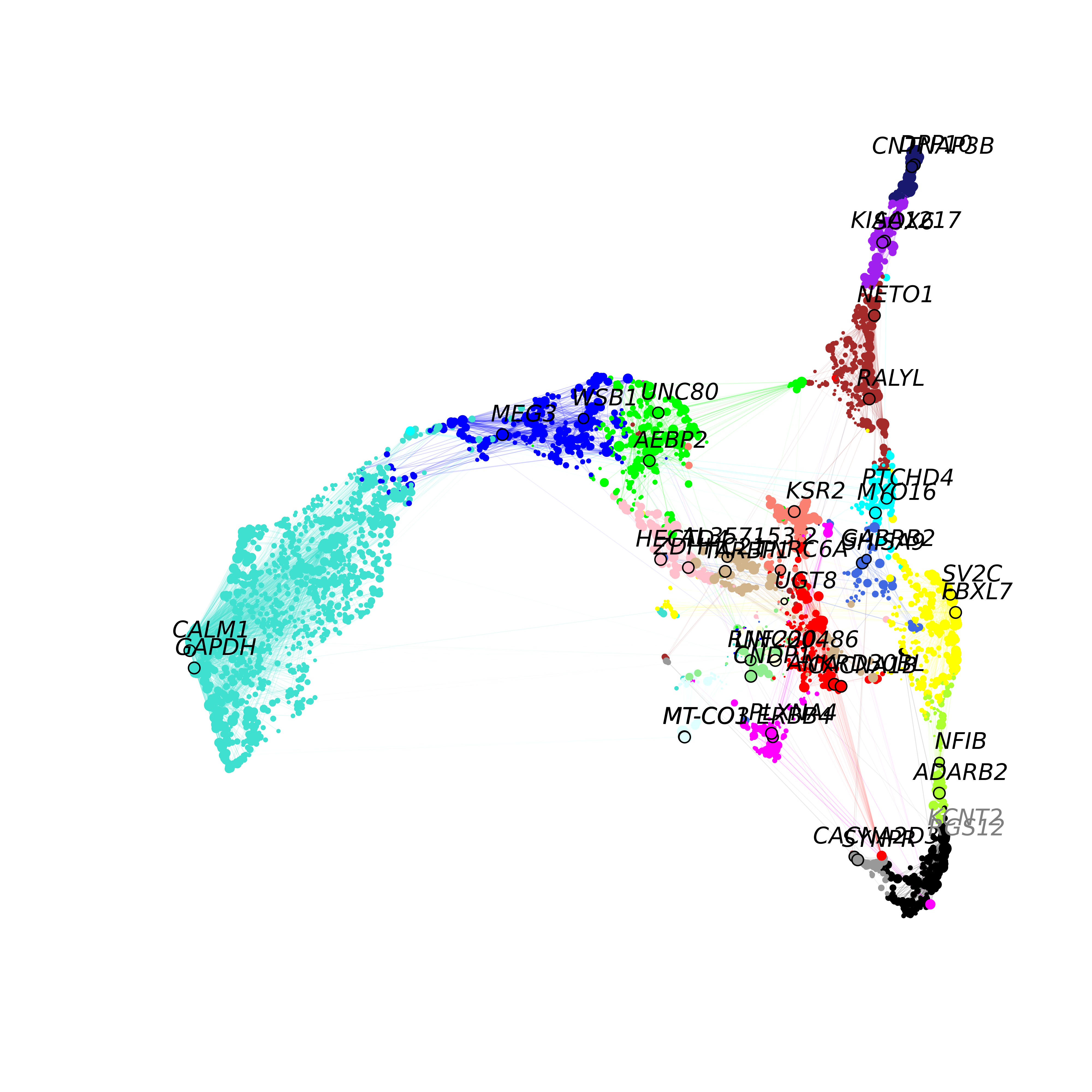
This plot is similar to the one that we made with ggplot2, but we are
showing the co-expression network, and labeling 2 hub genes in each
module. For visual clarity, the we downsample to keep only 10% of the
edges in this network using the edge_prop parameter. We
also allow the user to also return the igraph object to make their own
custom plots or to perform downstream network analysis:
g <- ModuleUMAPPlot(seurat_obj, return_graph=TRUE)Varying the number of hub genes
The number of hub genes that we include in the UMAP calculation
influences the downstream visualization. Here we use gganimate to visually
compare the UMAPs that are computed with different numbers of hub
genes.
Code
# different label weights to test
n_hubs <- c(1, 1:10*5)

# loop through different weights
df <- data.frame()
for(cur_hubs in n_hubs){

  # make a module UMAP using different label weights
  seurat_obj <- RunModuleUMAP(
    seurat_obj,
    n_hubs = cur_hubs,
    n_neighbors=15,
    exclude_grey = TRUE,
    min_dist=0.1
  )

  # add to ongoing dataframe
  cur_df <- GetModuleUMAP(seurat_obj)
  cur_df$n_hubs <- cur_hubs
  df <- rbind(df, cur_df)
}

# ggplot animation library
library(gganimate)

# plot with ggplot + gganimate
p <- ggplot(df, aes(x=UMAP1, y=UMAP2)) +
  geom_point(color=df$color, size=df$kME*2 ) +
  ggtitle("N hubs: {closest_state}") +
  transition_states(
    n_hubs,
    transition_length = 2,
    state_length = 2,
    wrap = TRUE
  ) +
  view_follow() +
  enter_fade() +
  umap_theme()

animate(p, fps=30, duration=25)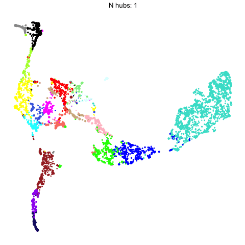
This animation shows each of the UMAPs generated using different numbers of hub genes.
Supervised UMAP
UMAP is often used as an unsupervised approach to project data points into a dimensionally-reduced spaced, but we can also supply UMAP with known labels to perform a supervised analysis. In principal, UMAP can better distinguish between different groups of data points in the embedding if the algorithm is aware of these groupings. Therefore, we allow the user to run a supervised UMAP using the RunModuleUMAP function, where each gene’s module assignment is supplied as the label.
To perform a supervised UMAP analysis, we set
supervised=TRUE, and we can optionally use the
target_weight parameter to determine how much influnce the
labels will have on the final embedding. A target_weight
closer to 0 weights based on the structure of the data while a
target_weight closer to 1 weights based on the labels. The
following code shows how to run and visualize the supervised UMAP:
# run supervised UMAP:
seurat_obj <- RunModuleUMAP(
  seurat_obj,
  n_hubs = 10,
  n_neighbors=15,
  min_dist=0.1,
  supervised=TRUE,
  target_weight=0.5
)

# get the hub gene UMAP table from the seurat object
umap_df <- GetModuleUMAP(seurat_obj)

# plot with ggplot
ggplot(umap_df, aes(x=UMAP1, y=UMAP2)) +
  geom_point(
   color=umap_df$color, # color each point by WGCNA module
   size=umap_df$kME*2 # size of each point based on intramodular connectivity
  ) +
  umap_theme()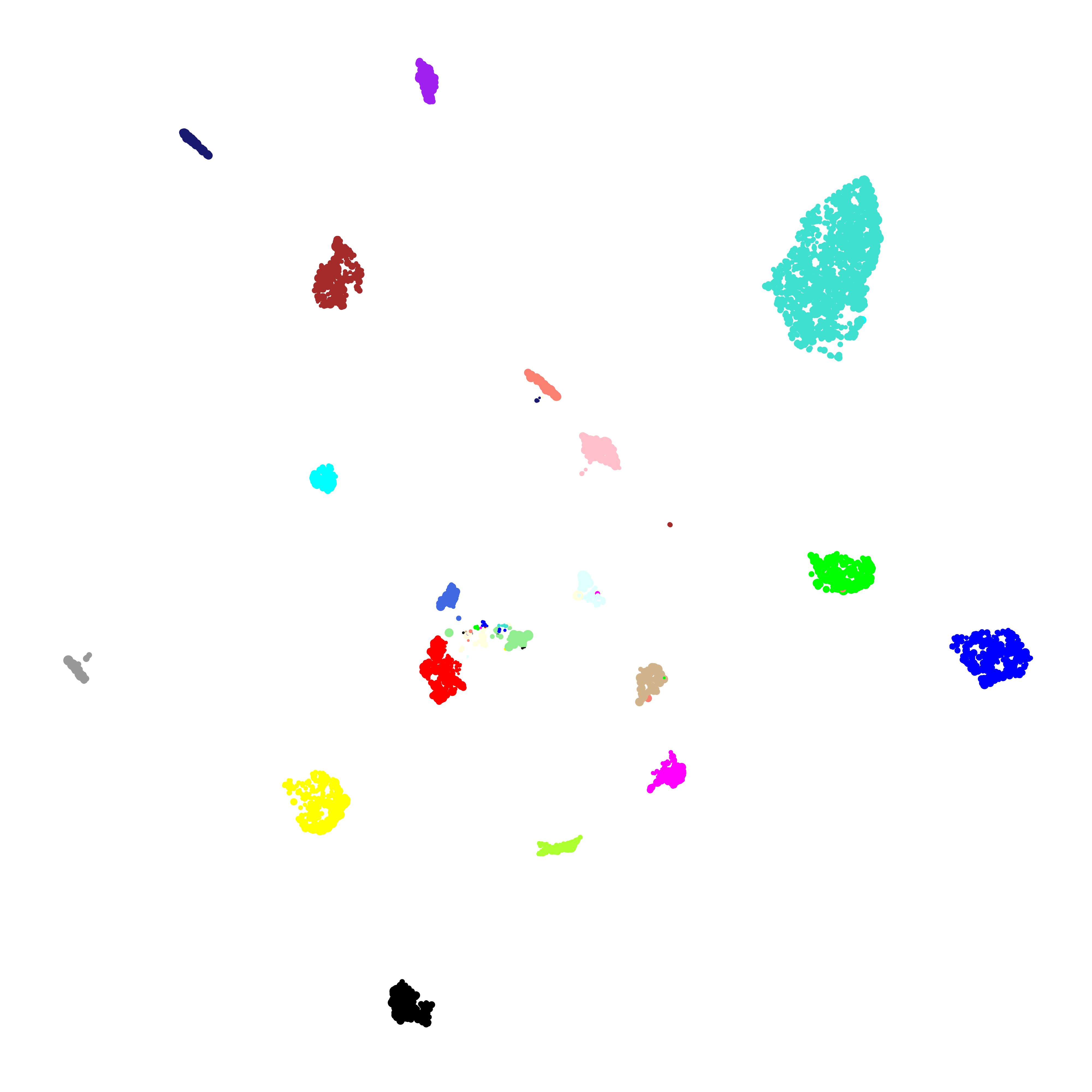
To demonstrate what the supervised UMAP looks like using different
weights for the labels, we can make a different UMAP for several values
of target_weight and compare the outputs using gganimate.
Code
# different label weights to test
weights <- 0:10/10

# loop through different weights
df <- data.frame()
for(cur_weight in weights){

  # make a module UMAP using different label weights
  seurat_obj <- RunModuleUMAP(
    seurat_obj,
    n_hubs = 10,
    n_neighbors=15,
    exclude_grey = TRUE,
    min_dist=0.3,
    supervised=TRUE,
    target_weight = cur_weight
  )

  # add to ongoing dataframe
  cur_df <- GetModuleUMAP(seurat_obj)
  cur_df$weight <- cur_weight
  df <- rbind(df, cur_df)
}

# ggplot animation library
library(gganimate)

# plot with ggplot + gganimate
p <- ggplot(df, aes(x=UMAP1, y=UMAP2)) +
  geom_point(color=df$color, size=df$kME*2 ) +
  ggtitle("Supervised weight: {closest_state}") +
  transition_states(
    weight,
    transition_length = 2,
    state_length = 2,
    wrap = TRUE
  ) +
  view_follow() +
  enter_fade() +
  umap_theme()

animate(p, fps=30, duration=25)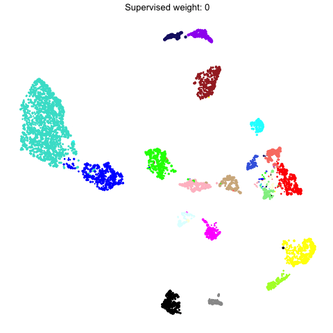
Customized network plots
There are many different packages within R and beyond for making network visualizations aside from the functions that are included in hdWGCNA. Here we provide a guided example of creating a customized network plot using the ggraph and tidygraph R packages. Making a custom network plot to suit your specific needs will likely require writing custom code, so we consider this part an optional advanced topic.
In this example, our goal is to make a custom network plot showing only the genes that are involved in “nervous system development” based on Gene Ontology. We start with a simple example and we gradually different customization options, which is the typical process of making a customized network plot. In principal this approach can be applied to any custom list of genes.
Setup
First, we need to install ggraph and tidygraph. We also need to install fgsea in order to load the Gene Ontology lists from the EnrichR website.
# install fgsea:
BiocManager::install('fgsea')

# install tidygraph and ggraph
install.packages(c("ggraph", "tidygraph"))

# load the packages:
library(ggraph)
library(tidygraph)
Next we need to get the genes associated with nervous system development and subset our co-expression network by these genes. Please follow this link to download the GO Biological Process 2021 database from the EnrichR website.
# get modules and TOM from the seurat obj
modules <- GetModules(seurat_obj) %>%
  subset(module != 'grey') %>%
  mutate(module = droplevels(module))
mods <- levels(modules$module)
TOM <- GetTOM(seurat_obj)

# get module colors for plotting
mod_colors <- dplyr::select(modules, c(module, color)) %>% distinct()
mod_cp <- mod_colors$color; names(mod_cp) <- as.character(mod_colors$module)

# load the GO Biological Pathways file (donwloaded from EnrichR website)
pathways <- fgsea::gmtPathways('GO_Biological_Process_2021.txt')

# remove GO Term ID for simplicity:
names(pathways) <- stringr::str_replace(names(pathways), " \\s*\\([^\\)]+\\)", "")

# selected pathway
cur_pathway <- 'nervous system development'

# get genes in this pathway
cur_genes <- pathways[[cur_pathway]]
cur_genes <- cur_genes[cur_genes %in% modules$gene_name]

# subset the TOM
cur_TOM <- TOM[cur_genes,cur_genes]
Basic network plot with ggraph
We now have a co-expression network which only contains our 136 genes
of interest. Next we create a graph object with igraph and
tidygraph, and then we make our network plot with
ggraph.
# set up the graph object with igraph & tidygraph
graph <- cur_TOM %>%
  igraph::graph_from_adjacency_matrix(mode='undirected', weighted=TRUE) %>%
  tidygraph::as_tbl_graph(directed=FALSE) %>%
  tidygraph::activate(nodes)

# make the plot with ggraph
p <- ggraph(graph) +
  geom_edge_link(color='grey', alpha=0.2) +
  geom_node_point(color='black') +
  geom_node_label(aes(label=name), repel=TRUE, max.overlaps=Inf, fontface='italic')

p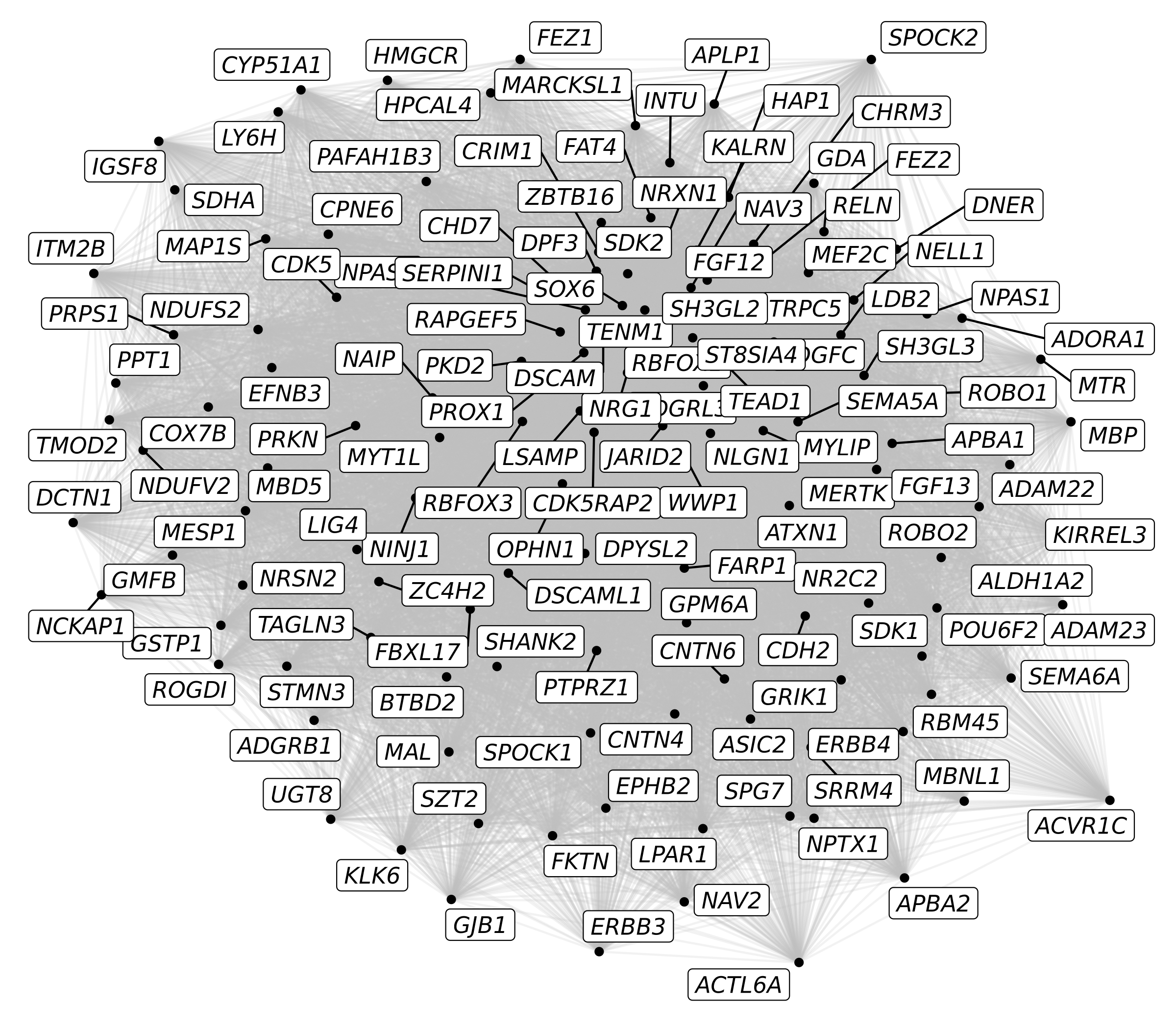
Here we have our first custom network plot showing 136 genes. Each node (dot) represents a gene, and the edges (lines) represent co-expression between two genes. There are a few problems with this plot that make it less meaningful.
- There are too many edges, we are showing all 136*136 co-expression links, so the resulting graph looks like a hairball.
- All of the links have the same thickness, color, and opacity, so we cannot tell which links are stronger or weaker.
- All of the nodes are colored the same, so we cannot tell which come from each module.
- All of the nodes are labeled, so this may be too much information to effectively display at once.
Let’s try to fix some of these problems. Next we will set the edges
opacity (alpha) by the co-expression strength using
geom_edge_link and we will color the nodes by each gene’s
assigned module using geom_node_point. With
igrah, we can use V(graph) to set attributes
for the network’s nodes, in order to add the module information to the
graph.
# set up the graph object with igraph & tidygraph
graph <- cur_TOM %>%
  igraph::graph_from_adjacency_matrix(mode='undirected', weighted=TRUE) %>%
  tidygraph::as_tbl_graph(directed=FALSE) %>%
  tidygraph::activate(nodes)

# add the module name to the graph:
V(graph)$module <- modules[V(graph)$name,'module']

# make the plot with gggraph
p <- ggraph(graph) +
  geom_edge_link(aes(alpha=weight), color='grey') +
  geom_node_point(aes(color=module)) +
  geom_node_label(aes(label=name), repel=TRUE, max.overlaps=Inf, fontface='italic') +
  scale_colour_manual(values=mod_cp)

p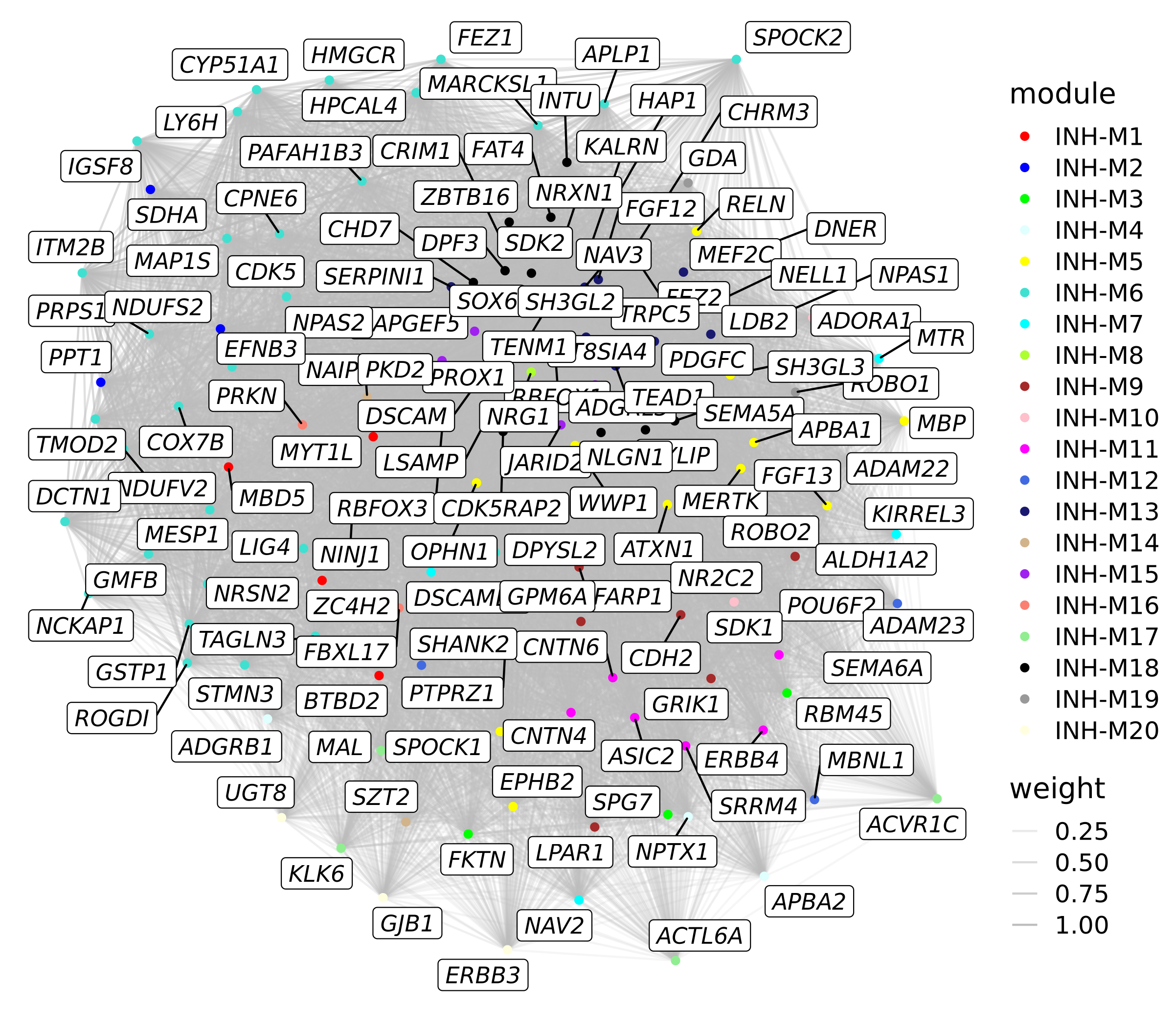
This plot is a little bit more informative than the last one, however there are still some issues.
Manipulating the network
In the previous plot, there are so many edges here that it is still hard to interpret the plot. There are also still too many genes labeled so the plot is very crowded. To solve these problems, we can make some simple manipulations to the graph to make the plots much more interpretable. Next we make a new plot where we reduce the number of edges by keeping only the strongest connections. We will also color the edges based on if the genes are in the same module, and we will only label genes if they are in the top 25 hub genes of each module.
# only keep the upper triangular part of the TOM:
cur_TOM[upper.tri(cur_TOM)] <- NA

# cast the network from wide to long format
cur_network <- cur_TOM %>%
  reshape2::melt() %>%
  dplyr::rename(gene1 = Var1, gene2 = Var2, weight=value) %>%
  subset(!is.na(weight))

# get the module & color info for gene1
temp1 <- dplyr::inner_join(
  cur_network,
  modules %>%
    dplyr::select(c(gene_name, module, color)) %>%
    dplyr::rename(gene1 = gene_name, module1=module, color1=color),
  by = 'gene1'
) %>% dplyr::select(c(module1, color1))

# get the module & color info for gene2
temp2 <- dplyr::inner_join(
  cur_network,
  modules %>%
    dplyr::select(c(gene_name, module, color)) %>%
    dplyr::rename(gene2 = gene_name, module2=module, color2=color),
  by = 'gene2'
) %>% dplyr::select(c(module2, color2))

# add the module & color info
cur_network <- cbind(cur_network, temp1, temp2)

# set the edge color to the module's color if they are the two genes are in the same module
cur_network$edge_color <- ifelse(
  cur_network$module1 == cur_network$module2,
  as.character(cur_network$module1),
  'grey'
)

# keep this network before subsetting
cur_network_full <- cur_network

# keep the top 10% of edges
edge_percent <- 0.1
cur_network <- cur_network_full %>%
  dplyr::slice_max(
    order_by = weight,
    n = round(nrow(cur_network)*edge_percent)
  )

# make the graph object with tidygraph
graph <- cur_network %>%
  igraph::graph_from_data_frame() %>%
  tidygraph::as_tbl_graph(directed=FALSE) %>%
  tidygraph::activate(nodes)

# add the module name to the graph:
V(graph)$module <- modules[V(graph)$name,'module']

# get the top 25 hub genes for each module
hub_genes <- GetHubGenes(seurat_obj, n_hubs=25) %>% .$gene_name
V(graph)$hub <- ifelse(V(graph)$name %in% hub_genes, V(graph)$name, "")

# make the plot with gggraph
p <- ggraph(graph) +
  geom_edge_link(aes(alpha=weight, color=edge_color)) +
  geom_node_point(aes(color=module)) +
  geom_node_label(aes(label=hub), repel=TRUE, max.overlaps=Inf, fontface='italic') +
  scale_colour_manual(values=mod_cp) +
  scale_edge_colour_manual(values=mod_cp)

p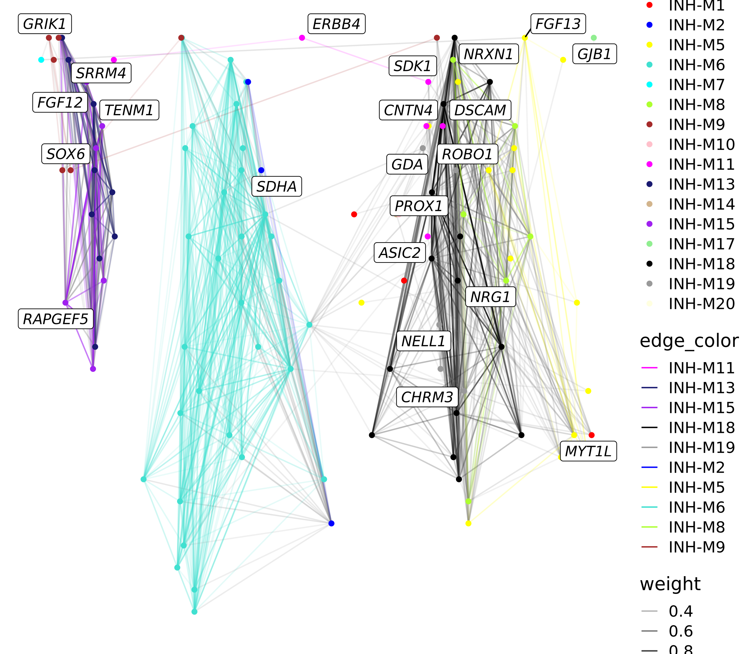
We can also make a similar plot where we only keep edges between genes in the same module instead of just keeping the strongest edges.
# subset to only keep edges between genes in the same module
cur_network <- cur_network_full %>%
  subset(module1 == module2)

# make the graph object with tidygraph
graph <- cur_network %>%
  igraph::graph_from_data_frame() %>%
  tidygraph::as_tbl_graph(directed=FALSE) %>%
  tidygraph::activate(nodes)

# add the module name to the graph:
V(graph)$module <- modules[V(graph)$name,'module']

# get the top 25 hub genes for each module
hub_genes <- GetHubGenes(seurat_obj, n_hubs=25) %>% .$gene_name
V(graph)$hub <- ifelse(V(graph)$name %in% hub_genes, V(graph)$name, "")

# make the plot with gggraph
p <- ggraph(graph) +
  geom_edge_link(aes(alpha=weight, color=edge_color)) +
  geom_node_point(aes(color=module)) +
  geom_node_label(aes(label=hub), repel=TRUE, max.overlaps=Inf, fontface='italic') +
  scale_colour_manual(values=mod_cp) +
  scale_edge_colour_manual(values=mod_cp) +
  NoLegend()

p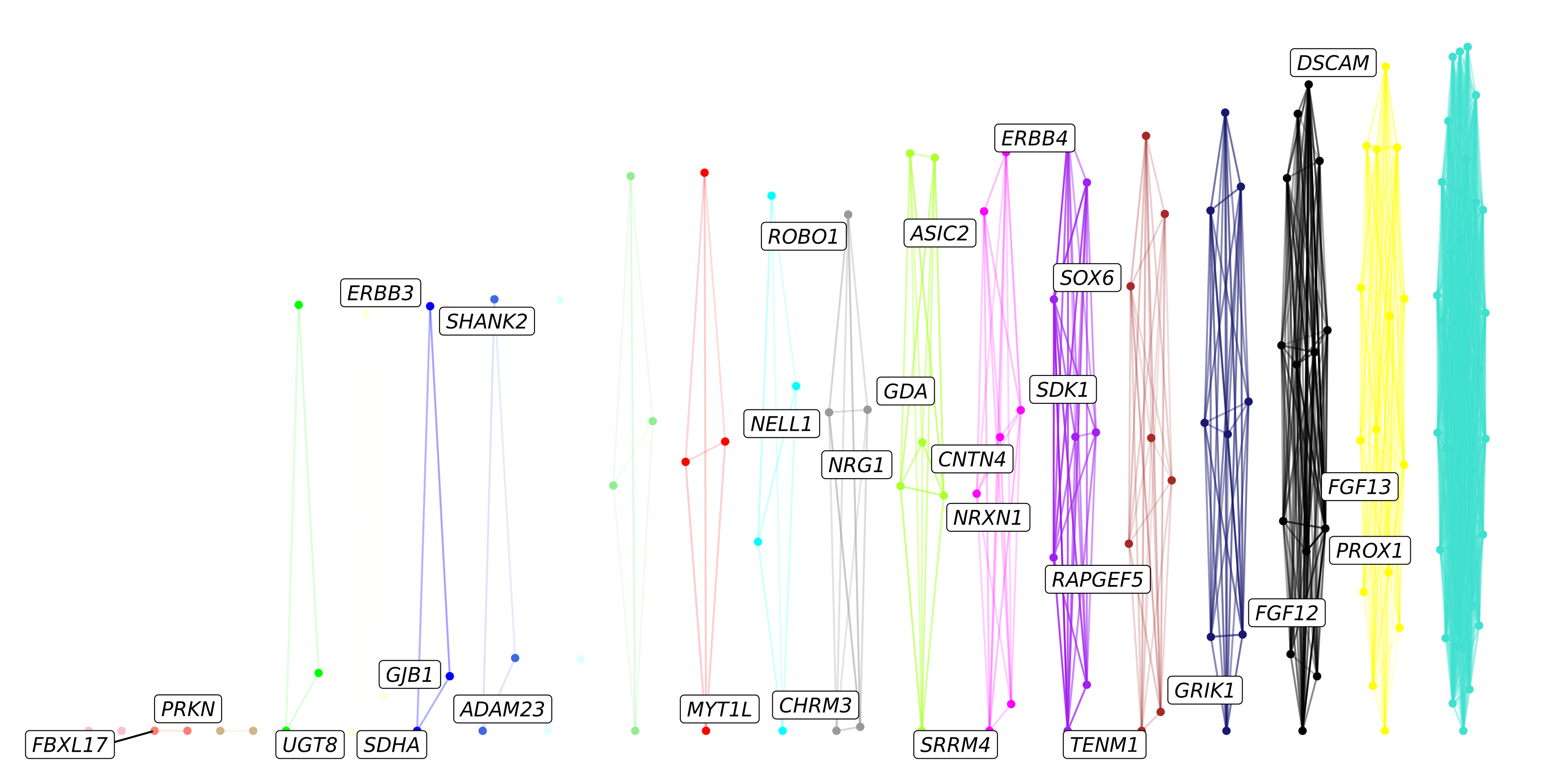
With the default settings, it seems that the layout of the nodes in this graph is making a very squished plot, partially because each of the modules are fully disconnected from one another.
Specifying network layouts
Under the hood, ggraph determines the 2D layout of the
points on the graph. Next we will try some different layouts other than
the default. Please consult this
documentation page to learn more about ggraph
layouts.
# randomly sample 50% of the edges within the same module
cur_network1 <- cur_network_full %>%
  subset(module1 == module2) %>%
  group_by(module1) %>%
  sample_frac(0.5) %>%
  ungroup()

# keep the top 10% of other edges
edge_percent <- 0.10
cur_network2 <- cur_network_full %>%
  subset(module1 != module2) %>%
  dplyr::slice_max(
    order_by = weight,
    n = round(nrow(cur_network)*edge_percent)
  )

cur_network <- rbind(cur_network1, cur_network2)

# set factor levels for edges:
cur_network$edge_color <- factor(
  as.character(cur_network$edge_color),
  levels = c(mods, 'grey')
)

# rearrange so grey edges are on the bottom:
cur_network %<>% arrange(rev(edge_color))

# make the graph object with tidygraph
graph <- cur_network %>%
  igraph::graph_from_data_frame() %>%
  tidygraph::as_tbl_graph(directed=FALSE) %>%
  tidygraph::activate(nodes)

# add the module name to the graph:
V(graph)$module <- modules[V(graph)$name,'module']

# get the top 25 hub genes for each module
hub_genes <- GetHubGenes(seurat_obj, n_hubs=25) %>% .$gene_name
V(graph)$hub <- ifelse(V(graph)$name %in% hub_genes, V(graph)$name, "")

# 1. default layout
p1 <- ggraph(graph) +
  geom_edge_link(aes(alpha=weight, color=edge_color)) +
  geom_node_point(aes(color=module)) +
  scale_colour_manual(values=mod_cp) +
  scale_edge_colour_manual(values=mod_cp) +
  ggtitle("layout = 'stress' (auto)") +
  NoLegend()

# 2. Kamada Kawai (kk) layout
graph2 <- graph; E(graph)$weight <- E(graph)$weight + 0.0001
p2 <- ggraph(graph, layout='kk', maxiter=100) +
  geom_edge_link(aes(alpha=weight, color=edge_color)) +
  geom_node_point(aes(color=module)) +
  scale_colour_manual(values=mod_cp) +
  scale_edge_colour_manual(values=mod_cp) +
  ggtitle("layout = 'kk'") +
  NoLegend()

# 3. igraph layout_with_fr
p3 <- ggraph(graph, layout=layout_with_fr(graph)) +
  geom_edge_link(aes(alpha=weight, color=edge_color)) +
  geom_node_point(aes(color=module)) +
  scale_colour_manual(values=mod_cp) +
  scale_edge_colour_manual(values=mod_cp) +
  ggtitle("layout_with_fr()") +
  NoLegend()

# 4. igraph layout_as_tree
p4 <- ggraph(graph, layout=layout_as_tree(graph)) +
  geom_edge_link(aes(alpha=weight, color=edge_color)) +
  geom_node_point(aes(color=module)) +
  scale_colour_manual(values=mod_cp) +
  scale_edge_colour_manual(values=mod_cp) +
  ggtitle("layout_as_tree()") +
  NoLegend()

# 5. igraph layout_nicely
p5 <- ggraph(graph, layout=layout_nicely(graph)) +
  geom_edge_link(aes(alpha=weight, color=edge_color)) +
  geom_node_point(aes(color=module)) +
  scale_colour_manual(values=mod_cp) +
  scale_edge_colour_manual(values=mod_cp) +
  ggtitle("layout_nicely()") +
  NoLegend()

# 6. igraph layout_in_circle
p6 <- ggraph(graph, layout=layout_in_circle(graph)) +
  geom_edge_link(aes(alpha=weight, color=edge_color)) +
  geom_node_point(aes(color=module)) +
  scale_colour_manual(values=mod_cp) +
  scale_edge_colour_manual(values=mod_cp) +
  ggtitle("layout_in_circle()") +
  NoLegend()


# make a combined plot
(p1 | p2 | p3) / (p4 | p5 | p6) 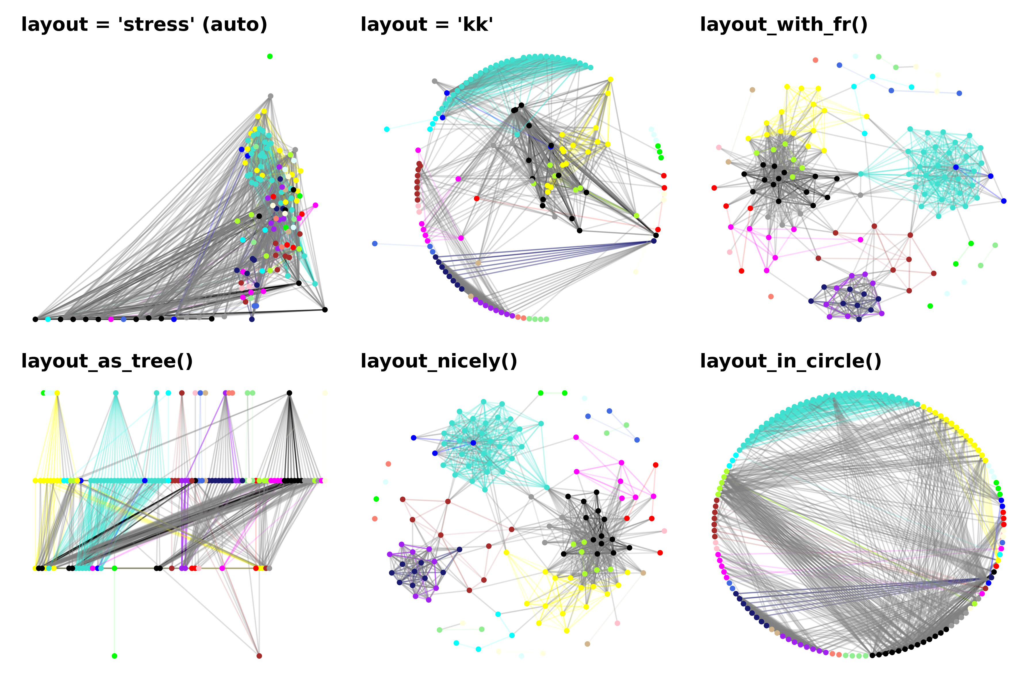
Here we show a combined plot of six different layouts of the same exact network. We can appreciate how different the results are when using different layout algorithms, and we encourage trying out different layouts which best suit your particular needs. The ggraph documentation page shows many more options for different graph layouts that you can use.
We can also provide a “custom” layout, which can be any set of 2D coordinates for each of the nodes. Here we show how we can use the co-expression UMAP layout that we computed previously. We also make a few additional modifications.
- Make the size of each node scaled by the kME.
- Highlight hub genes by giving them a black outline and plotting them on top.
# get the UMAP df and subset by genes that are in our graph
umap_df <- GetModuleUMAP(seurat_obj)
umap_layout <- umap_df[names(V(graph)),] %>% dplyr::rename(c(x=UMAP1, y = UMAP2, name=gene))
rownames(umap_layout) <- 1:nrow(umap_layout)

# create the layout
lay <- ggraph::create_layout(graph, umap_layout)
lay$hub <- V(graph)$hub

p <- ggraph(lay) +
  geom_edge_link(aes(alpha=weight, color=edge_color)) +
  geom_node_point(data=subset(lay, hub == ''), aes(color=module, size=kME)) +
  geom_node_point(data=subset(lay, hub != ''), aes(fill=module, size=kME), color='black', shape=21) +
  scale_colour_manual(values=mod_cp) +
  scale_fill_manual(values=mod_cp) +
  scale_edge_colour_manual(values=mod_cp) +
  geom_node_label(aes(label=hub), repel=TRUE, max.overlaps=Inf, fontface='italic') +
  NoLegend()


p 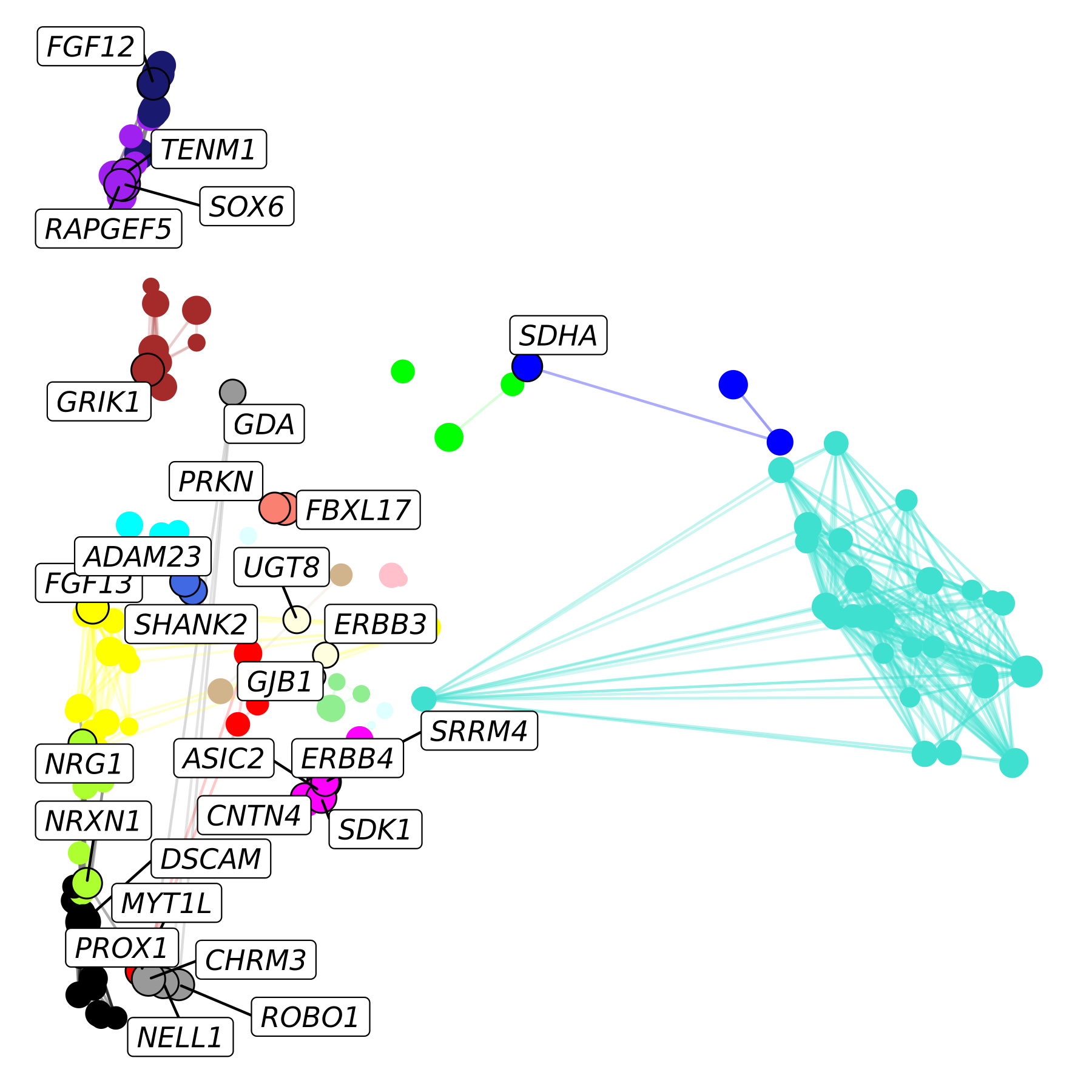
We can easily modify this plot to add a background layer showing all of the other genes in our co-expression network. We will also change the shape of the selected genes to better differentiate them from the background.
p <- ggraph(lay) +
  ggrastr::rasterise(
    geom_point(inherit.aes=FALSE, data=umap_df, aes(x=UMAP1, y=UMAP2), color=umap_df$color, alpha=0.1, size=1),
    dpi=500
   ) +
  geom_edge_link(aes(alpha=weight, color=edge_color)) +
  geom_node_point(data=subset(lay, hub == ''), aes(fill=module, size=kME), color='black', shape=21) +
  geom_node_point(data=subset(lay, hub != ''), aes(fill=module, size=kME), color='black', shape=23) +
  scale_colour_manual(values=mod_cp) +
  scale_fill_manual(values=mod_cp) +
  scale_edge_colour_manual(values=mod_cp) +
  geom_node_label(aes(label=hub), repel=TRUE, max.overlaps=Inf, fontface='italic') +
  NoLegend()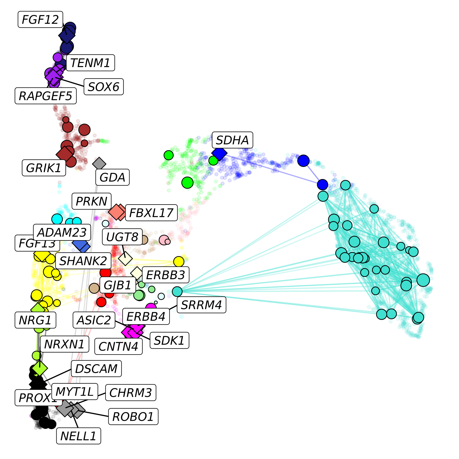
In this plot, we show the hub genes as diamonds, non-hub genes as circles, and all genes not in our pathway of interest in the background.
Since ggraph is based on ggplot2, we can
easily add further customizations. In this final example, we change the
gene label colors to match the assigned modules, we change the plot
background to black, and we add a title in the upper right corner.
p <- ggraph(lay) +
  ggrastr::rasterise(
    geom_point(inherit.aes=FALSE, data=umap_df, aes(x=UMAP1, y=UMAP2), color=umap_df$color, alpha=0.1, size=1),
    dpi=500
   ) +
  geom_edge_link(aes(alpha=weight, color=edge_color)) +
  geom_node_point(data=subset(lay, hub == ''), aes(fill=module, size=kME), color='black', shape=21) +
  geom_node_point(data=subset(lay, hub != ''), aes(fill=module, size=kME), color='black', shape=23) +
  scale_colour_manual(values=mod_cp) +
  scale_fill_manual(values=mod_cp) +
  scale_edge_colour_manual(values=mod_cp) +
  geom_node_label(aes(label=hub, color=module), repel=TRUE, max.overlaps=Inf, fontface='italic') +
  NoLegend()

p <- p +
  theme(
    panel.background = element_rect(fill='black'),
    plot.title = element_text(hjust=0.5)
  ) +
  annotate("text", x=Inf, y=Inf, label="Nervous system development",
  vjust=2, hjust=1.1, color='white', fontface='bold', size=5)

p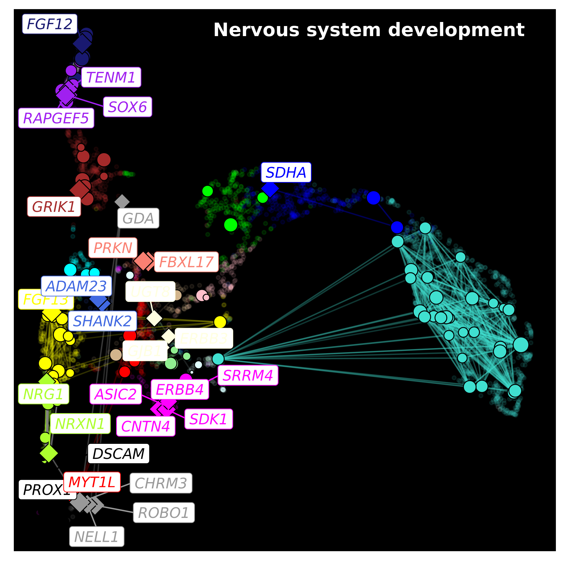
We encourage users to learn from this example, and to leverage these powerful plotting libraries to create custom network visualizations that suit their particular study.