Compiled: 09-10-2024
Introduction
In this tutorial we demonstrate transcription factor (TF) regulatory network analysis with hdWGCNA. This is an additional type of network analysis beyond the standard co-expression network analysis in hdWGCNA. While hdWGCNA co-expression networks are undirected networks, where we do not have explicit information about which genes regulate each other, TF regulatory networks leverage TF binding motif information to build directed networks of TFs and their downstream target genes. Some of this analysis and the concepts used here are similar to other approaches, but this TF regulatory network analysis included in hdWGCNA is a distinct approach with key differences, for example the use of metacells. Here, we demonstrate this analysis on a dataset of the human prefrontal cortex, but keep in mind that this analysis must be modified appropriately for different species.
We first described this TF regulatory network method in our paper Childs & Morabito et al., Cell Reports (2024). If you use the TF regulatory network analysis in your research, please cite this paper and the original hdWGCNA paper Morabito et al., Cell Reports Methods (2023).
Important Note: Before running the code in this tutorial, you must first perform the standard co-expression network analysis and module identification with hdWGCNA, as shown in our other tutorial.
# single-cell analysis package
library(Seurat)

# plotting and data science packages:
library(tidyverse)
library(cowplot)
library(patchwork)
library(magrittr)

# co-expression network analysis packages:
library(WGCNA)
library(hdWGCNA)

# network analysis & visualization package:
library(igraph)

# using the cowplot theme for ggplot
theme_set(theme_cowplot())

# set random seed for reproducibility
set.seed(12345)

# load your Seurat object which has already been processed with hdWGCNA
seurat_obj <- readRDS('data/Zhou_control.rds')
Install additional packages
For this analysis, we need to install some additional R packages to
work with TF binding motifs. These broadly fall in two categories, tools
for working TF motifs and genomic coordinates, and database tools to
provide us information on TF motifs and genomic features. Two of the
databases that we are using are specific to human data
(EnsDb.Hsapiens.v86,
BSgenome.Hsapiens.UCSC.hg38), and the JASPAR database
includes motif information for multiple species. We also need to install
xgboost, which includes an algorithm that we use to model
TF regulation for each gene.
# install packages for dealing with TF motifs and genomic coordinates
BiocManager::install(c(
  'motifmatchr',
  'TFBSTools',
  'GenomicRanges'
))

# install database packages for human motifs & genomic features
BiocManager::install(c(
  'EnsDb.Hsapiens.v86',
  'BSgenome.Hsapiens.UCSC.hg38'
))
BiocManager::install(c(
  'JASPAR2020',
  'JASPAR2024'
))

# install xgboost
install.packages('xgboost')

# load these packages into R:
library(JASPAR2020)
library(JASPAR2024)
library(motifmatchr)
library(TFBSTools)
library(EnsDb.Hsapiens.v86)
library(BSgenome.Hsapiens.UCSC.hg38)
library(GenomicRanges)
library(xgboost)
Transcription Factor Network Analysis
Identify TFs in promoter regions
The first main step in our TF regulatory network analysis is to
determine which genes are potentially regulated by each TF. We provide a
function MotifScan which uses the algorithm motifmatchr
to search for occurrences of different TF motifs within gene promoter
regions. This function will store information in the
seurat_obj about which TF motifs are present in each gene’s
promoter.
First, we set up a list of position weight matrices for each TF using
TFBStools. This process is slightly different depending on
the version of JASPAR that you use. In the tutorial, we
used JASPAR2020 but here we also show how to use
JASPAR2024.
# JASPAR 2020
pfm_core <- TFBSTools::getMatrixSet(
  x = JASPAR2020,
  opts = list(collection = "CORE", tax_group = 'vertebrates', all_versions = FALSE)
)

# JASPAR 2024 (not used for this tutorial)
library(JASPAR2024)
library(RSQLite)
library(EnsDb.Hsapiens.v86)

JASPAR2024 <- JASPAR2024()
sq24 <- RSQLite::dbConnect(RSQLite::SQLite(), db(JASPAR2024))

pfm_core <- TFBSTools::getMatrixSet(
  x = sq24,
  opts = list(collection = "CORE", tax_group = 'vertebrates', all_versions = FALSE)
)
Now we can run the hdWGCNA function MotifScan using
these motifs.
# run the motif scan
seurat_obj <- MotifScan(
  seurat_obj,
  species_genome = 'hg38',
  pfm = pfm_core,
  EnsDb = EnsDb.Hsapiens.v86
)
Construct TF Regulatory Network
Now that we have information about which TFs potentially regulate
each gene based on TF motif presence, we have a basis for constructing a
TF regulatory network. In this section, we use the function
ConstructTFNetwork to construct a network of TFs and their
putative target genes. This function leverages the extreme
gradient boosting (XGBoost) algorithm, a powerful ensemble learning
approach that we use to predict the expression of a given gene based on
the expression of all TFs with a matching motif in that gene’s promoter.
This analysis will reveal a ranking of which TFs are best at predicting
the expression of the target gene, which we consider the most likely
regulators of that particular gene. Please
read the methods section of our paper for more information.
Similar to the standard hdWGCNA co-expression network analysis, we
need to define the set of genes that will be used for this analysis, and
we need to explicitly define the expression matrix that will be used
with the function SetDatExpr. The user may decide which
genes that they want to use for this analysis, but here we will use all
of the genes that were assigned to a co-expression module based on the
co-expression network analysis, and all genes corresponding to a TF.
# get the motif df:
motif_df <- GetMotifs(seurat_obj)

# keep all TFs, and then remove all genes from the grey module
tf_genes <- unique(motif_df$gene_name)
modules <- GetModules(seurat_obj)
nongrey_genes <- subset(modules, module != 'grey') %>% .$gene_name
genes_use <- c(tf_genes, nongrey_genes)

# update the gene list and re-run SetDatExpr
seurat_obj <- SetWGCNAGenes(seurat_obj, genes_use)
seurat_obj <- SetDatExpr(seurat_obj, group.by = 'cell_type', group_name='INH')
Now we are ready to run ConstructTFNetwork. Since this
function models each gene, the runtime will scale wth the number of
genes selected from the previous step and it will scale with the number
of metacells / metaspots that are used for this analysis. We use the
parameter model_params to pass a list of arguments for
XGBoost. See this
webpage for the full list of parameters.
# define model params:
model_params <- list(
    objective = 'reg:squarederror',
    max_depth = 1,
    eta = 0.1,
    nthread=16,
    alpha=0.5
)

# construct the TF network
seurat_obj <- ConstructTFNetwork(seurat_obj, model_params)
This function results in a table showing information about each
potential TF-gene pair, which we can access using
GetTFNetwork.
results <- GetTFNetwork(seurat_obj)
head(results)
tf gene Gain Cover Frequency Cor
1 STAT3 IRF2 0.16588128 0.066 0.066 -0.08774167
2 CTCF IRF2 0.08142991 0.070 0.070 0.33443582
3 KLF5 IRF2 0.07912151 0.046 0.046 -0.29397638
4 PROX1 IRF2 0.07632654 0.032 0.032 0.22904364
5 ZNF140 IRF2 0.05930269 0.050 0.050 -0.16171536
6 ESRRA IRF2 0.04564704 0.056 0.056 -0.09254805This table shows the inferred relationships in the network between TFs and target genes from the XGBoost model, regarding the importance or strength of these relationships.
-
Gainrepresents the improvement in accuracy of the model in branches which used this feature. -
Coverrepresents the quantity of observations affected by a feature in the trees where is it used. -
Frequencyrepresents how often a feature appears in trees.CoverandFrequencyare the same for trees with shallow depths. -
Corsimply represents the pearson correlation coefficient.
Define TF Regulons
In this step, we use the whole TF network from the previous step to define “regulons” for each TF. Regulons are similar to co-expression modules, but the genes in each regulon are comprised of highly confident target genes for each TF. Essentially, this step is pruning the TF regulatory network to only keep the strongest TF-gene connections. Here we offer several strategies for defining TF regulons.
- Strategy “A” selects the top TFs for each gene.
- Strategy “B” selects the top genes for each TF.
- Strategy “C” retains all TF-gene pairs above a certain regulatory
score (
reg_thresh).
For this analysis, we employ Strategy “A”, selecting the top 10 TFs for each gene.
seurat_obj <- AssignTFRegulons(
    seurat_obj,
    strategy = "A",
    reg_thresh = 0.01,
    n_tfs = 10
)
The resulting table of TF regulons is a filtered version of the
previous TF network table, containing only the pairs of TFs and target
genes that meet the filtering criteria defined in the call to
AssignTFRegulons.
     tf   gene       Gain      Cover  Frequency        Cor
1 ARGFX  PITX1 0.45472037 0.12828582 0.12828582 0.32824384
2 ARGFX   MYF6 0.31286043 0.25862570 0.25862570 0.17616153
3 ARGFX SNAP91 0.07103855 0.06703947 0.06703947 0.19616570
4 ARGFX   KLC4 0.06418233 0.02600000 0.02600000 0.21036974
5 ARGFX  PPWD1 0.05068363 0.04400000 0.04400000 0.06973992
6 ARGFX ZRANB3 0.04465245 0.05000000 0.05000000 0.21549817
Expand to see example of Strategy “B”
seurat_obj <- AssignTFRegulons(
    seurat_obj,
    strategy = "B",
    reg_thresh = 0.01,
    n_genes = 50
)
Expand to see example of Strategy “C”
seurat_obj <- AssignTFRegulons(
    seurat_obj,
    strategy = "C",
    reg_thresh = 0.1
)
Visualize regulons
We can visualize the top target genes within TF regulons using the
function RegulonBarPlot.
p1 <- RegulonBarPlot(seurat_obj, selected_tf='RUNX2')
p2 <- RegulonBarPlot(seurat_obj, selected_tf='ETV1', cutoff=0.15)

p1 | p2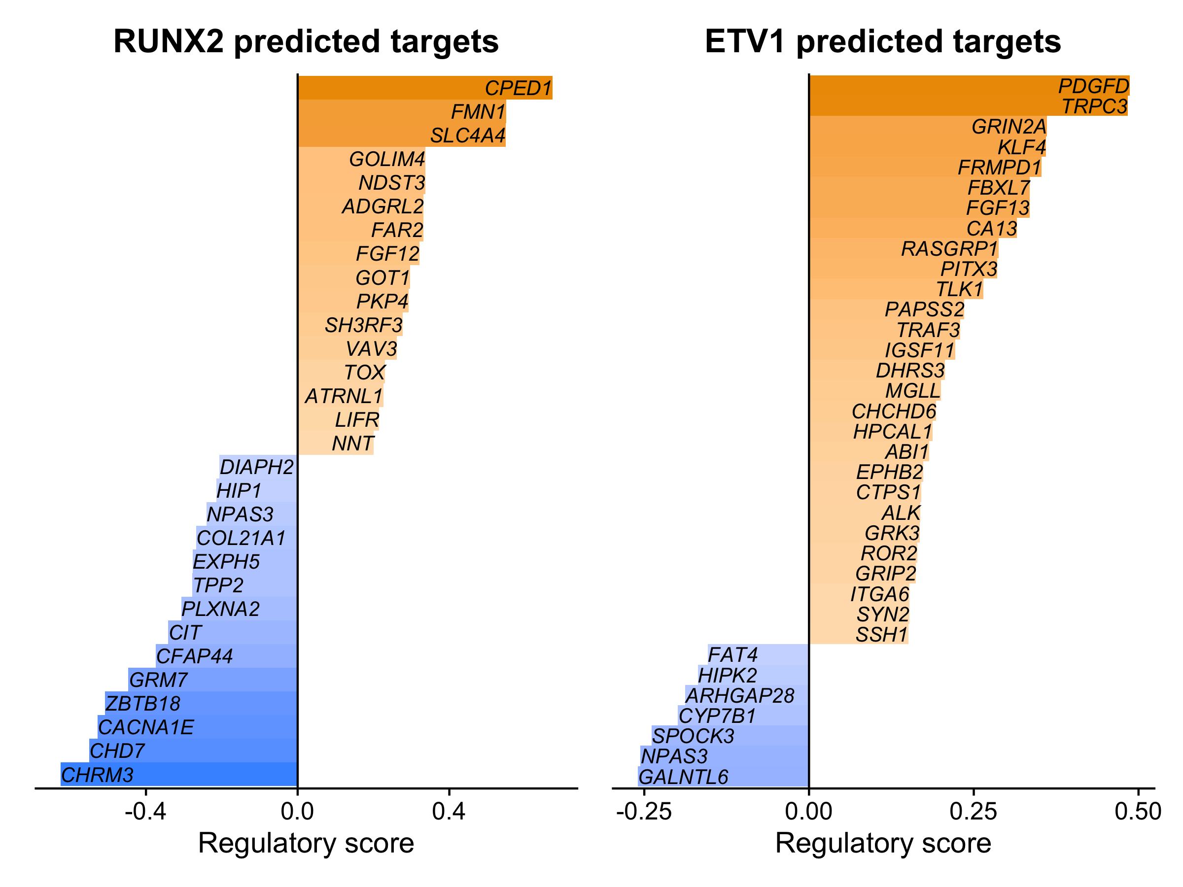
In this bar plot, the regulatory importance score from XGBoost is plotted on the x-axis, and target genes are ranked by their importance scores. This shows us the top predicted target genes for each TF, split by whether the target gene was positively (right side) or negatively (left side) correlated with the TF based on gene expression.
Calculate regulon expression signatures
In the hdWGCNA co-expression analysis, we compute aggregated
expression scores for each module, called Module Eigengenes. In TF
regulatory network analysis, we also have groups of genes (regulons) for
which we can calculate gene expression scores. This will inform us which
cells express genes which are likely regulated by specific TFs. Here we
use the function RegulonScores to compute scores for each
TF regulon.
Importantly, in our TF network analysis, there are some TF-gene pairs
with positive co-expression, and some TF-gene pairs with negative
co-expression. For regulon scoring, we provide the option
target_type to select ‘positive’, ‘negative’, or ‘both’,
making it possible to separately analyze the signatures for genes that
are activated or repressed by a given TF.
# positive regulons
seurat_obj <- RegulonScores(
    seurat_obj,
    target_type = 'positive',
    ncores=8
)

# negative regulons
seurat_obj <- RegulonScores(
    seurat_obj,
    target_type = 'negative',
    cor_thresh = -0.05,
    ncores=8
)

# access the results:
pos_regulon_scores <- GetRegulonScores(seurat_obj, target_type='positive')
neg_regulon_scores <- GetRegulonScores(seurat_obj, target_type='negative')
We can use various approaches to visualize the regulon scores. Here
we compare the regulon scores side-by-side with the expression of RUNX2
using a Seurat FeaturePlot.
# select a TF of interest
cur_tf <- 'RUNX2'

# add the regulon scores to the Seurat metadata
seurat_obj$pos_regulon_score <- pos_regulon_scores[,cur_tf]
seurat_obj$neg_regulon_score <- neg_regulon_scores[,cur_tf]

# plot using FeaturePlot
p1 <- FeaturePlot(seurat_obj, feature=cur_tf) + umap_theme()
p2 <- FeaturePlot(seurat_obj, feature='pos_regulon_score', cols=c('lightgrey', 'red')) + umap_theme()
p3 <- FeaturePlot(seurat_obj, feature='neg_regulon_score', cols=c('lightgrey', 'seagreen')) + umap_theme()

p1 | p2 | p3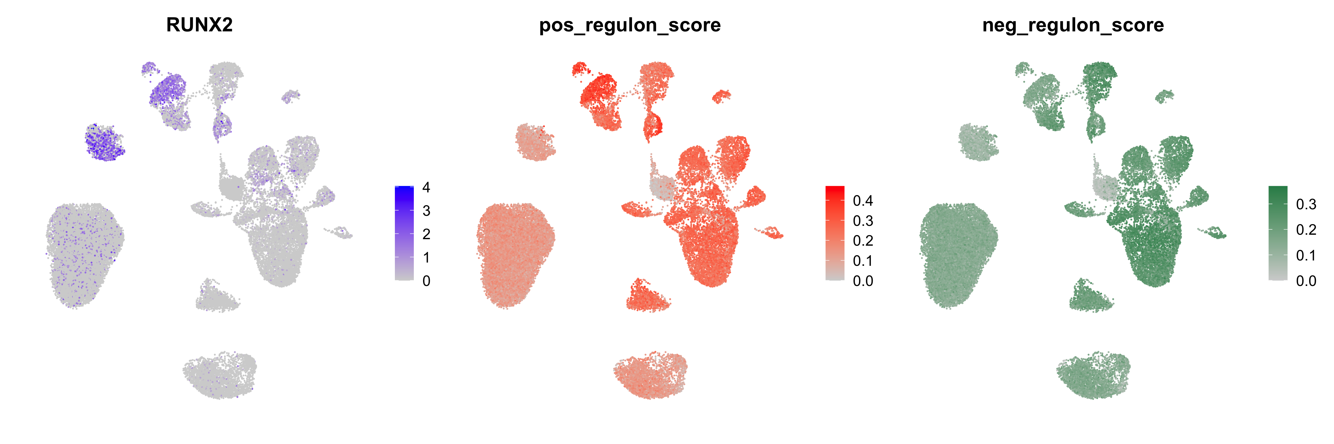
Other functions like VlnPlot or DotPlot can
be used to visualize the regulon scores in a similar way, or you can
create custom visualizations.
Network Visualization
TFNetworkPlot
Based on the specific research project or biological question, there
are many different ways that one could visualize the TF network. In this
section we will use TFNetworkPlot, a built-in funciton
within hdWGCNA to plot the network centered around specified TFs.
First, we use TFNetworkPlot with the default settings
using a TF of interest, RUNX2.
# select TF of interest
cur_tf <- 'RUNX2'

# plot with default settings
p <- TFNetworkPlot(seurat_obj, selected_tfs=cur_tf)

p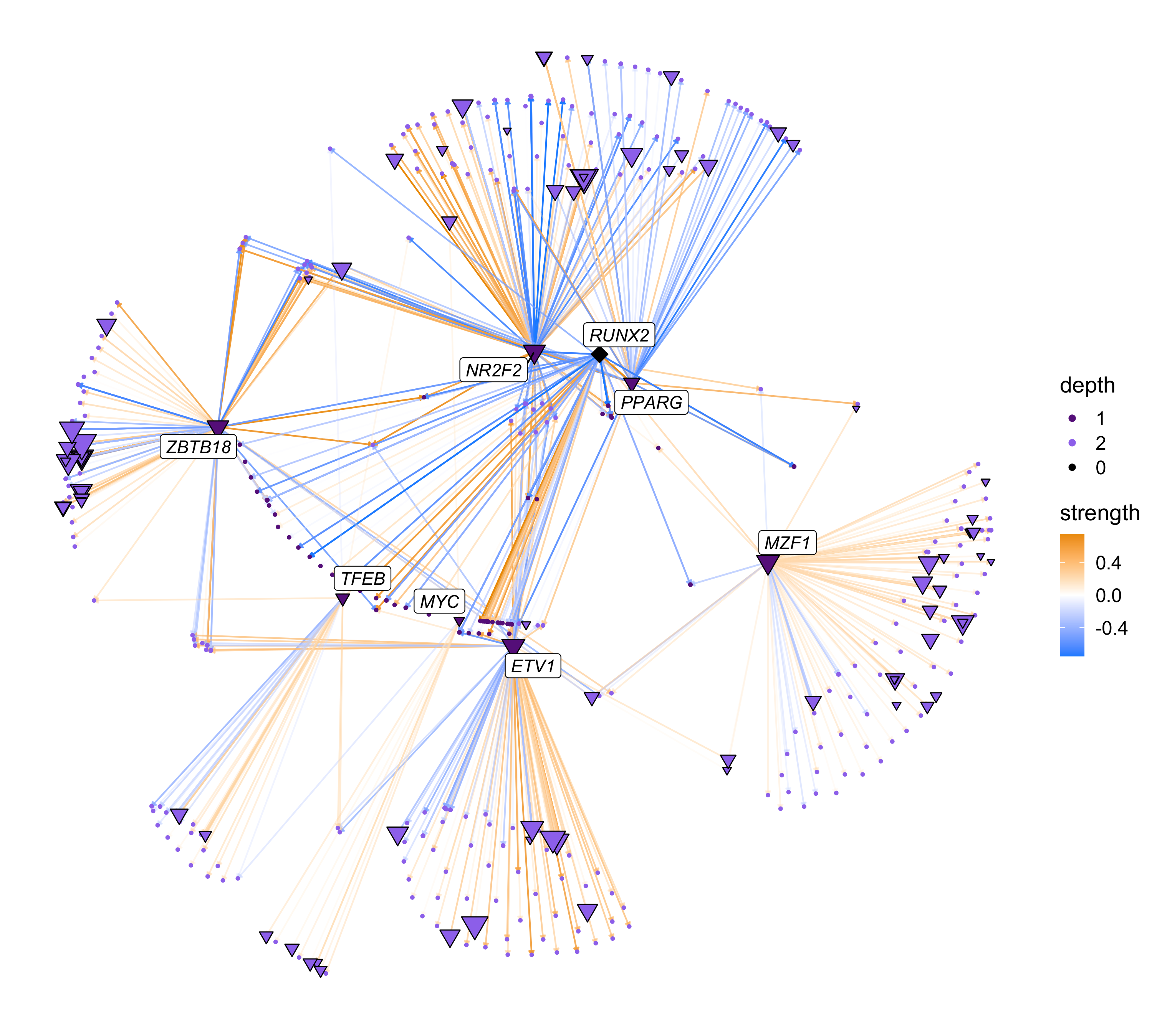
Expand to see how we select TFs of interest
To select interesting TFs, we look for TFs that are specifically expressed in our cell type of interest (INH), and TFs that are hub genes in our co-expression modules.
# get the TF regulons
tf_regulons <- GetTFRegulons(seurat_obj)

# get hub genes and subset by TFs
hub_df <- GetHubGenes(seurat_obj, n_hubs=25) %>%
    subset(gene_name %in% tf_regulons$tf)

# identify marker TFs
Idents(seurat_obj) <- seurat_obj$cell_type
marker_tfs <- FindAllMarkers(
    seurat_obj,
    features = unique(tf_regulons$tf)
)

# get top 25 TFs
top_tfs <- marker_tfs %>% subset(cluster == 'INH') %>% slice_max(n=25, order_by=avg_log2FC)

# intersect marker TFs and hub genes:
intersect(top_tfs$gene, hub_df$gene_name)
[1] "PKNOX2" "RARB" "RUNX2"This plot is a directed network showing regulatory links originating from our TF of interest. The nodes (dots) in this network represent TFs and genes, and the edges (arrows) represent inferred regulatory relationships. The selected TF is shown as a diamond, other TFs are shown as triangles, and genes are shown as circles. The size of each node corresponds to the outdegree in the network (number of outgoing connections). The color of the edges represent the strength of the TF-gene interaction based on the pearson correlation of gene expression. The color of each node represents the number of links to the selected TFs, in this case showing us the “primary” and “secondary” targets of RUNX2. By default, the only genes that are labeled are the selected TFs and the primary TF targets.
The TFNetworkPlot function contains many options to
modify the network plot, and here we show some of these options. First,
we show different plots based on the network “depth”.
# plot the RUNX2 network with primary, secondary, and tertiary targets
p1 <- TFNetworkPlot(seurat_obj, selected_tfs=cur_tf, depth=1, no_labels=TRUE)
p2 <- TFNetworkPlot(seurat_obj, selected_tfs=cur_tf, depth=2, no_labels=TRUE)
p3 <- TFNetworkPlot(seurat_obj, selected_tfs=cur_tf, depth=3, no_labels=TRUE)

p1 | p2 | p3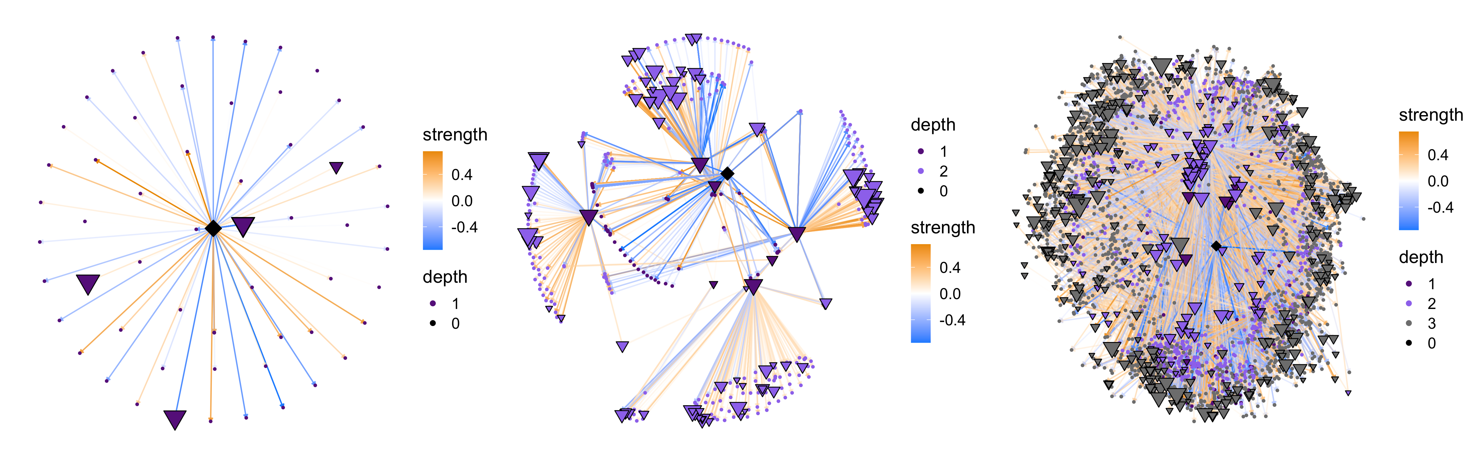
The network complexity increases drastically when we use
depth=3, so in general we recommend using
depth=1 to plot the primary targets or depth=2
to plot primary and secondary targes (default).
We can also use TFNetworkPlot with multiple selected
TFs. Here we show a network plot with three selected TFs. We also use
the option target_type to show different plots for the
positive and negative TF-gene relationships based on the sign of their
correlations.
# select TF of interest
cur_tfs <- c('RUNX2', 'RXRA', 'TCF4')

# plot with default settings
p1 <- TFNetworkPlot(
    seurat_obj, selected_tfs=cur_tfs,
    target_type='positive',
    label_TFs=0, depth=1
) + ggtitle("positive targets")
p2 <- TFNetworkPlot(
    seurat_obj, selected_tfs=cur_tfs,
    target_type = 'both',
    label_TFs=0, depth=1
) + ggtitle("pos & neg targets")

p3 <- TFNetworkPlot(
    seurat_obj, selected_tfs=cur_tfs,
    target_type = 'negative',
    label_TFs=0, depth=1
) + ggtitle("negative targets")

p1 | p2 | p3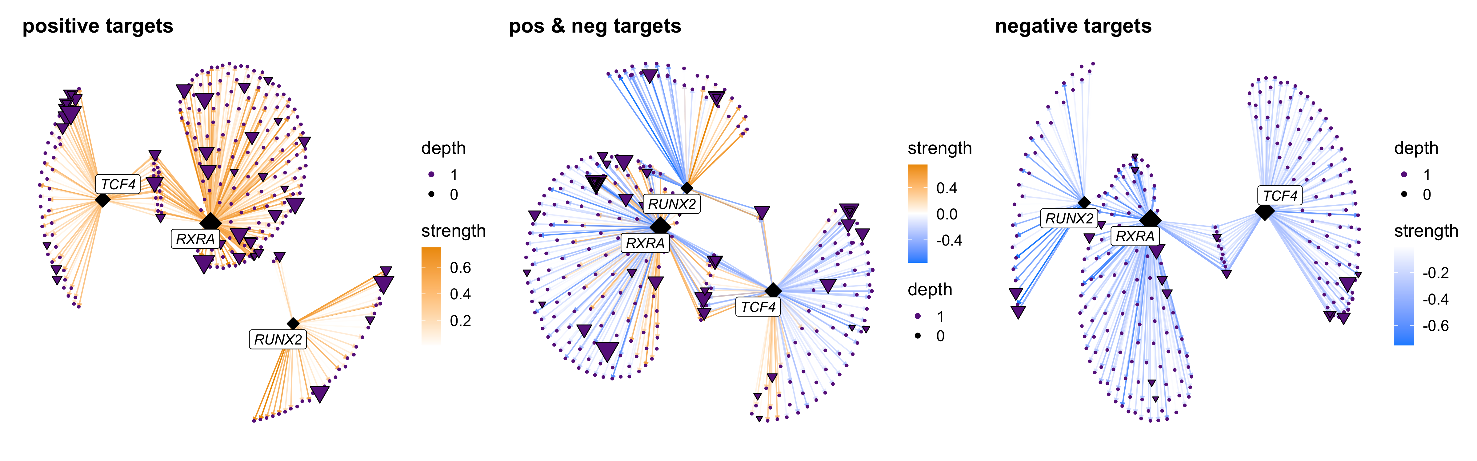
There are two options for how to change the edge weights, either
based on TF-gene pearson correlations (edge_weight='Cor')
or based on the importance from the XGBoost model
(edge_weight='Gain'). Here we show both of these options,
and we also show how to
cur_tf <- 'RUNX2'
p1 <- TFNetworkPlot(
    seurat_obj, selected_tfs=cur_tf,
    edge_weight = 'Cor', cutoff=0.05
) + ggtitle("edge_weight='Cor'")

p2 <- TFNetworkPlot(
    seurat_obj, selected_tfs=cur_tf,
    edge_weight = 'Gain', cutoff=0.05,
) + ggtitle("edge_weight='Gain'")

p1 | p2 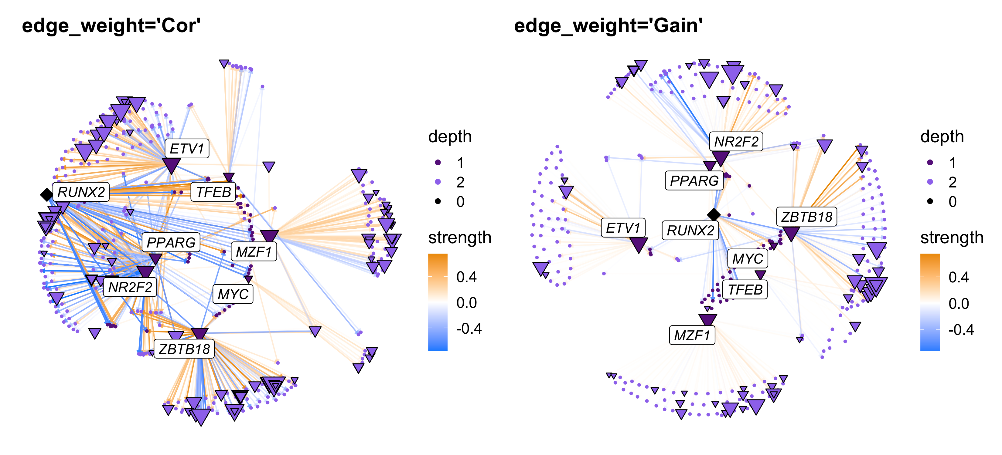
Finally we show a few more options: plotting only TFs, adding custom gene labels, and changing the color scheme.
cur_tf <- 'RUNX2'

# get a list of hub genes in the same module as RUNX2
tf_regulons <- GetTFRegulons(seurat_obj)
hub_df <- GetHubGenes(seurat_obj)
cur_mod <- subset(hub_df, gene_name == cur_tf) %>% .$module %>% as.character
cur_mod_genes <- subset(hub_df, module == cur_mod) %>% .$gene_name

# plot TFs only
p1 <- TFNetworkPlot(
    seurat_obj, selected_tfs=cur_tf,
    TFs_only=TRUE,
) + ggtitle('TFs only')

# plot with custom gene labels
p2 <- TFNetworkPlot(
    seurat_obj, selected_tfs=cur_tf,
    label_TFs=0, label_genes=cur_mod_genes
) + ggtitle('Custom gene labels')

# custom colors
p3 <- TFNetworkPlot(
    seurat_obj, selected_tfs=cur_tf,
    label_TFs=0,
    high_color='hotpink', mid_color='grey98', low_color='seagreen',
    node_colors = c('grey30', 'grey60', 'grey90')
) + ggtitle('Custom colors')

p1 | p2 | p3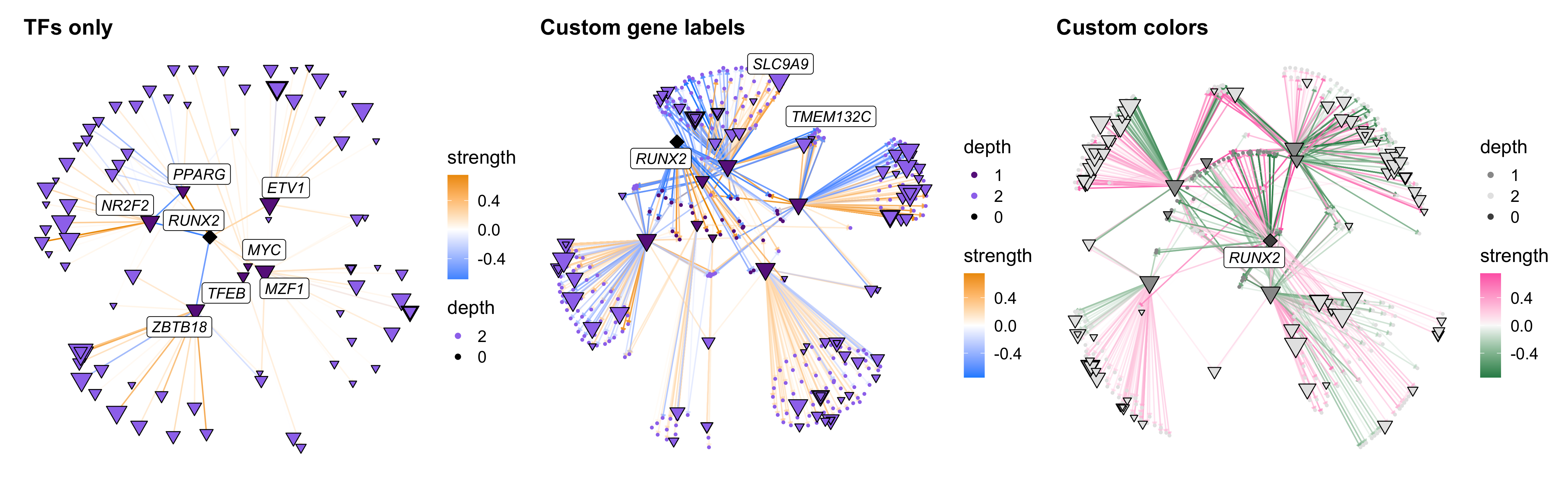
Custom network visualizations
Next we demonstrate different ways to visualize the TF regulatory
network beyond TFNetworkPlot using ggraph and tidygraph, similar to
our other tutorial for customized
network plots. We recommend custom network plots to advanced users
who want to create a plot that cannot be made with
TFNetworkPlot. For example, if you want a custom network
layout, if you want to show interactions only within a specific module
or set of modules, if you want to edit the shape aesthetics, etc.
In this example, we will plot the RUNX2 TF regulatory network using the co-expression UMAP as the graph layout, and we will color genes by their co-expression module assignment.
Expand to see code to generate the custom network plot
# Need to do this if not already run
seurat_obj <- RunModuleUMAP(
  seurat_obj,
  n_hubs = 5,
  n_neighbors=15,
  min_dist=0.1
)

#------------------------------------------------#
# Part 1: get relevant data to plot
#------------------------------------------------#

# select TF
cur_tf <- 'RUNX2'

# get the modules table
modules <- GetModules(seurat_obj)
umap_df <- GetModuleUMAP(seurat_obj)

# get module color scheme
mods <- levels(modules$module)
mod_colors <- dplyr::select(modules, c(module, color)) %>%
  distinct %>% arrange(module) %>% .$color
cp <- mod_colors; names(cp) <- mods

# get top 10 hub genes per module:
hub_df <- GetHubGenes(seurat_obj, n_hubs=10)

# get TF regulons
tf_net <- GetTFNetwork(seurat_obj)
tf_regulons <- GetTFRegulons(seurat_obj) %>%
  subset(gene %in% umap_df$gene & tf %in% umap_df$gene)
all(tf_regulons$gene %in% umap_df$gene)

# get the target genes
cur_network <- GetTFTargetGenes(
    seurat_obj,
    selected_tfs=cur_tf,
    depth=2,
    target_type='both'
) %>% subset(gene %in% umap_df$gene & tf %in% umap_df$gene)

# get the max depth of each gene
gene_depths <- cur_network %>%
    group_by(gene) %>%
    slice_min(n=1, order_by=depth) %>%
    select(c(gene, depth)) %>% distinct()

#------------------------------------------------#
# Part 2: Format data for ggraph / tidygraph
#------------------------------------------------#

# rename columns
cur_network <- cur_network %>%
    dplyr::rename(c(source=tf, target=gene))

# only include connections between TFs:
cur_network <- subset(cur_network, target %in% unique(tf_net$tf) | target %in% hub_df$gene_name)

# make a tidygraph object
graph <- tidygraph::as_tbl_graph(cur_network) %>%
    tidygraph::activate(nodes) %>%
    mutate(degree = centrality_degree())

# compute the degree for each TF:
tf_degrees <- table(tf_regulons$tf)
tmp <- tf_degrees[names(V(graph))]; tmp <- tmp[!is.na(tmp)]
V(graph)[names(tmp)]$degree <- as.numeric(tmp)

# specify the selected TFs vs TFs vs genes
V(graph)$gene_type <- ifelse(names(V(graph)) %in% unique(tf_regulons$tf), 'TF', 'Gene')
V(graph)$gene_type <- ifelse(names(V(graph)) == cur_tf, 'selected', V(graph)$gene_type)

# make the layout table using the umap coords:
umap_layout <- umap_df[names(V(graph)),] %>% dplyr::rename(c(x=UMAP1, y = UMAP2, name=gene))
rownames(umap_layout) <- 1:nrow(umap_layout)
lay <- create_layout(graph, umap_layout)

# add the depth info:
gene_depths <- subset(gene_depths, gene %in% lay$name)
tmp <- dplyr::left_join(lay, gene_depths, by = c('name' = 'gene'))
lay$depth <- tmp$depth
lay$depth <- ifelse(lay$name %in% cur_tf, 0, lay$depth)
lay$depth <- factor(lay$depth, levels=0:max(as.numeric(lay$depth)))

# shape layout:
cur_shapes <- c(23, 24, 25); names(cur_shapes) <- levels(lay$depth)

# set up plotting labels
label_tfs <- subset(cur_network, target %in% tf_regulons$tf) %>% .$target %>% unique
lay$lab <- ifelse(lay$name %in% c(cur_tf, label_tfs), lay$name, NA)

#------------------------------------------------#
# Part 3: make the plot
#------------------------------------------------#

p <- ggraph(lay)

# 1: the full module umap showing all genes
p <- p + geom_point(inherit.aes=FALSE, data=umap_df, aes(x=UMAP1, y=UMAP2), color=umap_df$color, alpha=0.3, size=2)

# 2: Network edges
p <- p + geom_edge_fan(
    aes(color=Cor, alpha=abs(Cor)),
    arrow = arrow(length = unit(2, 'mm'), type='closed'),
    end_cap = circle(3, 'mm')
  )

# 3: Network nodes (hub genes)
p <- p + geom_node_point(
  data=subset(lay, gene_type == 'Gene'), aes(fill=module), shape=21, color='black', size=2
)

# 4: Network nodes (TFs)
p <- p + geom_node_point(
  data=subset(lay, gene_type == 'TF'),
  aes(fill=module, size=degree, shape=depth), color='black'
)

# 5: add labels
p <- p + geom_node_label(
  aes(label=lab), repel=TRUE, max.overlaps=Inf,
  fontface='italic', color='black'
)

# 6: set colors, shapes, clean up legends
p <- p +  scale_edge_colour_gradient2(high='orange2', mid='white', low='dodgerblue')  +
  scale_colour_manual(values=cp) +
  scale_fill_manual(values=cp) +
  scale_shape_manual(values=cur_shapes) +
  guides(
        edge_alpha="none",
        size = "none",
        shape = "none",
        fill = "none"
    )

p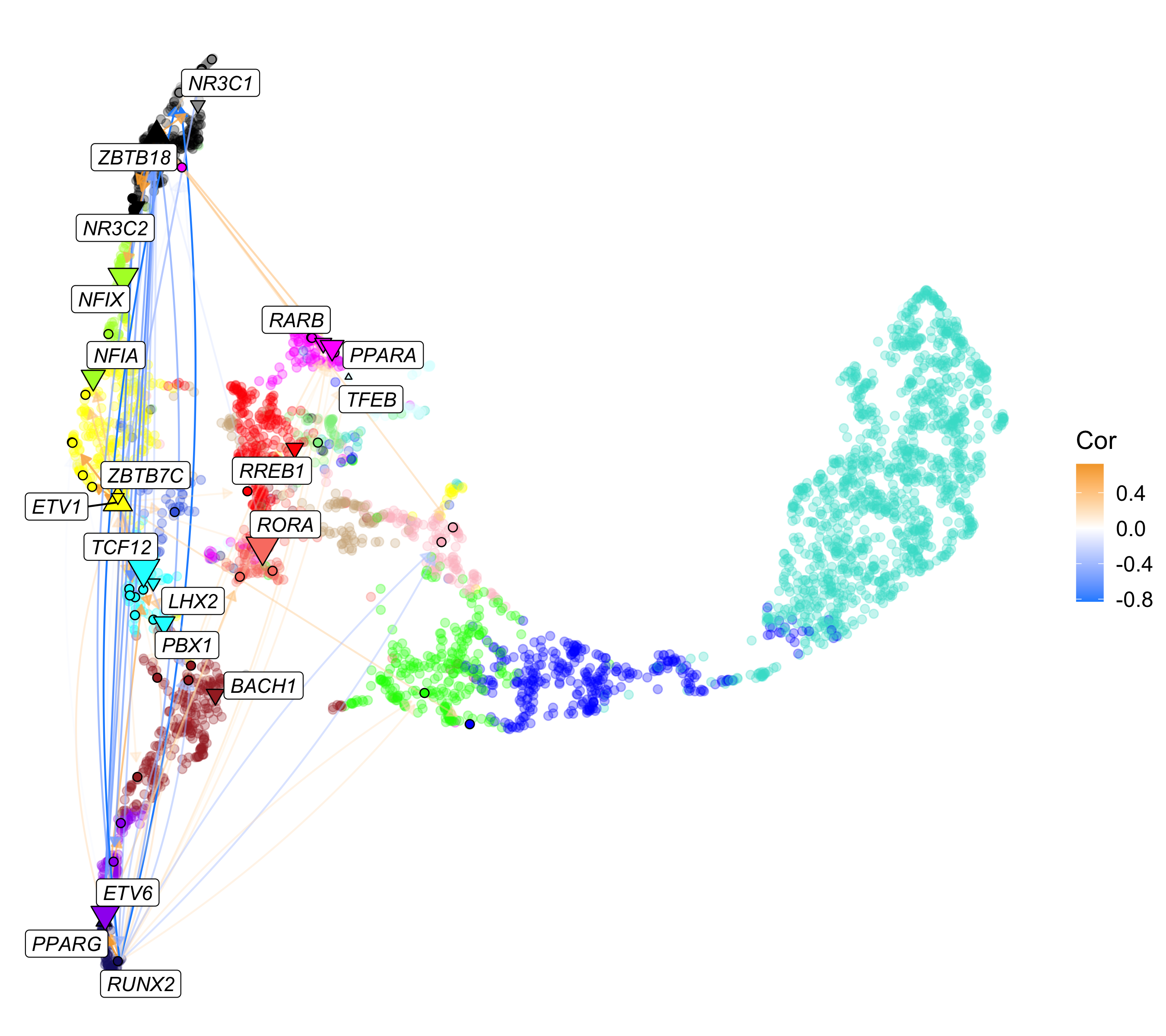
We encourage users to use this example as a template for creating fully custom network visualizations.
Differential regulon analysis
FindDifferentialRegulons
Similar to differential expression analysis or differential module eigengene analysis,
we can perform differential regulon analysis to compare
the TF regulon scores between two groups using the
FindDifferentialRegulons function. This function performs
differential analysis based on the positive and negative regulon scores,
and on the gene expression level of the corresponding TFs. Here we run
FindDifferentialRegulons to compare female vs. male in the
inhibitory neuron cell population.
# get the cell barcodes for the groups of interest
group1 <- seurat_obj@meta.data %>% subset(cell_type == 'INH' & msex == 0) %>% rownames
group2 <- seurat_obj@meta.data %>% subset(cell_type == 'INH' & msex != 0) %>% rownames

# calculate differential regulons
dregs <- FindDifferentialRegulons(
  seurat_obj,
  barcodes1 = group1,
  barcodes2 = group2
)

# show the table
head(dregs)
The resulting table contains an effect size and significance level for the difference between the two groups for the positive regulon scores, negative regulon scores, and gene expression for the TFs in our network. The module assignment of the TF and the kME are included for convenience.
Expand to see the differential regulons table
      tf p_val_positive avg_log2FC_positive p_val_adj_positive p_val_negative
1 TCF7L2   1.207455e-62          -0.3421176       8.572930e-61   7.105807e-21
2  NR2C1   1.835241e-61          -0.3747572       1.303021e-59   3.803810e-08
3    TBP   1.199167e-44          -0.3630856       8.514085e-43   5.298521e-19
4 ZNF682   5.916022e-32          -0.2712451       4.200375e-30   1.441206e-08
5 TFAP2E   7.645554e-27          -0.1822518       5.428343e-25   8.017671e-14
6 ZNF449   1.276234e-26          -0.2703349       9.061259e-25   2.865893e-09
  avg_log2FC_negative p_val_adj_negative avg_log2FC_deg p_val_adj_deg  module
1          0.17744670       5.045123e-19     -0.2709456    1.00000000  INH-M3
2          0.08154737       2.700705e-06     -0.3078851    0.03085842  INH-M3
3          0.15949878       3.761950e-17     -0.5854185    0.13673349  INH-M2
4          0.11242609       1.023256e-06     -0.3163022    1.00000000 INH-M10
5          0.18148616       5.692546e-12     -0.2233587    1.00000000 INH-M14
6          0.12186969       2.034784e-07     -0.4360043    1.00000000  INH-M2
        kME
1 0.1255949
2 0.2838355
3 0.2625859
4 0.2031141
5 0.1351454
6 0.1867791
Visualize and interpret the results
TF regulon scores describe the overall expression levels of the
predicted target genes of a given TF, split by target genes that are
positively or negatively correlated with the TF. Intuitively, if a
specific TF is expressed higher in one group, the positive target genes
should be up-regulated and the negative target genes should be
down-regulated. Therefore, we expect an inverse relationship between the
effect sizes for the positive and negative regulons for TFs that are
differentially regulating the two groups. We provide the plotting
function PlotDifferentialRegulons to visualize the
differential regulon data, summarizing this point.
# use the dregs which we obtained above
p <- PlotDifferentialRegulons(seurat_obj, dregs)

# show the plot
p 
PlotDifferentialRegulons shows a scatter plot comparing
the effect sizes from the differential regulon test for the positive
(x-axis) and negative (y-axis) regulons. Each point represents a TF,
colored by the module assignment. Diamonds represent TFs that are also
significantly differentially expressed, while circles are not
differentially expressed. TFs that did not reach significance are opaque
while the significant TFs have a black outline. A linear regression line
is also shown (optional). The number of significantly differentially
expressed regulons in each quadrant of the plot are labeled in the
corners.
In this plot, we want to focus on TFs in the bottom right and top left corners. For the TFs in the bottom right corner, the positively-correlated target genes are up-regulated in group1 relative to group2, while the negatively-correlated target genes are down-regulated in this comparison. The opposite is true for the TFs in the upper left corner. These labeled TFs comprise the differential TF regulons between these groups.
Enrichment analysis
Here we perform pathway enrichment analysis using EnrichR for the set
of target genes of each TF using the function
RunEnrichrRegulons. This function can take a while to run
because it is performing a separate query to the enrichR server for each
TF. You can specify a subset of TFs to query to speed up the
runtime.
library(enrichR)

seurat_obj <- RunEnrichrRegulons(seurat_obj, wait_time=1)
At this time, we do not provide a plotting function for the regulon enrichR results, but here we demonstrate how to make a simple bar plot using ggplot2.
Expand to see barplot code
# get the enrichr results table
enrich_df <- GetEnrichrRegulonTable(seurat_obj)

# select a TF to plot
cur_tf <- 'RUNX2'

plot_df <- subset(enrich_df, tf == cur_tf & P.value < 0.05)
table(plot_df$target_type)

# barplot for negatively-correlated target gene enrichment
p1 <- plot_df %>%
  subset(target_type == 'negative') %>%
  slice_max(n=10, order_by=Combined.Score) %>%
  mutate(Term = stringr::str_replace(Term, " \\s*\\([^\\)]+\\)", "")) %>% head(10) %>%
  ggplot(aes(x=-log(Combined.Score), y=reorder(Term, Combined.Score)))+
  geom_bar(stat='identity', position='identity', fill='lightgrey') +
  geom_text(aes(label=Term), x=-.1, color='black', size=3.5, hjust='right') +
  xlab('log(Enrichment)') +
  scale_x_continuous(expand = c(0, 0), limits = c(NA, 0)) +
  ggtitle('Negatively correlated target genes') +
  theme(
    panel.grid.major=element_blank(),
    panel.grid.minor=element_blank(),
    legend.title = element_blank(),
    axis.ticks.y=element_blank(),
    axis.text.y=element_blank(),
    axis.line.y=element_blank(),
    plot.title = element_text(hjust = 0.5),
    axis.title.y = element_blank()
  )


# barplot for positively-correlated target gene enrichment
p2 <- plot_df %>%
  subset(target_type == 'positive') %>%
  slice_max(n=10, order_by=Combined.Score) %>%
  mutate(Term = stringr::str_replace(Term, " \\s*\\([^\\)]+\\)", "")) %>% head(10) %>%
  ggplot(aes(x=log(Combined.Score), y=reorder(Term, Combined.Score)))+
  geom_bar(stat='identity', position='identity', fill='lightgrey') +
  geom_text(aes(label=Term), x=.1, color='black', size=3.5, hjust='left') +
  xlab('log(Enrichment)') +
  scale_x_continuous(expand = c(0, 0), limits = c(0, NA)) +
  ggtitle('Positively correlated target genes') +
  theme(
    panel.grid.major=element_blank(),
    panel.grid.minor=element_blank(),
    legend.title = element_blank(),
    axis.ticks.y=element_blank(),
    axis.text.y=element_blank(),
    axis.line.y=element_blank(),
    plot.title = element_text(hjust = 0.5),
    axis.title.y = element_blank()
  )

p1 | p2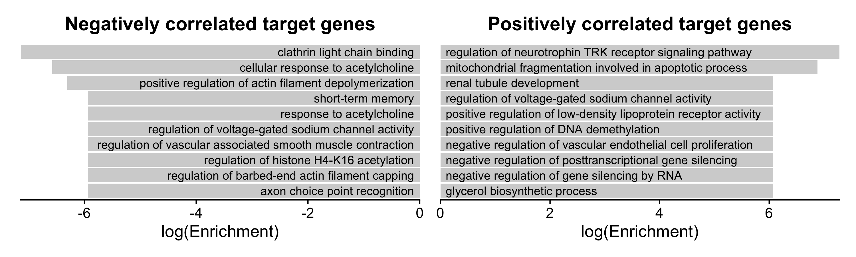
Module regulatory networks
Transcription factors make up some of the genes within co-expression
modules. Due to the complexity of the TF regulatory network, a TF within
one co-expression module likely regulates genes across other
co-expression modules. We can summarize these patterns across all TFs to
infer describe how co-expression modules may regulate each other via
their constituent TFs. In this section we use two functions to visualize
these regulatory dynamics: ModuleRegulatoryHeatmap and
ModuleRegulatoryNetworkPlot.
ModuleRegulatoryHeatmap
Here we demonstrate the function ModuleRegulatoryHeatmap
to show the summarized regulatory relationships between co-expression
modules based on the underlying relationships between TFs and predicted
target genes in these modules. First, we plot the “positive” and
“negative” regulatory relationships separately.
p1 <- ModuleRegulatoryHeatmap(
  seurat_obj, feature='positive',
  high_color='orange2')
p2 <- ModuleRegulatoryHeatmap(
  seurat_obj, feature='negative',
  high_color='dodgerblue')

p1 | p2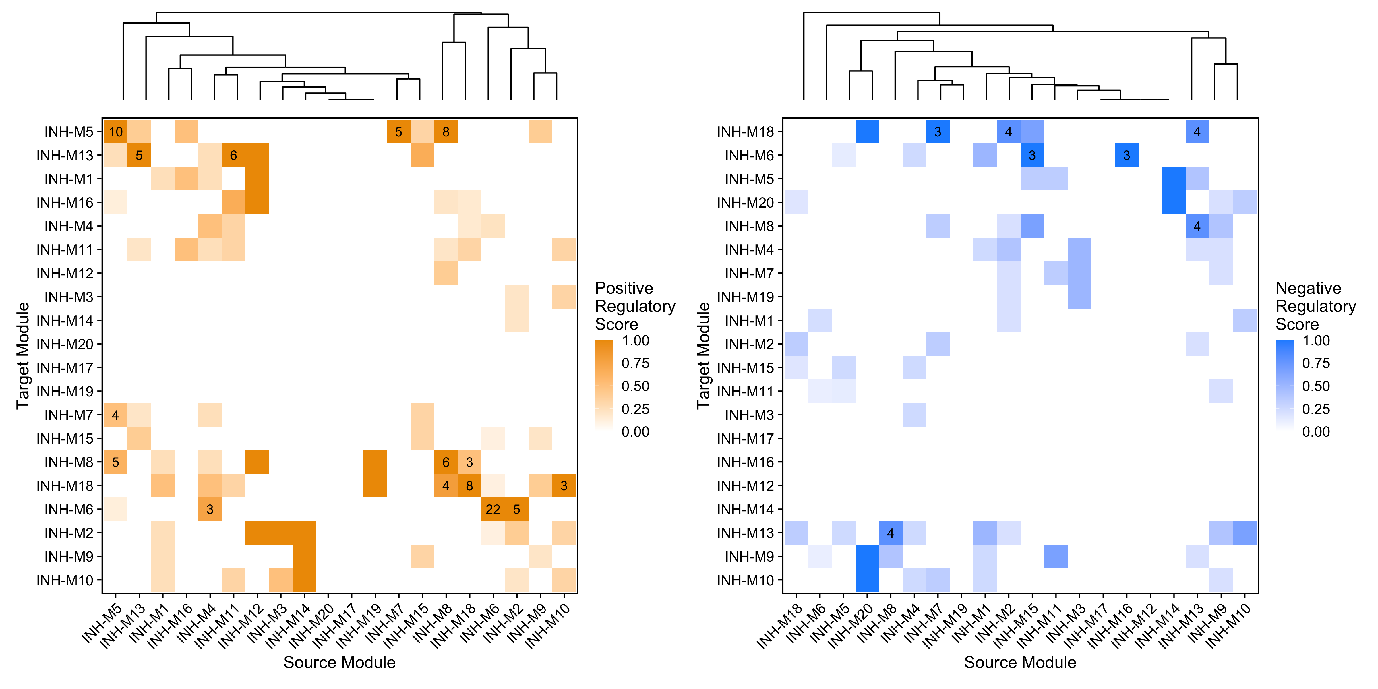
These heatmaps summarize the TF-mediated regulatory relationships between each pair of co-expression modules. The x-axis shows the “source” module containing the TFs, and the y-axis shows the “target” module containing the target genes. The regulatory scores (heatmap color) are calculated by counting the number of TF-gene links going from the source to the target module, normalized by the total number of TFs found in the source module. The labels on the heatmap show the actual number of regulatory links between the pair of modules.
By default, this plot only shows relationships between TFs
and other TFs, all other target genes are excluded. We can use
the option TFs_only=FALSE to show the same plot for all
genes.
p1 <- ModuleRegulatoryHeatmap(
  seurat_obj, feature='positive',
  high_color='orange2')
p2 <- ModuleRegulatoryHeatmap(
  seurat_obj, feature='negative',
  high_color='dodgerblue')

p1 | p2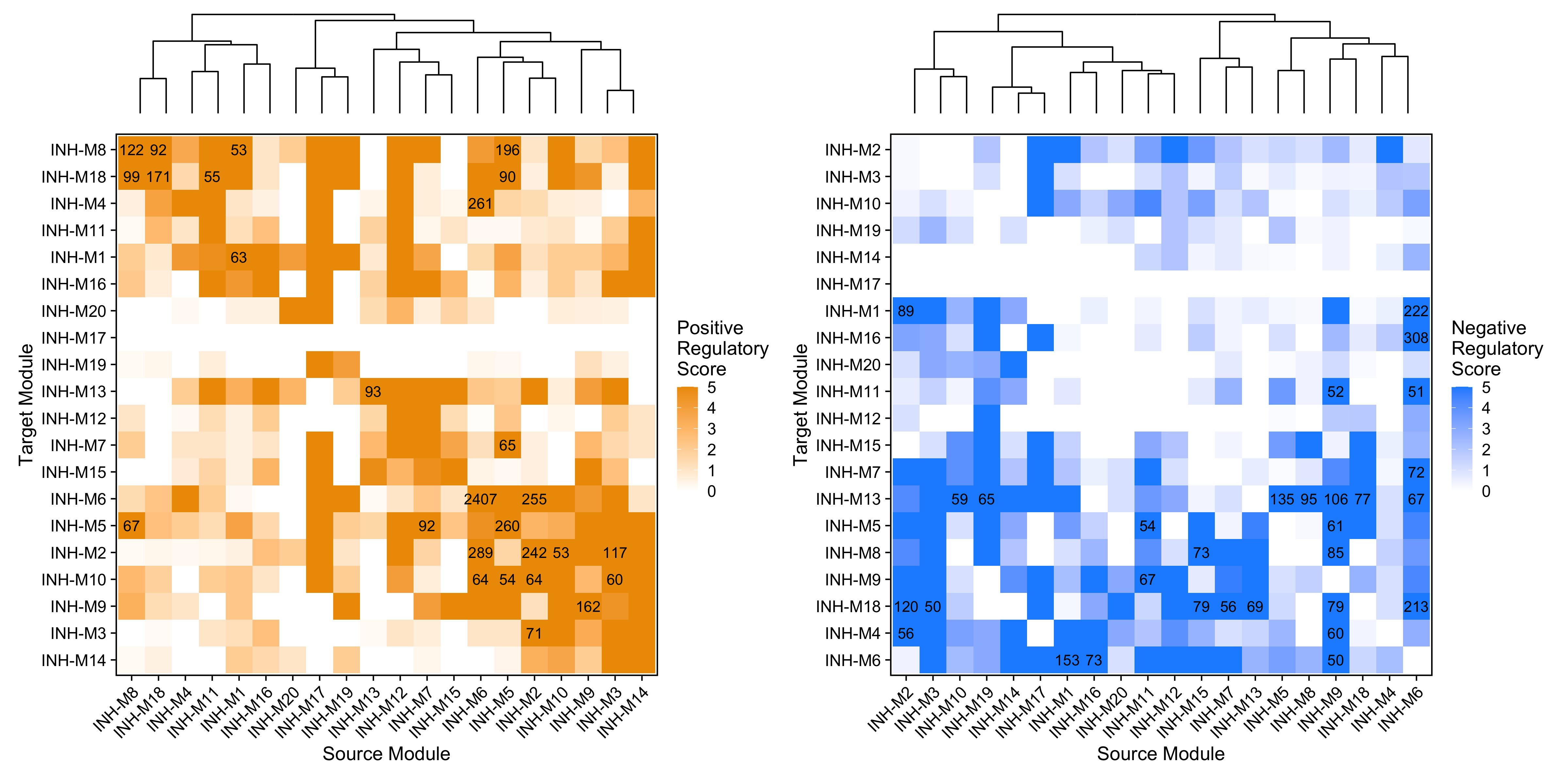
We can also use this function to plot the difference between the
positive and negative regulatory scores, which helps us to understand if
one module is overall activating or repressing another module. To
accomplish this, we use the option feature='delta' (this is
the default behavior). We can also avoid using the dendrogram by setting
dendrogram=FALSE
p1 <- ModuleRegulatoryHeatmap(
  seurat_obj, feature='delta', dendrogram=FALSE
) + ggtitle('TFs only')
p2 <- ModuleRegulatoryHeatmap(
  seurat_obj, feature='delta',TFs_only=FALSE,
  max_val=5, dendrogram=FALSE
) + ggtitle('All target genes')

p1 | p2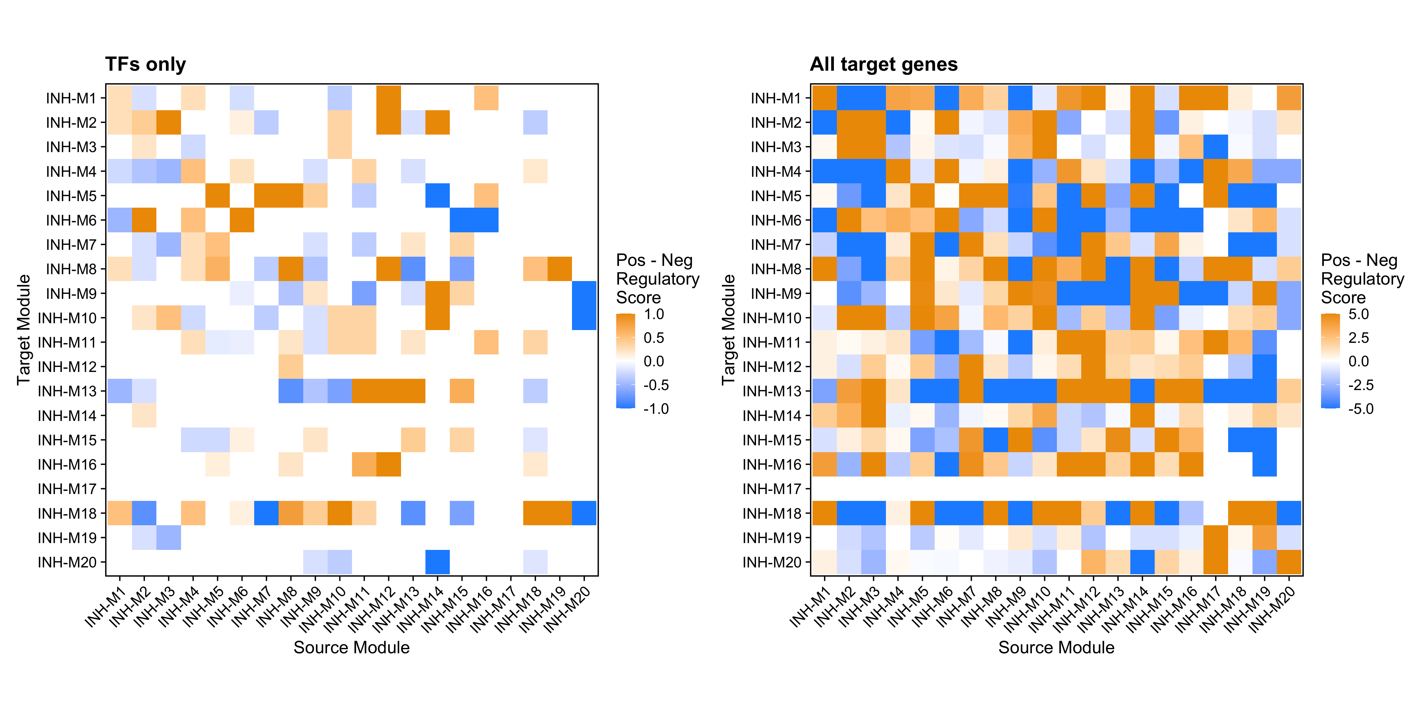
The orange color indicates where positive regulation is stronger than negative, while the blue color indicates where negative regulation is stronger. For example, here we can see that module INH-M8 contains TFs that positively regulate modules INH-M5 and INH-M18, and TFs that negatively regulate module INH-M13.
ModuleRegulatoryNetworkPlot
We can plot the same module regulatory information as a network plot
rather than as a heatmap using
ModuleRegulatoryNetworkPlot.
p <- ModuleRegulatoryNetworkPlot(
    seurat_obj, cutoff=0.5, max_val=1.5)

p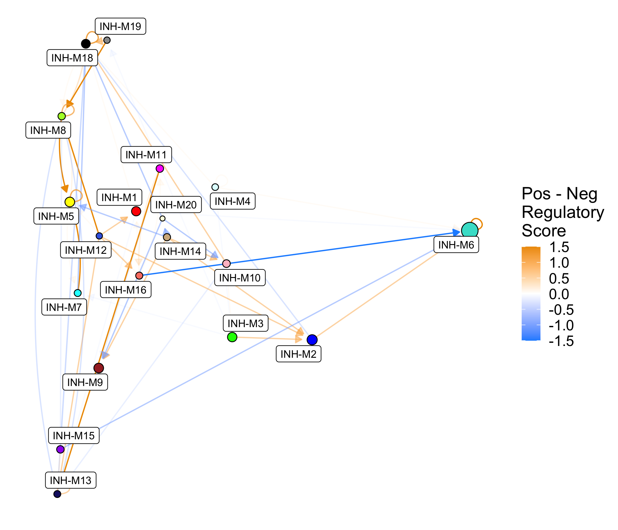
This network shows the same information as the previous heatmap shown above. We can also make similar network plots split by positive and negative regulatory relationships.
p1 <- ModuleRegulatoryNetworkPlot(
  seurat_obj, feature='positive', high_color='orange2')
p2 <- ModuleRegulatoryNetworkPlot(
  seurat_obj, feature='negative', high_color='dodgerblue')

p1 | p2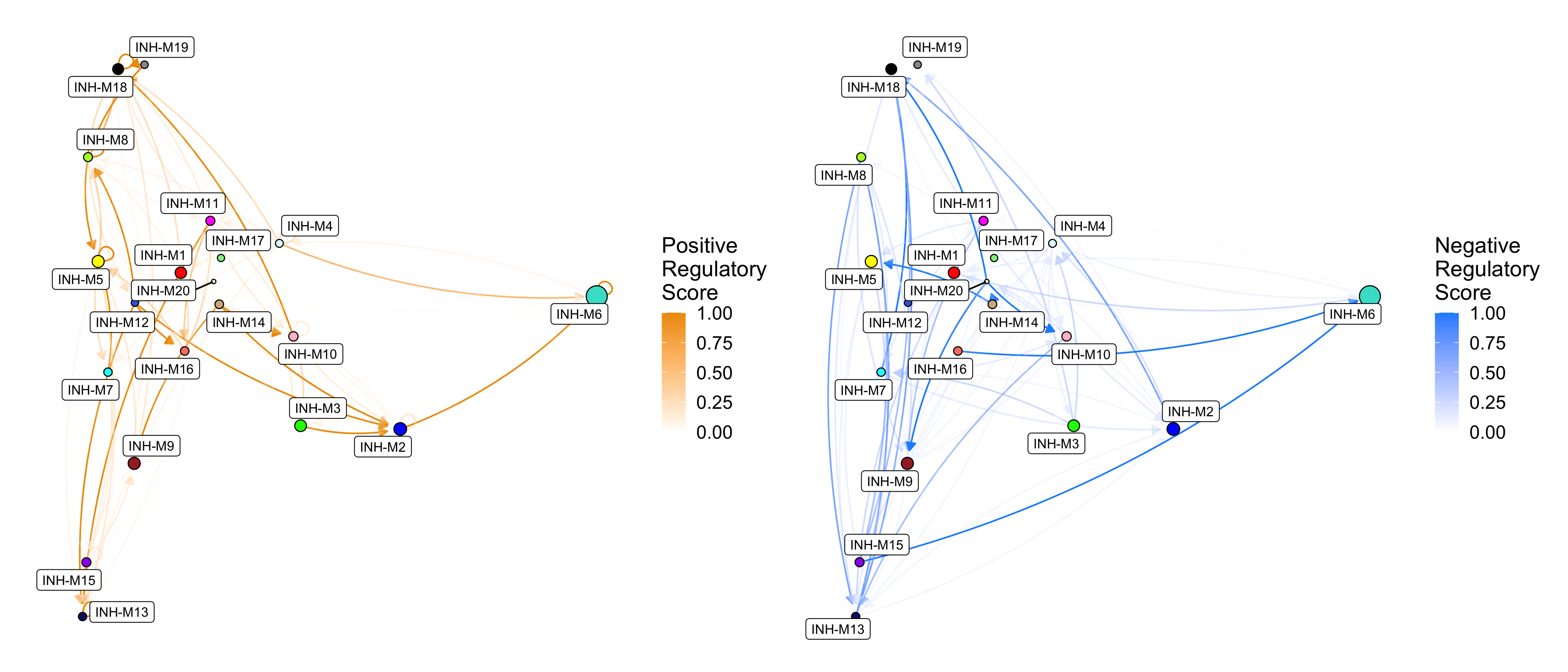
These directed network plots show the positive (right) and negative
(left) regulatory relationships between modules. Nodes represent
modules, and directed edges represent a regulatory relationship from the
source module to the target module (this is the same as the heatmap
color in ModuleRegulatoryHeatmap). By default, the layout
of the nodes is based on the module UMAP (RunModuleUMAP),
but other
layouts can be used as well.
Expand to see example with alternate layouts.
p1 <- ModuleRegulatoryNetworkPlot(
    seurat_obj, layout='circle', loops=FALSE
) + ggtitle("layout='circle'")

p2 <- ModuleRegulatoryNetworkPlot(
    seurat_obj, layout='stress', loops=FALSE
) + ggtitle("layout='stress'")

p1 | p2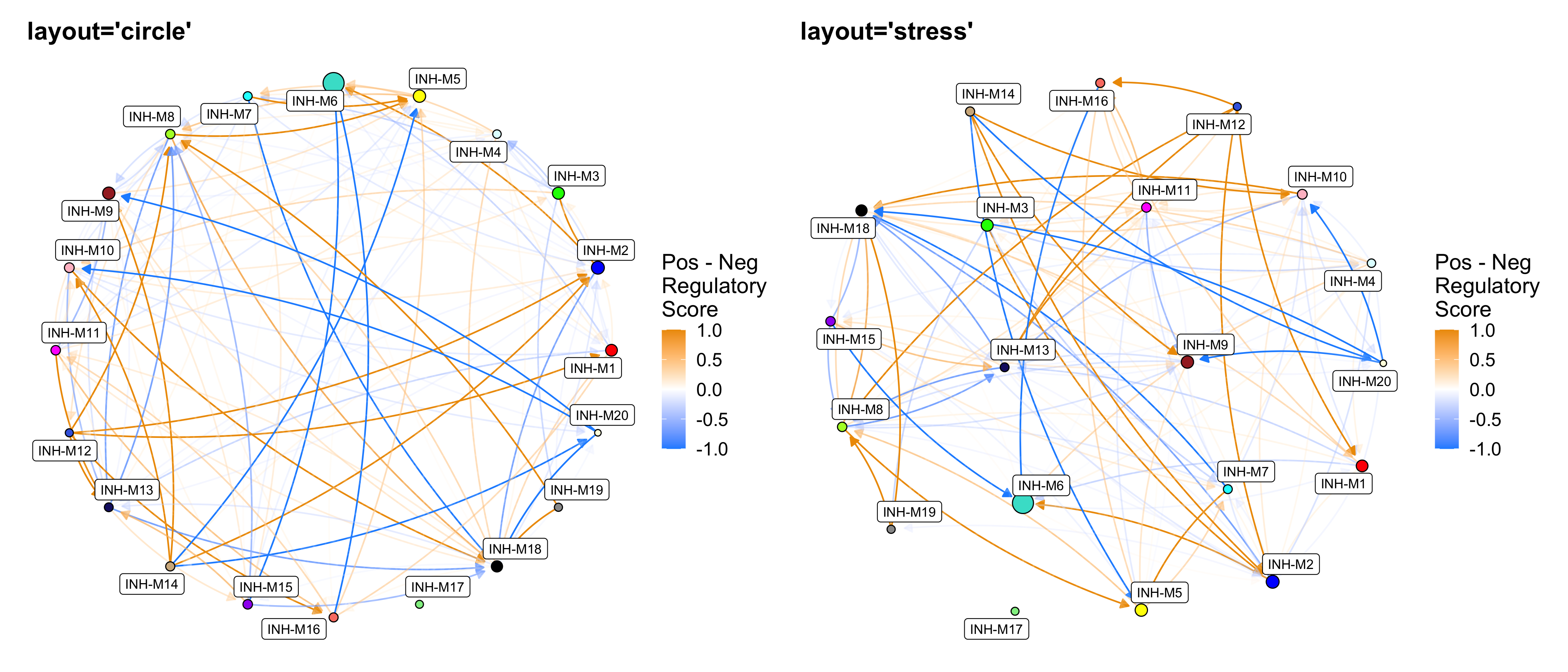
Next we set TFs_only=FALSE to show the regulatory
relationships between TFs and all target genes.
# set max_val=50 to stop the color scale at 50
p1 <- ModuleRegulatoryNetworkPlot(
  seurat_obj, feature='positive', high_color='orange2',
  TFs_only=FALSE, max_val=50)

p2 <- ModuleRegulatoryNetworkPlot(
  seurat_obj, feature='negative', high_color='dodgerblue',
  TFs_only=FALSE, max_val=50)

p1 | p2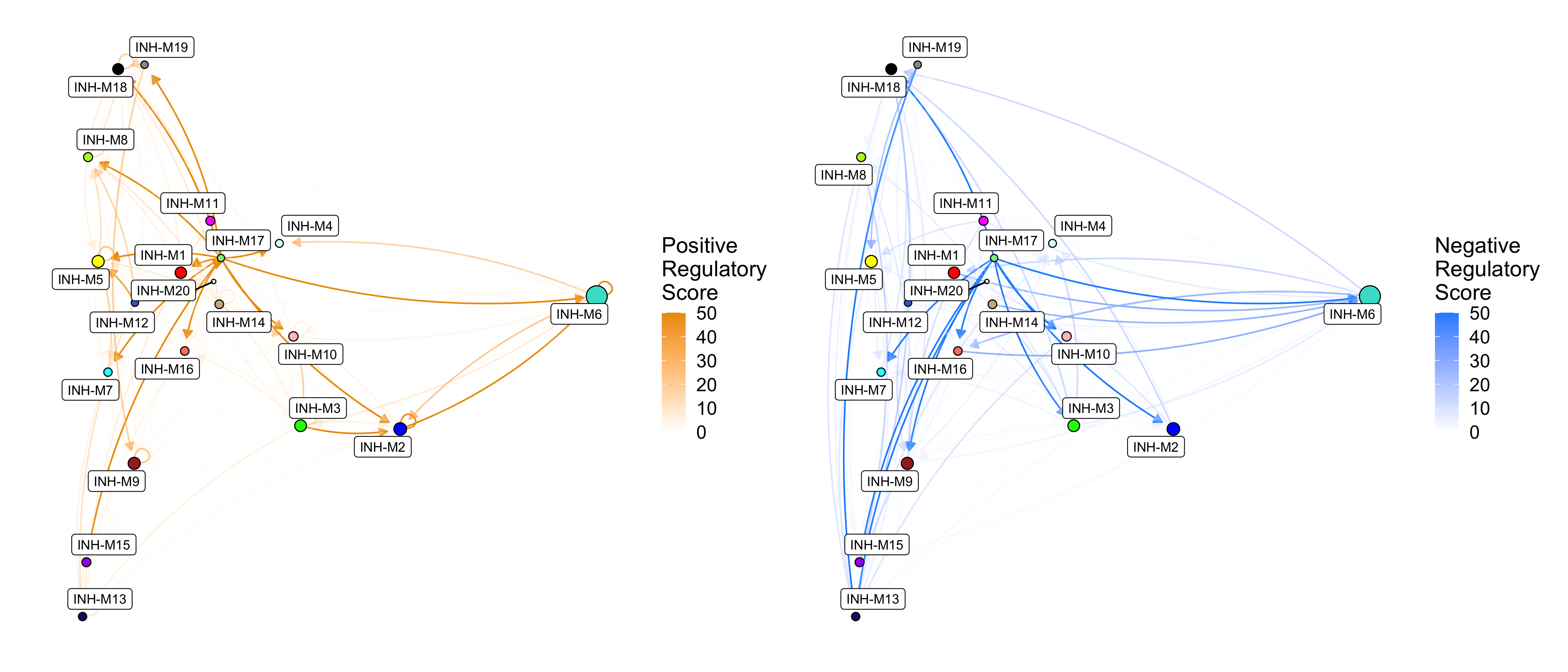
Similar to ModuleRegulatoryHeatmap, we can also show
edge weights as the difference between the positive and negative
regulatory scores. Here we also show some additional options. We use
cutoff=0.5 to remove weak relationships, we use
umap_background=TRUE to show the individual genes in the
co-expression UMAP, and we use label_modules=FALSE to
remove the module labels.
p1 <- ModuleRegulatoryNetworkPlot(
    seurat_obj, feature='delta',
    cutoff=0.5, max_val=1.5)

# same plot with additional options
p2 <- ModuleRegulatoryNetworkPlot(
    seurat_obj, feature='delta',
    cutoff=0.5, max_val=1.5,
    umap_background=TRUE, label_modules=FALSE)


p1 | p2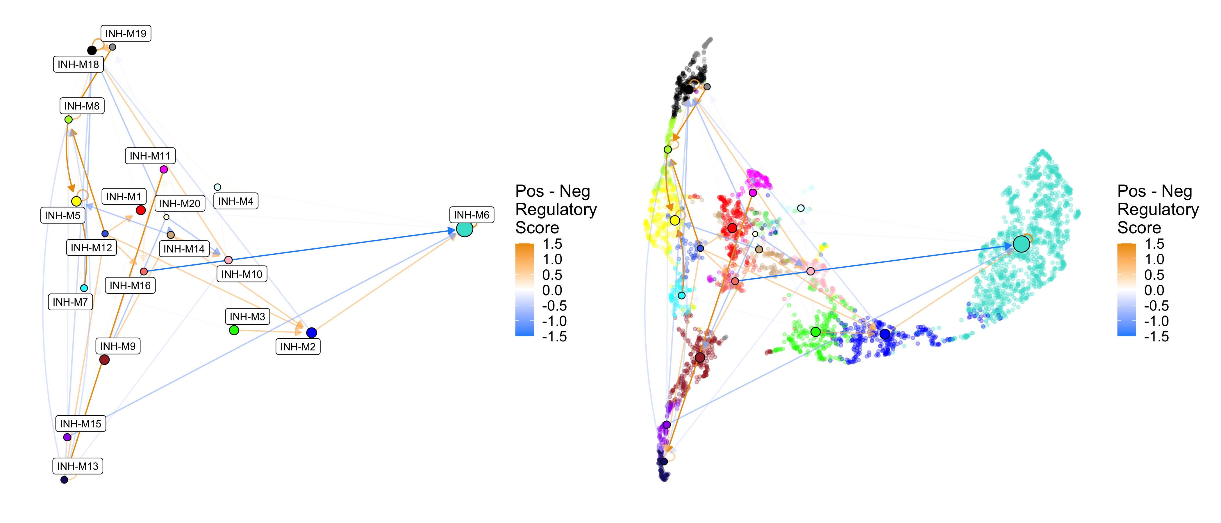
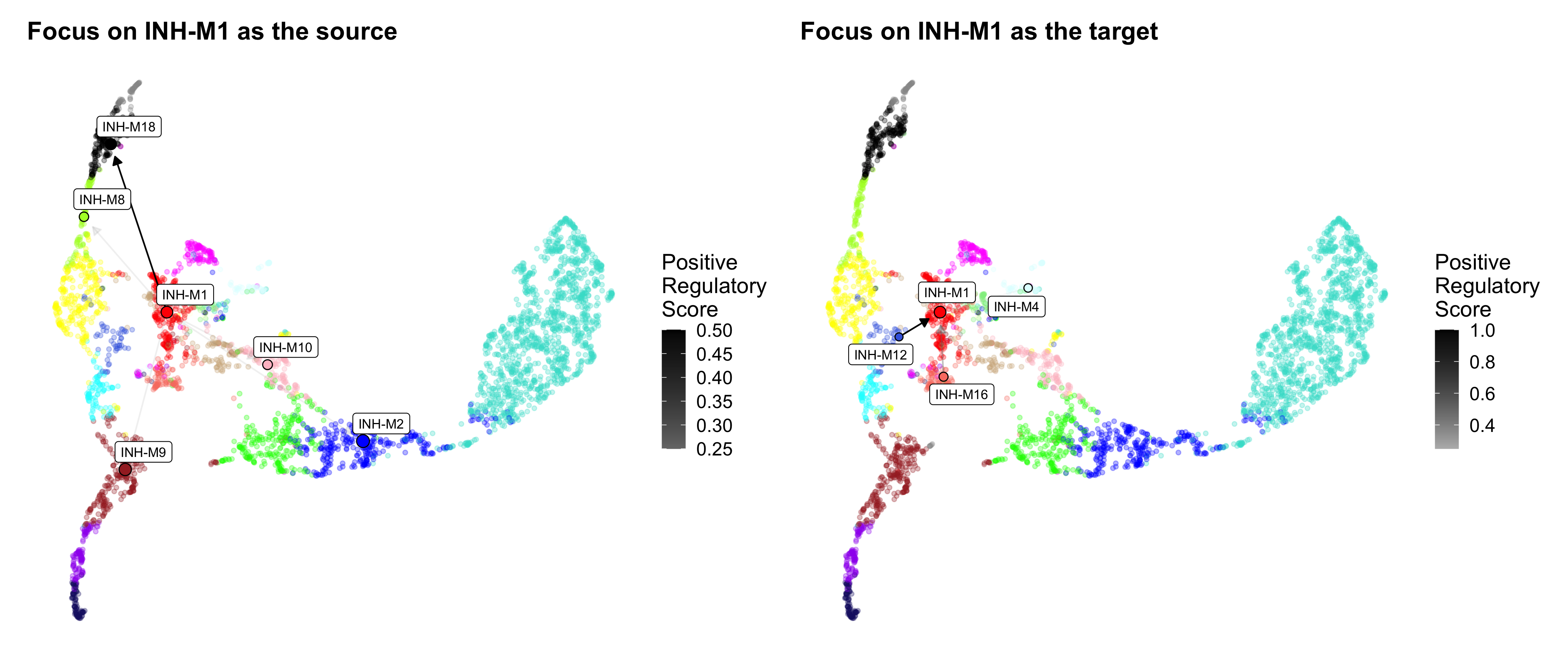
We can also make network plots that focus on specific modules as the source or the targets.
# source
p1 <- ModuleRegulatoryNetworkPlot(
    seurat_obj, feature='positive',
    umap_background=TRUE,
    high_color='black',
    cutoff=0.1,
    loops=FALSE,
    focus_source = 'INH-M1') + ggtitle('Focus on INH-M1 as the source')

# target
p2 <- ModuleRegulatoryNetworkPlot(
    seurat_obj, feature='positive',
    umap_background=TRUE,
    high_color='black',
    loops=FALSE,
    cutoff=0.1,
    focus_target = 'INH-M1') + ggtitle('Focus on INH-M1 as the target')

p1 | p2